
Nutrition Tree Poster
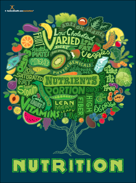
Nutrition Tree Poster is a poster produced and sold at Nutrition Education Store which follows the aim of conveying the importance of the nutrients and healthy eating to the person’s daily intake. Proper nutrients need an ability to control your portions and a specific diet which combines more plant-based foods, high fibre and many other required products.
This poster is a great example of typography by implementing different fonts which is the delivery of the typeface to describe the importance of nutrients each person requires in their diets on the daily intake in the form of a tree. In terms of typefaces, the designer used the traditional and in some areas decorative hand lettering which is legible with the help of upper cases and different tones of green. The tree used in poster is representing the life and wisdom to show how the crucial importance of nutrients such as “normal growth, development and ageing, helps to maintain a healthy body weight, and reduces the risk of chronic disease leading to overall health and wellbeing” (NHS, n.d.). So if the person doesn’t receive daily intake of vegetables and protein the consequences could be fatal such as illness and diseases (NHS, 2019). Linking with the an idea of wisdom, tree is just giving knowledge to help the person live longer and enjoy their living by receiving a balanced amount of nutrients as a treatment. In terms of knowledge, this poster would also be used in classrooms to teach children of any age the purpose of nutrients in healthy eating as they are growing mentally and physically. A display of healthy fruits such as vegetables, proteins and dairies give a denotative meaning which links with its purpose such as healthy eating . These small illustrations also reminds us of the accessibility of these nutrients, so you can purchase them in every shop due to being cheap or even grow fruits and vegetables in your garden. Blue and green hues used in the poster visually represents the vintage/retro view to when you first look at it.
“Eat Fruit-Be Healthy” Poster
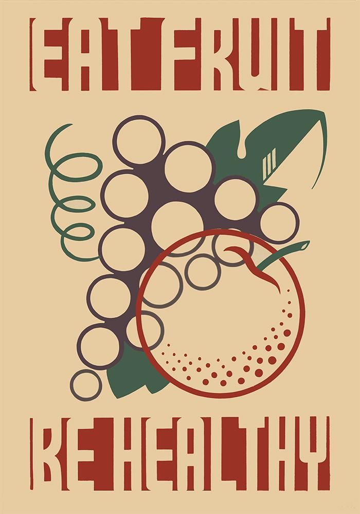
This poster is a vintage public information poster promoting healthy diet with the slogan “Eat Fruit – Be Healthy” which was created by the Federal Art Project between 1936 and 1938 to promote proper dietary habits by showing stylised fruit (Richard B. Levine, 1936-1938).
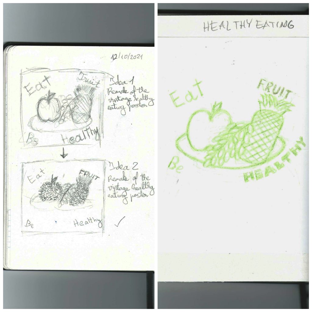
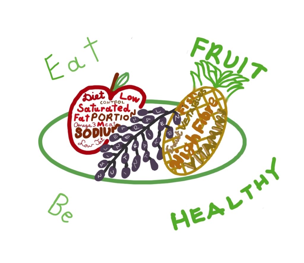
“Eat Fruit – Be Healthy” poster is a good example of typography by implementing with a simple design to promote the important of healthy. However, this poster can be improved by rounding the slogan instead of having it in a rectangle shape, changing to more saturated colour scheme and making the fruit more recognisable because the apple in the poster visually look like an orange, however this poster has an effective use of circles to represent fruit. So, the initial idea was to include typography not only outside the fruit but also the inside the fruit, so the people which are looking at the poster will understand the importance of healthy eating just by looking at the legible hand drawn keywords. In the slogan, the keywords “Fruit” and “Healthy” will be in upper cases only with dark green to highlight the purpose of the poster and in the classrooms to educate pupils of any age. In addition to the apple and grapes on the plate, a pineapple will be added as a circular shaped fruit, and important source of “vitamins and minerals including calcium, manganese, plus vitamins A and C” in our daily diet ( Nicola Shubrook, n.d. ). All fruits and the plate will be drawn using one circular shape which links with the actual poster and have a saturated colour scheme compare to the 20th century poster but at the same time will be recognisable and include uniquely stylised fruit. The hand drawn typography will be drawn, so the keywords will follow the pattern of my hand writing, upper cases and sans script in various tones of reds, purple and yellow ochre which links with the Nutrition Tree Poster in the above. Below, there are my initial sketches, traditional mock up and additional final design ideas.
Design sketches
Final design
References
NHS, n.d, Eat Well (Article) [Online] (Updated 27 March 2019) Available at: https://www.nhs.uk/live-well/eat-well/ [Accessed in 28 October 2021]
Nicola Shubrook, n.d. The health benefits of pineapple (Article) [Online] (n.d.) Available at: https://www.bbcgoodfood.com/howto/guide/health-benefits-pineapple [Accessed in 28 October 2021]
Nutrition Education Store, n.d. Tree of Nutrition Poster (Educational posters original website) [Online] (n.d.) Available at: https://nutritioneducationstore.com/products/tree-of-nutrition-poster?variant=13766329411 [Accessed in 28 October 2021]
Tammi Jantzen, n.d. The Importance of Nutrition (Article) [Online] (n.d.) Available at: https://astartemedical.com/the-importance-of-nutrition/ [Accessed in 28 October]
Vintagraph, n.d. Eat Fruit Be Healthy (Vintage poster original website) [Online] (n.d.) Available at: https://vintagraph.com/products/eat-fruit-health-poster?variant=12106463871078 [Accessed in 28 October 2021]