
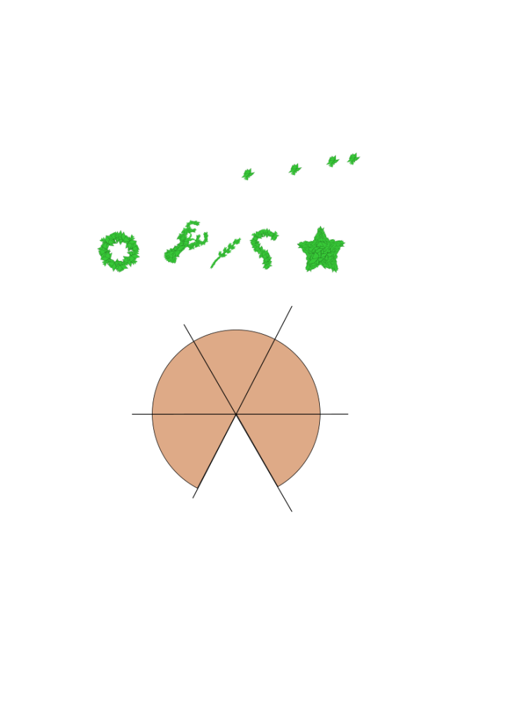
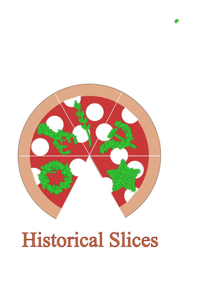
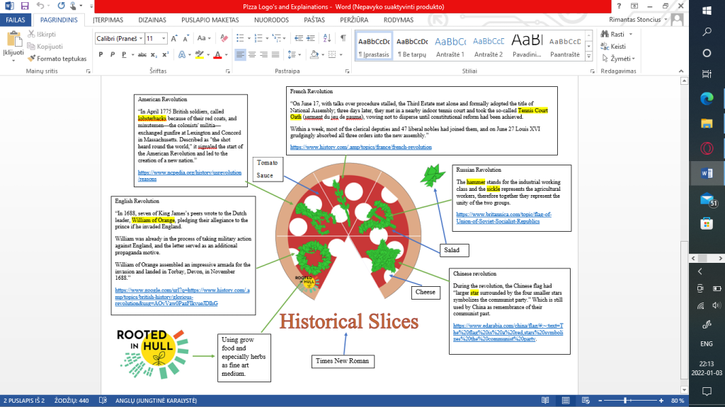
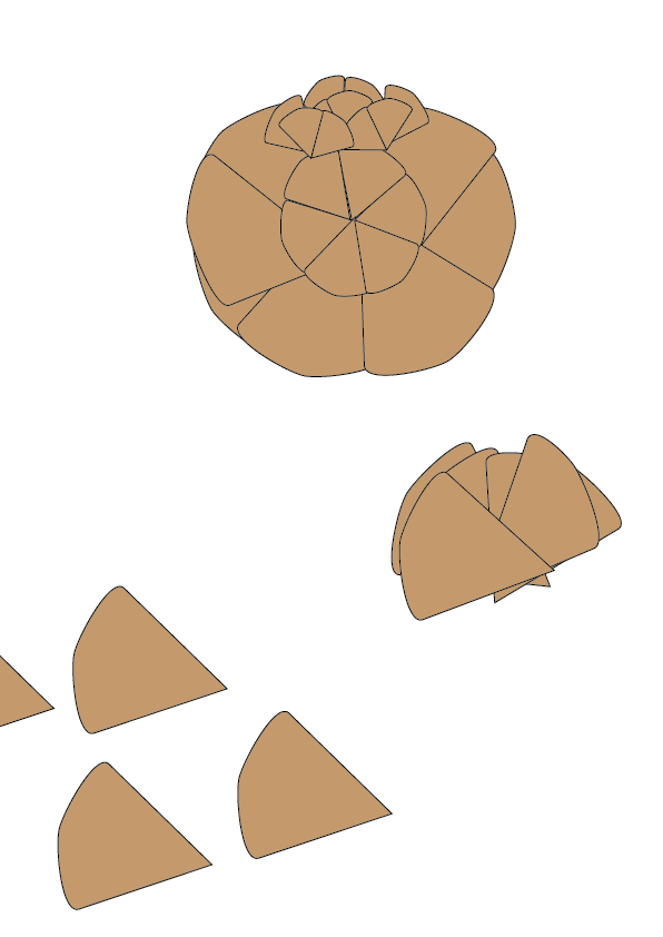
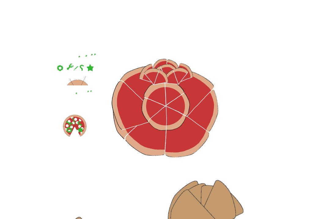
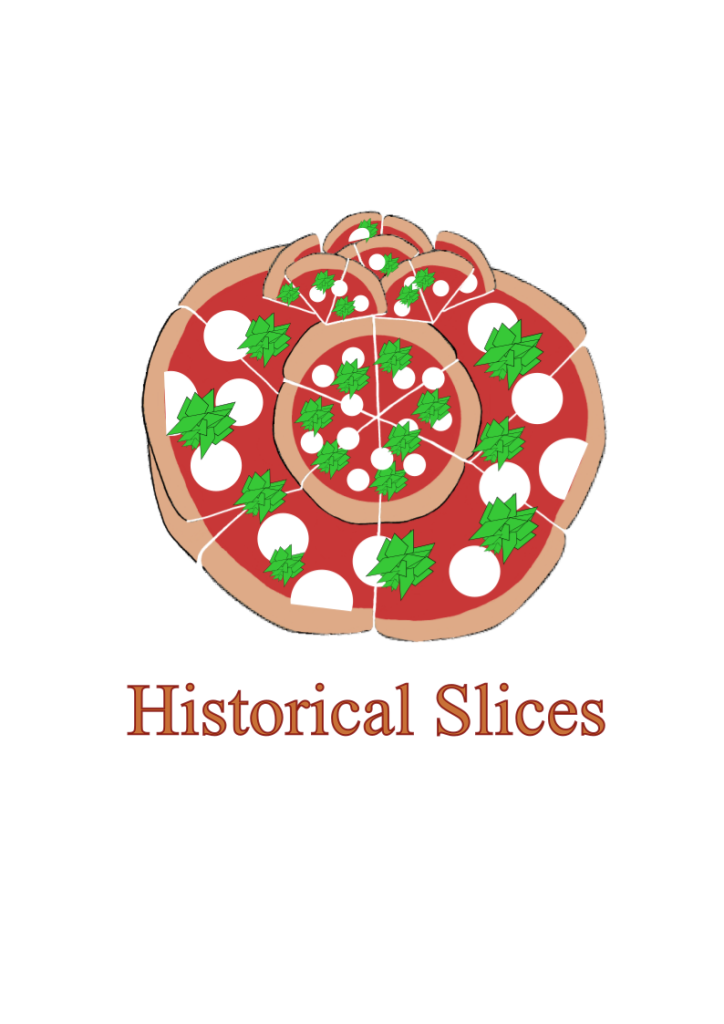
Two logo designs were created as part of my pizza project, based on the client’s preferences and my first concepts. To bring customers together, the design incorporates the sickle and hammer from the Russian Revolutionary banner, as requested by the client. By slicing the pizza into five slices, the client’s interpretation was achievable. Based on the history of the English, American, French, Russian, and Chinese Revolutions, each slice will have a distinguishable element. Salad and herbs abundant in the area, however, were used to unify and construct these revolutions. The entire pizza was reduced to a salad, mozzarella, and tomato sauce, making reference to its 19th-century roots during the American-European migration. To complement my historical pizza, Times, New Roman was chosen. A Rooted in Hull transparent logo will be placed to the bottom corners of both designs.
The logo incorporates many pizza slides to form a tomato, which is often used as a base in pizza and grows in the territory, based on my original concept. Tomato design is similar to the design from above as it has a simple design and a well-known colour scheme. The customer provided comments and suggested improvements to my logo ideas during my visit to Rooted in Hull. Following the input, a third logo concept was created, combining pizza slices with a united call to action represented by two sickles joined together. To match Rooted in Hull, the sickle handles will be green. This time, though, the client gave his bakery the name “The People’s Pizza.”
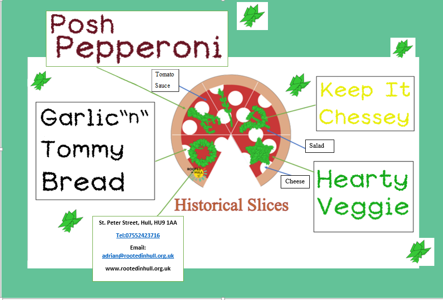
Following the creation of my logos. The flyer’s structure was based on the above-mentioned explanation diagrams. Rather than providing information, each section will include the name of a certain pizza as well as the font. So there will be five parts, four of which will carry the name of the pizza and the bottom box will have the contact information and address. To tie in with the Rooted in Hull campaign, the background will have a light green primary colour border. Each circular box will have a goal that both projects will strive to achieve. Rob Graves font was selected for this poster to tie in with the name labels at Rooted in Hull’s entryway to show where everything is. To associate with revolution, a Times New Roman font was used to the logo name.
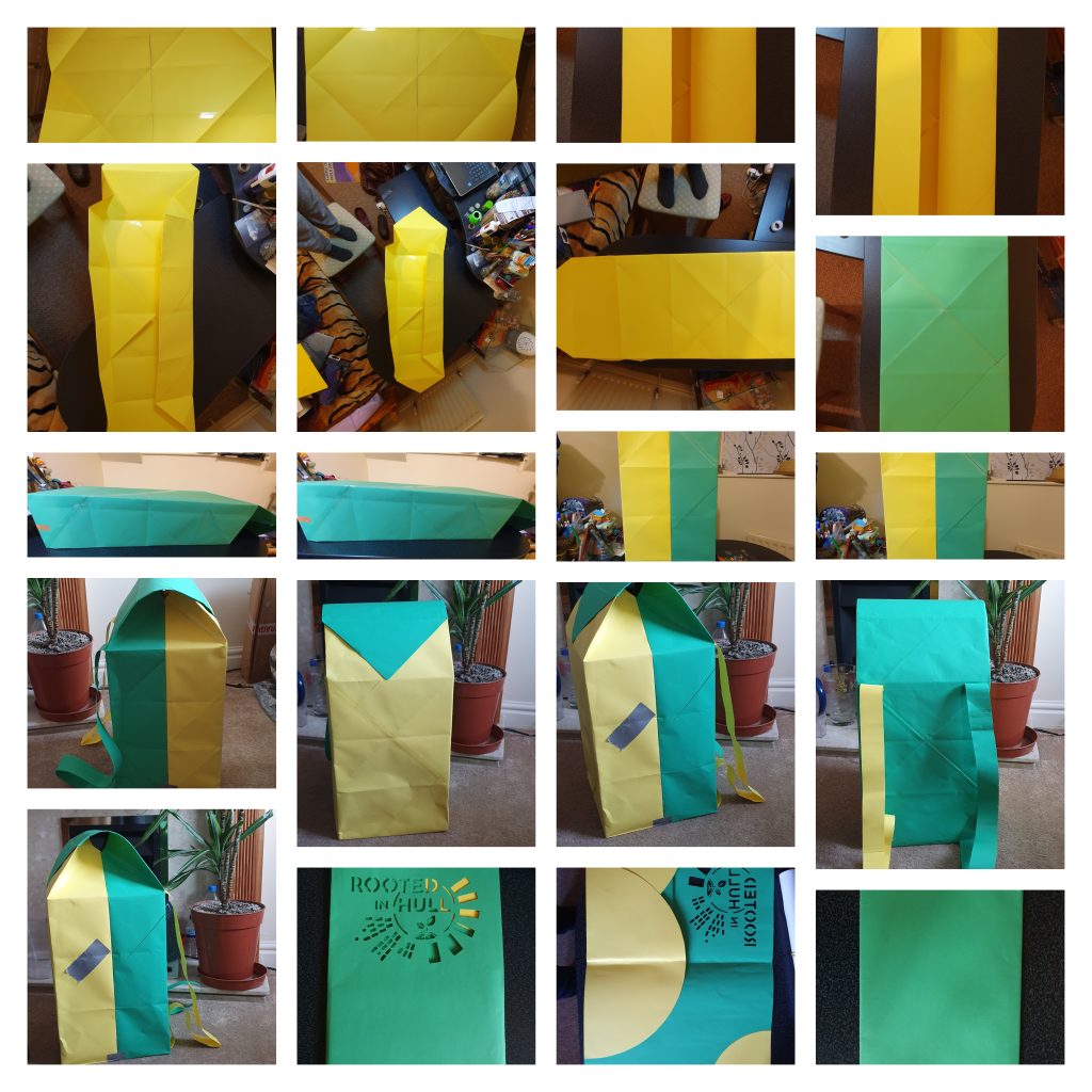
The thermal backpack packing was designed as a mobile billboard for passing individuals in order to deliver flyers. Because it is environmentally friendly, this package is made of origami paper. This structure is made up of two folded boxes held together with sellotape. Two more origami boxes will be included in the bag for distributing pizzas vertically and horizontally. The backpack’s walls will be foil-lined as part of the thermal heating system to keep the pizza warm. Pizza will be laminated for delivery in various locations so that the topping does not slide off and the pizza can be reused for other goods after it is consumed.