
Mood boards

Colour planning +Typography
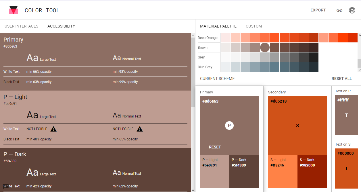
To select an accessible colour palette, I used Adobe Colour new accessibility section. New feature had contrast section to check the legibility of text on the chosen colour. Another section was colour blindness to check three different types of colour blindness and colour conflict. The chosen colour was brown-ish orange because its very optimistic and user friendly in terms of legibility. While using the Google Guidelines for the app construction, an updated version came out with a Colour Tools to check contract and legibility of my chosen colour palette from Adobe Colour.

However, in order to select an accessible typography for the companion app, the black were change to white to help users see the text clearly and some users have problems reading black text. Roboto was chosen as a body and title font for the Creative Life App because its a standard font used for the android users and it allow a good legibility in different sizes. This app will also have Ocr A typeface for the realistic debit card number input.
Creative Life Website uses Cambria as it’s mostly used in Windows computer and allows a very legible text reading.
User flow
This is an user process of Fred Jackson (Persona) visiting the website to plan the journey and buying a ticket.