
Caroline’s feedback
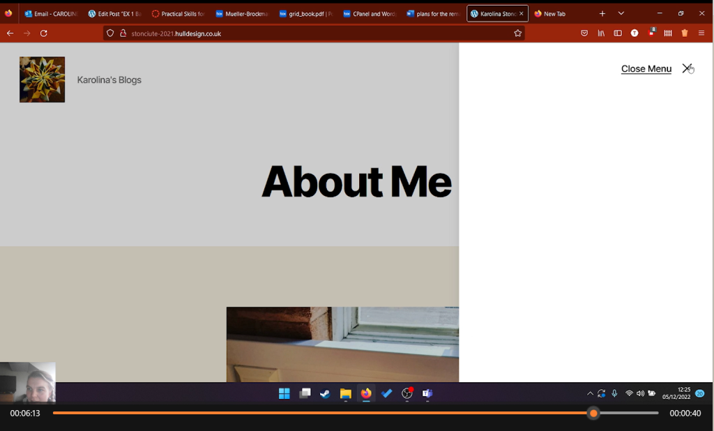
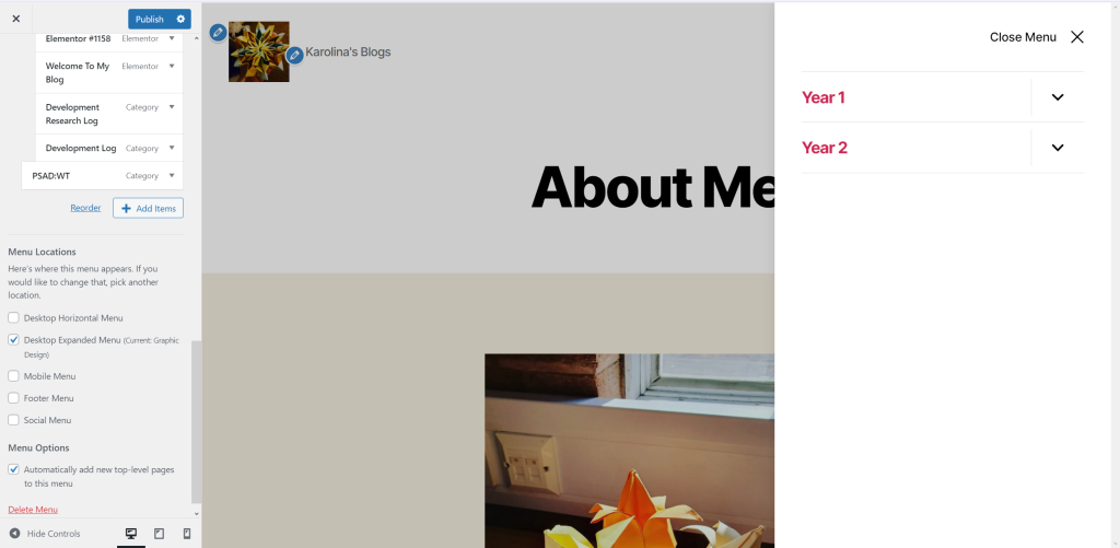
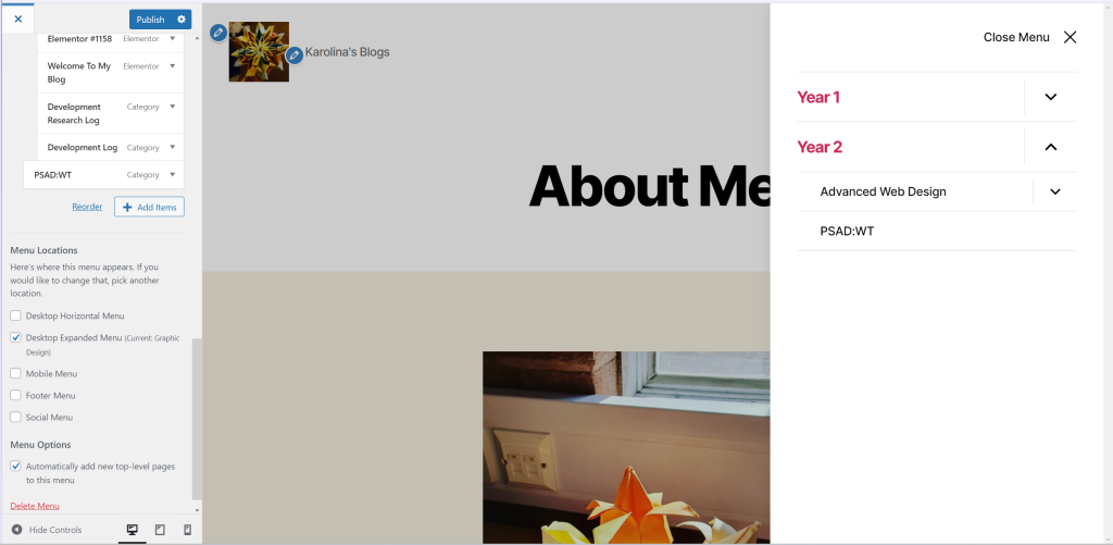
Regardless of my website and what may be done to make it more accessible, this is Caroline’s feedback. The website is in decent shape, however as Caroline said, “An additional menu which is not need” can hinder accessibility by misleading the user because the burger emblem is frequently used in menus, and by having nothing there, the user may assume there is something there.
Improvement
You will show how you have responded to the evaluation in terms of design changes or in terms of identifying issues for consideration. You should annotate the key points in the participants narration and show with screen shots and annotations the changes you have made to the design or propose making.
After listening to Caroline’s feedback, I have removed the not required menu and while watching the video I realised that there is also a comment section in “RP1 – Grids and Frames ” which was also removed.
Rana’s feedback
According to Rana “However, in the video I experienced some difficulty with one image that I could not get a bigger zoom-in feature. This had me pause and experience a little amount of difficulty when trying to get a closer look at that specific image.” This issue would stop the user from viewing the content which may be useful to you.
“Another improvement I would give Karolina is to just make sure that all her images are clickable and that users can actually access the zoom-in feature to all her images that have been posted. This makes her pages and media files user-friendly and all images can be accessed in any way with no hassle to the user.”