
Logo
In order to create the logo, I did research into different helping organisations and their logo’s, so it’s recognisable to the users in terms of purpose/message of the project. As long research, I did a sketch of how the logo would visually look like and so it meets design essentials just as colour, typography, conceptual design and composition. After 3 different concepts were sketched, they were transferred to the Illustrator and with help of Path Finders converted to the vector designs.
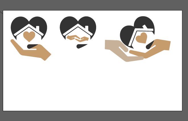
After choosing the perfect logo, I went back to the moodboard for the hex numbers of the chosen colours and typography. I have also additional elements to make the logo more professional and the hand giving other hand their heart which is in a darker colour to show stereotypes is broken with house and heart coming from this person as small kindness could mean a lot to the other person.
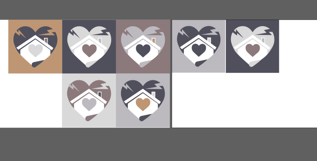
The major message, which was how society mistreats and misunderstands the homeless and how they may receive assistance, is represented by the logo. As it takes mental force to act physically, even a modest act of kindness could motivate a homeless person to reevaluate their situation and perhaps even change their life. So the heart is given to the homeless person. Their hand is a pale shade of grey, whereas the recipient’s hand is a toasty shade of brown.
The dark grey color broken heart stands for stereotypes. There is a warm, cozy home within this heart, where everyone deserves to live with hope. Since persons who are homeless would receive support if they desired to completely improve their lives, the term “Last Hope” was chosen. This company uses a Segoe Script typeface that was hand-drawn.
Summary
As the branding was created with logo. A graphic identity was also created with intro and outro logo animation for video content. Brand design manual involves all the design aspects used throughout the project. Next step is to introduce the stakeholders and how will the project meet the stated requirements while keeping the core message and purpose.
References
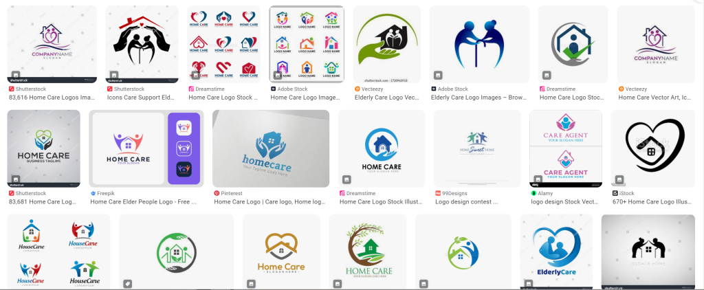
Google, n.d. People home support logos [Online] (n.d.) Available at : https://www.google.com/search?client=opera-gx&hs=ro&sxsrf=AB5stBjnjJdNjzGuuFgF_sPdAO8n6b2vRg:1690962362217&q=people+home+support+logos&tbm=isch&source=lnms&sa=X&ved=2ahUKEwj9t7bXvb2AAxWbVEEAHRr3D60Q0pQJegQIDRAB&biw=1650&bih=792&dpr=1.5 [Accessed in 25 July 2023]