
Maisto bankas (Food bank)
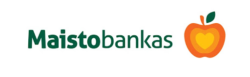
Maisto bankas is a Lithuanian food organisation which do their best to help people who are suffering from shortage of food and decrease the amount of edible food being thrown away. Their logo can be found next to products in shops and stuck on the yellow bins in the airports.
This logo incorporates the heart shape in an apple to indicate the passing of light of hope, trust and kindness to other people which is shown by an effective section gradient from orange to bright yellow. An apple is an important product in the healthy diet as being one of the key nutrients in 5 a day, so if the daily intake decreases, the person becomes less energetic and start to gain a weak immune system by lacking in vitamins, minerals and many other healthy nutrients (NHS, 2018). This shape links with the main focus of this organisation in terms of every good condition but not used or unwanted product can be given to someone who might eat their apple as their dinner. Apple itself is a food product which can be found in any shop or even market and it doesn’t cost much to purchase. So anyone can buy the apple and give it to a person on the street. The logo is also recognisable and explains the idea of this organisation to the people when they look at this logo by having bold letters in a Lithuanian word “food” as a contextual keyword. Use of negative space around the logo plays important role as it makes the logotype and logomark stand out when people look at it.
Save the Children
Save the Children is a UK based child helping organisation which delivers food, medicine and protection, and holding governments to account for providing for these basic needs themselves because this organisation believes that every child has the potential to change the world. According to the staff, Save the Children organisation is “Driven by becoming the biggest and shiniest charity, Save the Children has lost sight of values it once held. It’s run like a big corporation and staff working on the ground don’t appear to be treated well. The focus is on quantity not quality, with unrealistic targets set in terms of delivering any quality work. Good work is still happening on the ground due to individuals believing in the work, but I don’t believe that it’s a healthy environment for them.” (Guardian, 2015) which links the poor designing of this logo.
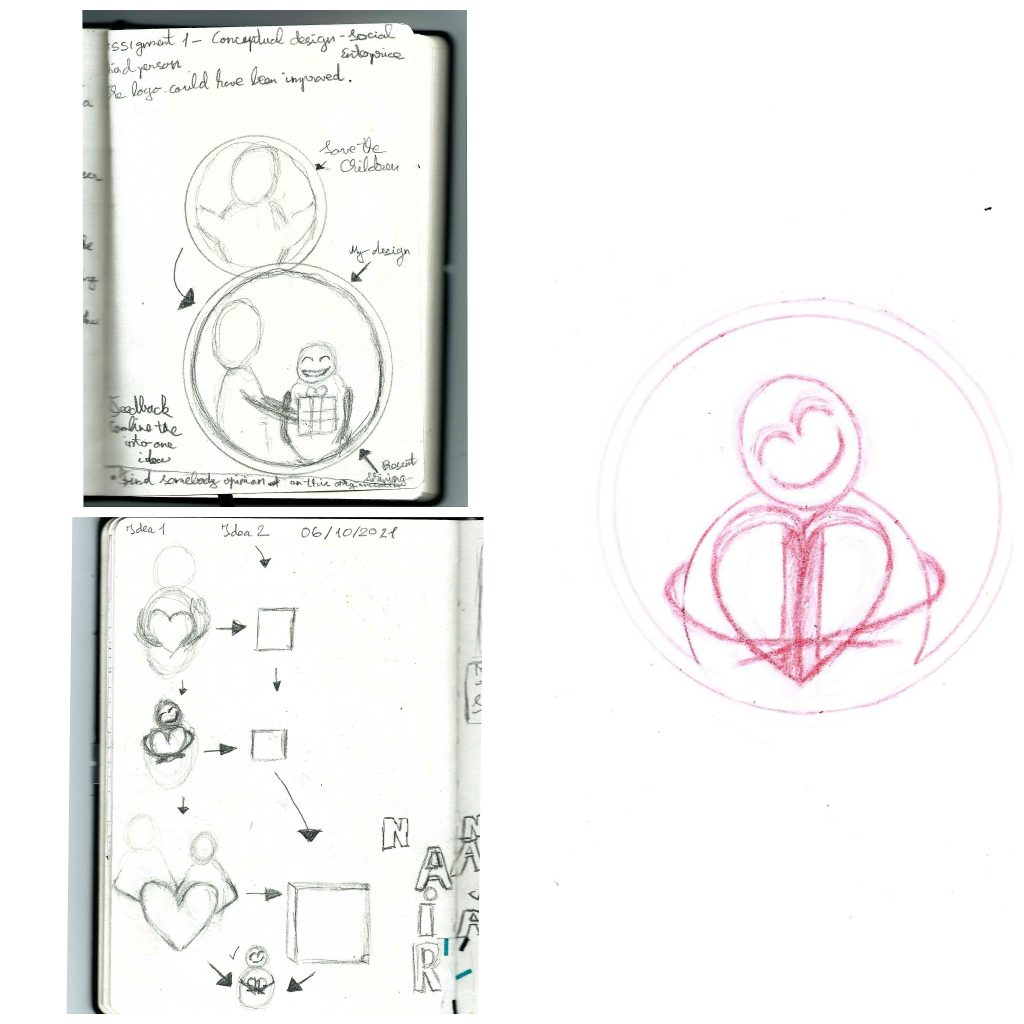
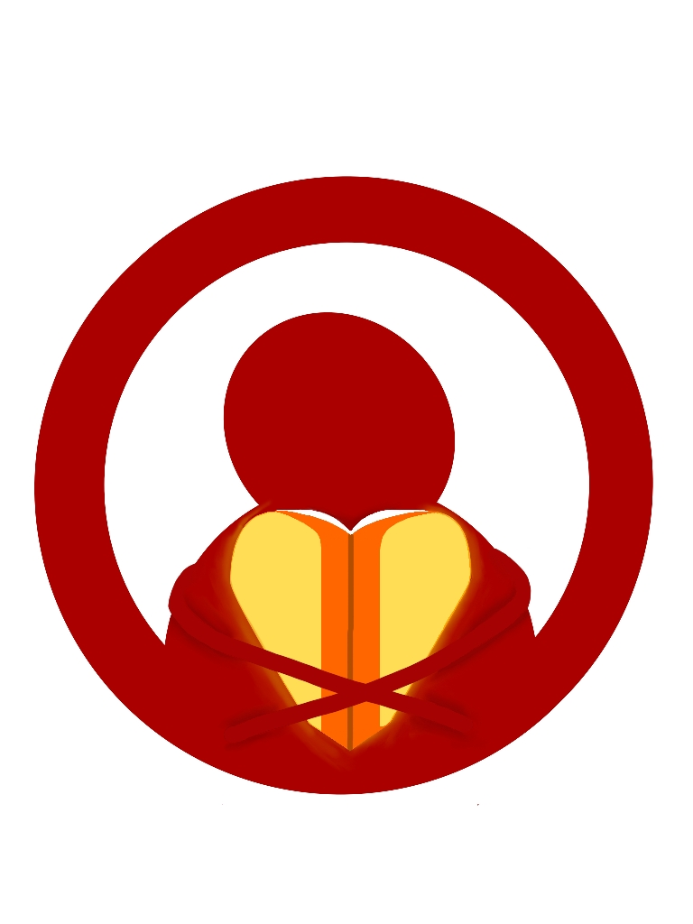
Design process
maller standing straight receiving the present. After few days I analysed my design idea and realised that the idea is too literal, so my greatest mission was to combine the child, adult and present together. So I thought of two similar idea which include hugging a heart or a book with three possible combinations. These combinations include just hugging an item, hugging tightly an item and holding hands with an adult which they hold an item together. I have decided to keep the colour red logomark and black logotype because there isn’t a need to change colours due to their conceptual importance to Save the Children and just the helping organisations in general. However, the item will be shinning to show importance and preciousness to the child which is given from the adult which represents the idea and purpose of the organisation. Then I will sketch the final result with a red erasable pencil and using colour to show visual idea when transitioning into a digital design.
Design sketches
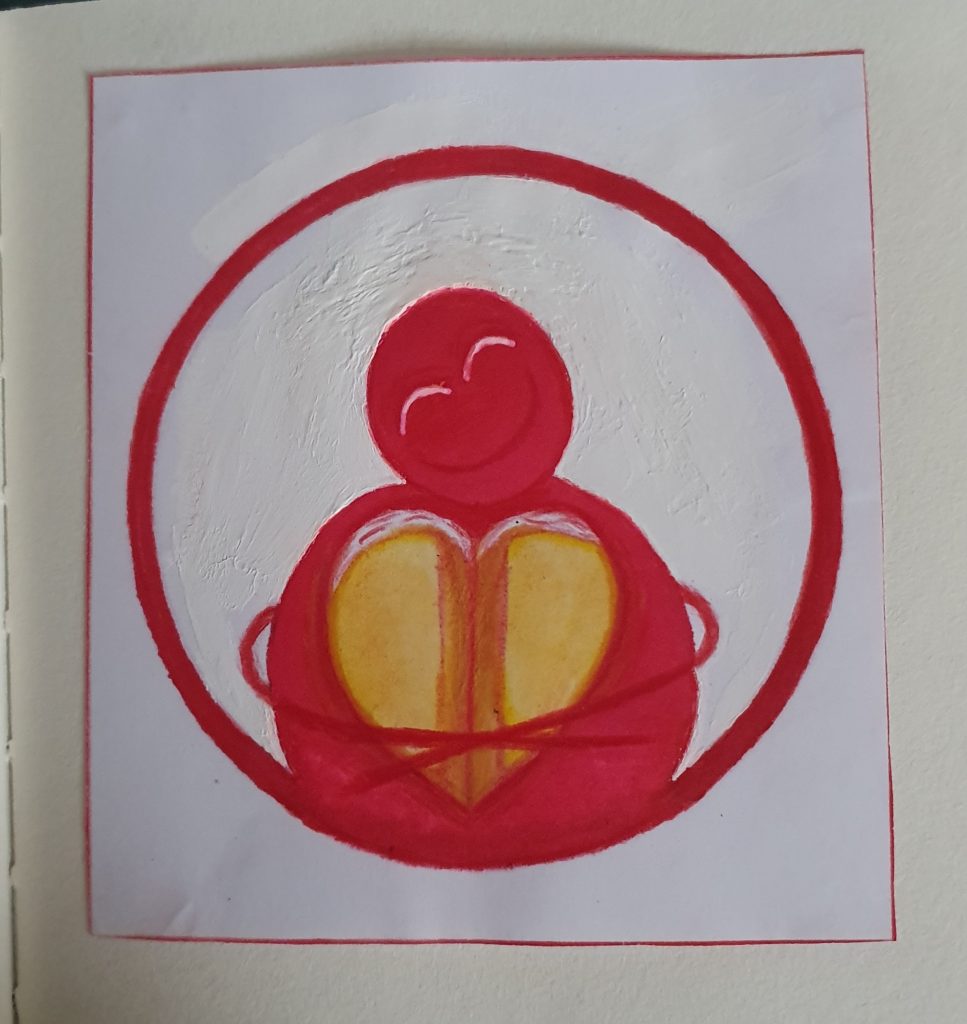
Final design
References
Guardian, 2015 We’re proud to work for Save the Children, but has it lost direction? (Article) [Online] (Updated 11 November 2015) Available at: https://www.theguardian.com/global-development-professionals-network/2015/nov/11/save-the-children-staff-stories [Accessed in 06 October 2021]
Maisto bankas, 2021 Musu misija (Social enterprise original website) [Online] (n.d.) Available at: :https://www.maistobankas.lt/musu-misija/ [Accessed in 02 October 2021]
NHS, 2018 Why 5 A Day? (Website) [Online] (Updated 8 October 2018) Available at: https://www.nhs.uk/live-well/eat-well/why-5-a-day/ [Accessed in 06 October 2021]
Save the Children, 2021 Save the Children UK 2019-2021 Strategy (Social enterprise original website)[Online] (n.d.) Available at: https://www.savethechildren.org.uk/about-us/who-we-are/our-strategy [Accessed in 02 October 2021]