
This is my project’s Graphic Standards Manual. The use of logos, colour, and typography is guided by the graphic standards. In every case, the logos must be identical, so it needs to be in the right colours, proportioned correctly, and used in the right situations.
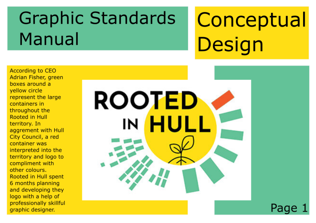
The first page contains the Rooted in Hull logo’s conceptual design as well as its roots. According to CEO Adrian Fisher, the huge containers in the Rooted in Hull region are represented as green boxes around a yellow circle. A red container was interpreted into the territory and logo in collaboration with Hull City Council to complement other colours. Rooted in Hull worked with a professional graphic designer for 6 months to conceive and construct their logo.
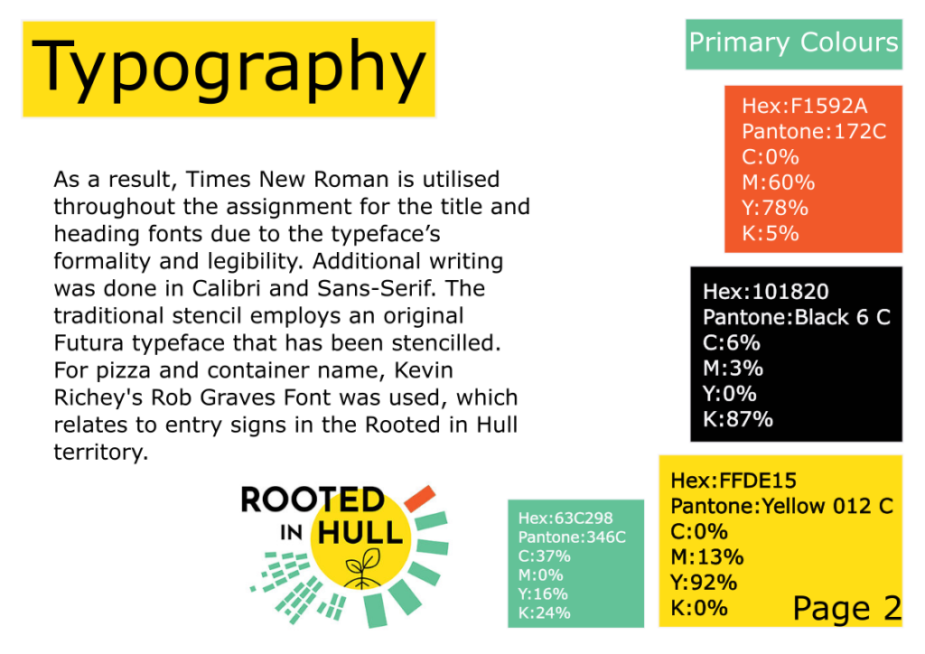
On the second page of this manual, there is a list of fonts that are appropriate and can be used throughout the project. As a result, Times New Roman is utilised throughout the assignment for the title and heading fonts due to the typeface’s formality and legibility. Additional writing was done in Calibri and Sans-Serif. The traditional stencil employs an original Futura typeface that has been stencilled. For pizza and container name, Kevin Richey’s Rob Graves Font was used, which relates to entry signs in the Rooted in Hull territory. Primary colours are employed in the Rooted in Hull logo and throughout the assignment to tie the complete thing together in the right hand corner. Yellow, green, black, and dark orange are the main colours. For printing out flyers and posters, each colour has its own hex number, Pantone general colour scheme, and CMYK percentages. Due to several checks in a range of colour sources, every single measurement is precise.
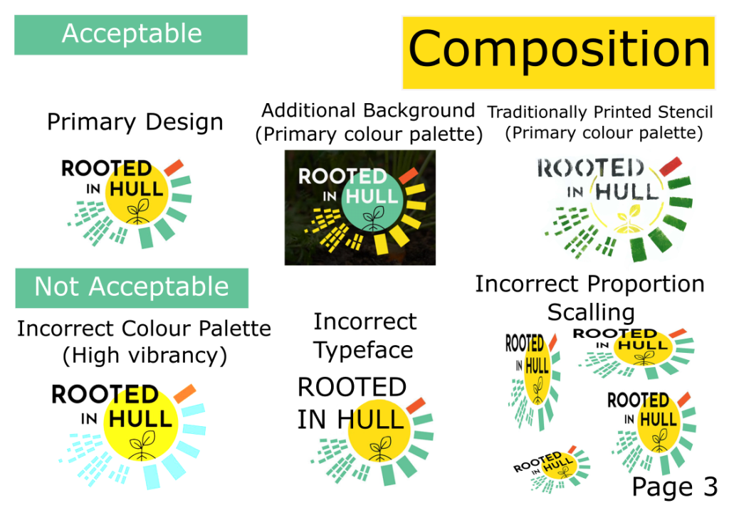
The third page focuses on the acceptably and unacceptably represented Rooted in Hull logo. Every work associated with Rooted in Hull will use the fundamental colours in a recognisable logo form. This also requires sticking to the same font and not altering the logo in any way. The logo can, however, be recreated in a traditional manner as a stencil label for delivery and purchase purposes, but the logo features should remain the same. A logo with high intensity colours that are eye-burning and do not match the authentic Rooted in Hull logo is not acceptable. Another thing that isn’t permitted is utilising a font that isn’t the same as the original or having additional logo elements put wrongly. Another thing that isn’t acceptable is a Rooted in Hull logo that is missing components, such as the green boxes or the name in black. When you fail to hit shift, the logo becomes disproportional and unreadable, which means it can’t be used for commercial purposes.