
What have I done so far?
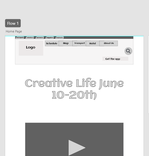
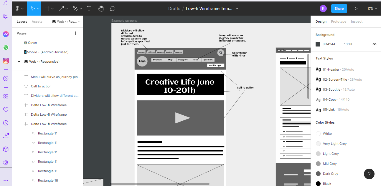
At the top of the website, each stakeholder is separated with the divider used to specify the stakeholder’s purposes for entering the website. The Header also has menu buttons with quick access to the important sections of the website and additional information about the festival. As the user scrolls down, the search bar of this website will transform into a help point and live message, so users can efficiently get help and engage in conversations if wanted. Under stakeholder dividers, the website will also have a menu and a call-to-action video introducing Creative Life and an opportunity to download a companion app by clicking a white button. Engaging video will be embedded link from YouTube which follows Laws of UX with a small description. Under the small description, the user will find an embedded Google Maps which was created with all events and small information about the participants.
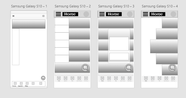
Low fidelity
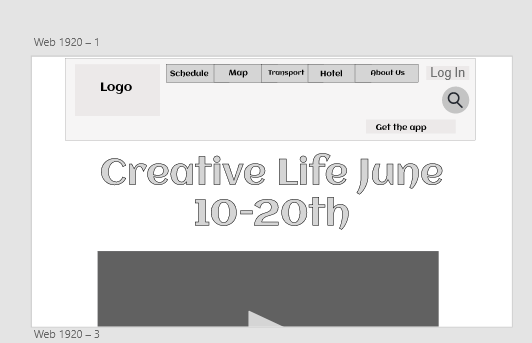
Top header of my website was changed after looking for additional references such as „York Ice Trail“ to allow efficiency and accessibility. Dividers were decreased and had a dark background box to meet the Laws of UX. However, after meeting with UX/UI professional Anna Singer made me reconsider the layout of the whole website with three different potential layouts.
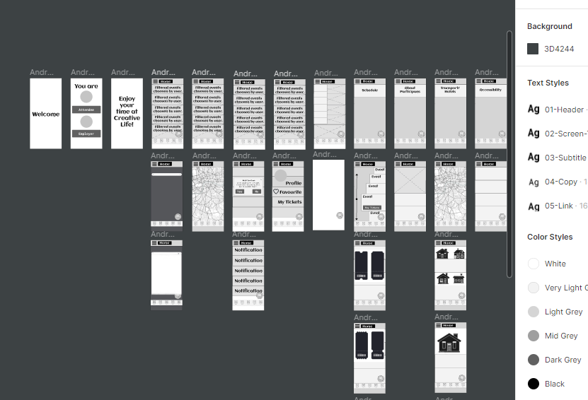
Medium fidelity
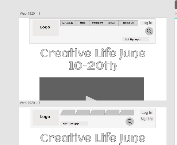
Through iteration process, classmates were taking the tallies for which layout works the best in terms of usability. The chosen layout involved removing the dividers and adding the “LOG IN”/ “SIGN IN” buttonS allowing users to be automatically identified just by entering the details. However, menu buttons turns into dividers to keep the unique shape. The search button was removed from the home page and added to the event page to show the proper need of the search bar.
High fidelity
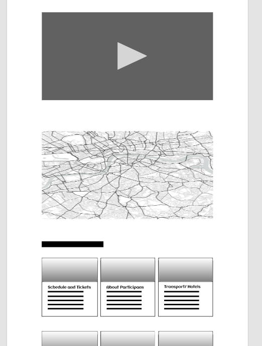
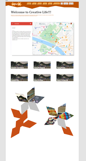
In order to make the website more profesional, the layout of the dividers and bitmap elements were adjusted to the right size with the help of the standard guidelines which were 12 columns wide and 16 gutter width. The boxed header was changed to a header with zig zag border with pen tool and the video was made under the divider with large call to action naming the festival with the dates. By scrolling down, the header “Welcome to Creative Life!!!” was added and a small description was attached. As you scroll down, the background map was changed to the existing map with existing pin point created by me on Google “My Maps ” with a small description of each event. The large buttons were changed to the a smaller and instead of the description, the title of each button was made descriptive. At the bottom the flower construction was masked with primary and secondary photographs with zooming in as you press down the petal. The sponsors were adapted to the footer the website and site map was added to help users efficiently lcate the website.


References
Material Design, n.d. Guidelines [Online] (n.d.) Availiable at: https://material.io/design/guidelines-overview [Accessed in 20 March 2022]