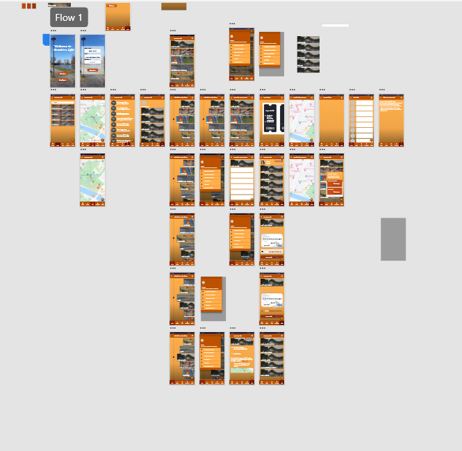
What have I done so far?
As the app will be downloaded, the “Welcome” screen will appear and the user will choose between attendees, volunteers, and employees because the interface will be slightly different depending on the stakeholder. The user will see a home with five relevant buttons and six menu sections. This app will not only allow map embedded maps but also will be able to purchase a ticket depending on the attendee and book a hotel, so attendees from far away will not have difficulties going to the festival.
Low fidelity
The „Welcome“ screen was changed to „Attendee“ and „Employee“ so, the user can easily access without pressing the additional buttons and a simple sign up section . Home page of the companion app has the fillterd events choosen by the user after the they have successfully signed up.
Medium fidelity
However, after meeting with UX and UI professional Anna Singer made me reconsider my app design. So her suggestions were to add a „LOG IN“ button with comments as action was successfully completed. After doing an additional research, the schedule turned into a carousel with moving events as you go down the timetable. Each event will its own description and call to action button “BUY TICKETS”. During the iteration process, my classmates were testing the app and were giving ways to improve the app to become user friendly. My parents also participated in the process, as they relay in the symbolic representation due to not being able to read in English.
High fidelity
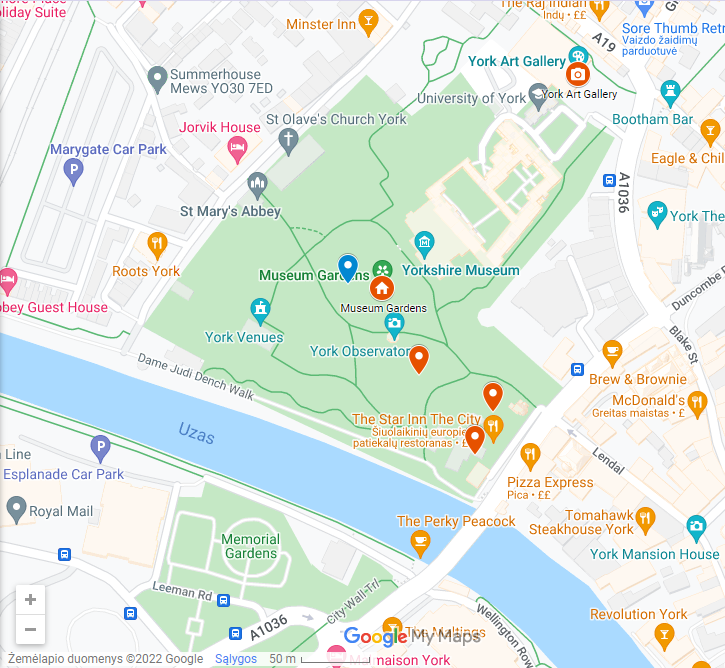
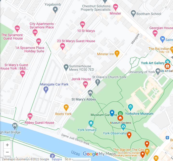
While doing the additional research, a Google UI kit was downloaded with Spacing guidelines for each icon and text. An icon requirements for an android users should be 24 x 24 pixels with 48 x 48 pixels touch space. Bottom navigation bar had accurately measured and working five small icons such as “Home”, “Search”, ”Map”, ”Notificate”, and ”Profile”. As you press the “Map” button, the existing map with existing pin point created and added by me on Google “My Maps ” with a small description of each event. The map is scrollable to give the realitic Google Maps effect.
Most of the moving components such as carousel and maps were prototyped to allow efficient access. All of the app buttons and icons follow the professional Google Guidelines and Accessibility needs for different users. Payment process of Creative Life App was made efficient by including skeoucard such as realistic card to let users add the correct bank details into the specified sections when buying tickets. The help button will allow the users to message in the live chat to talk to other people and ask for help by messaging the employees. The profile icons on the side of each screen will have the person’s photograph and will give feedback wheather the task was successful. This icon will also have a small button “BUY TICKETS” as call to action when scrolling through the event screen. At the top navigation panel with the “Profile” icon, the Menu Burger icon was added with sections to help user find what they are looking for.