Categories
2D visual design Development Log

Rooted in Hull Brochure

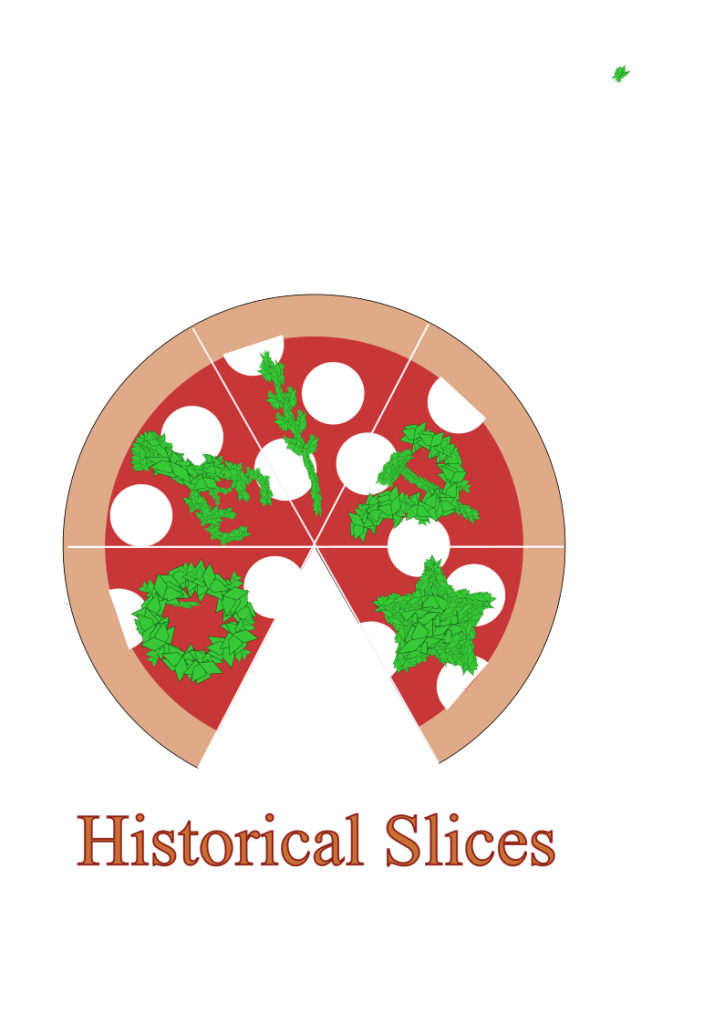
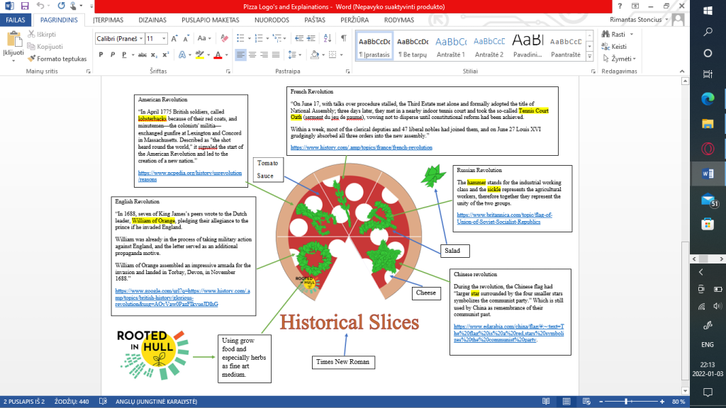
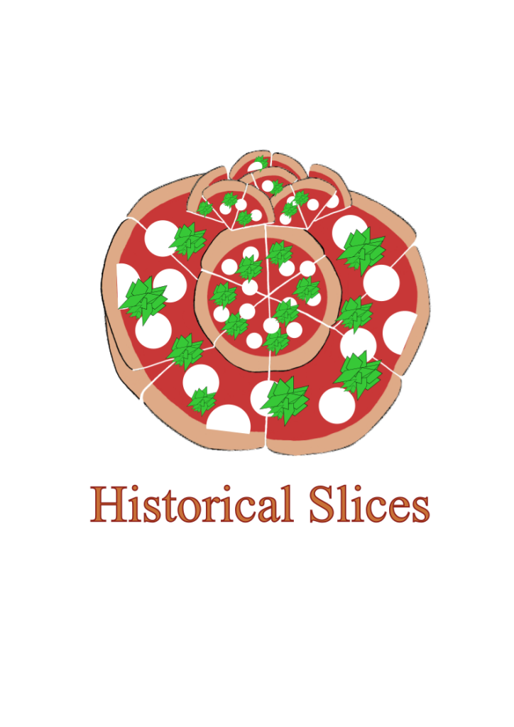
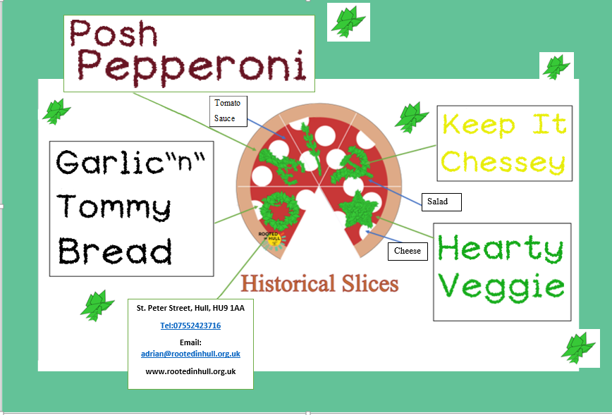
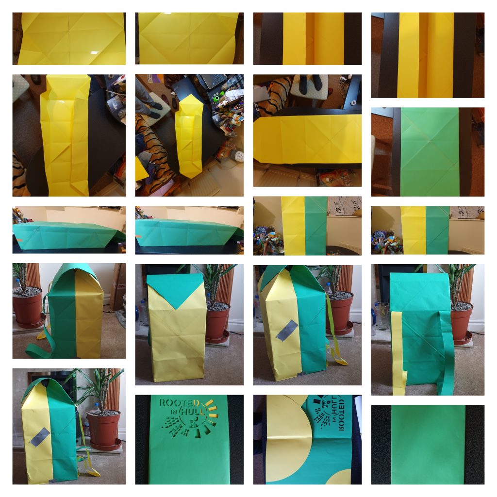
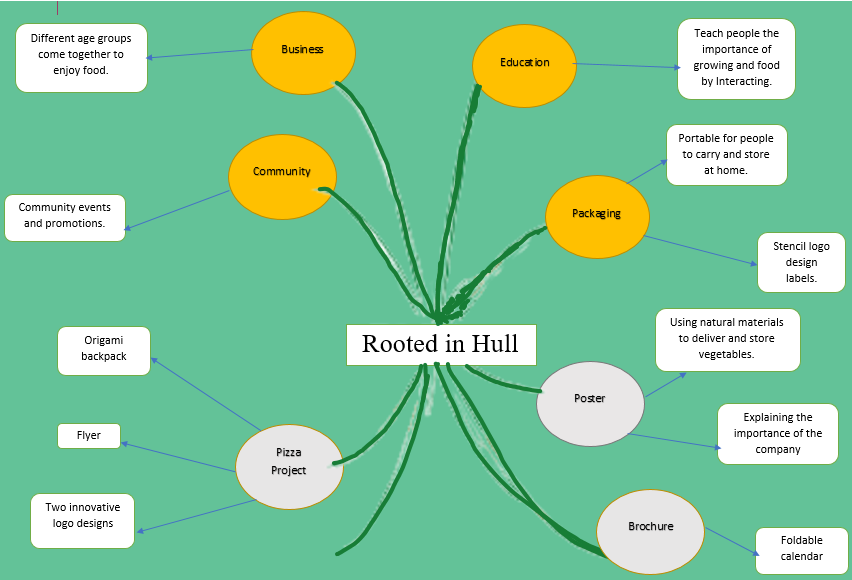
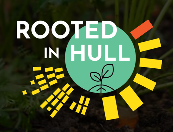
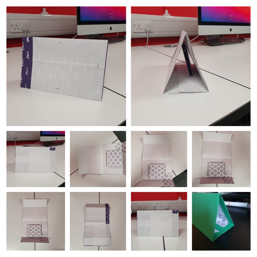
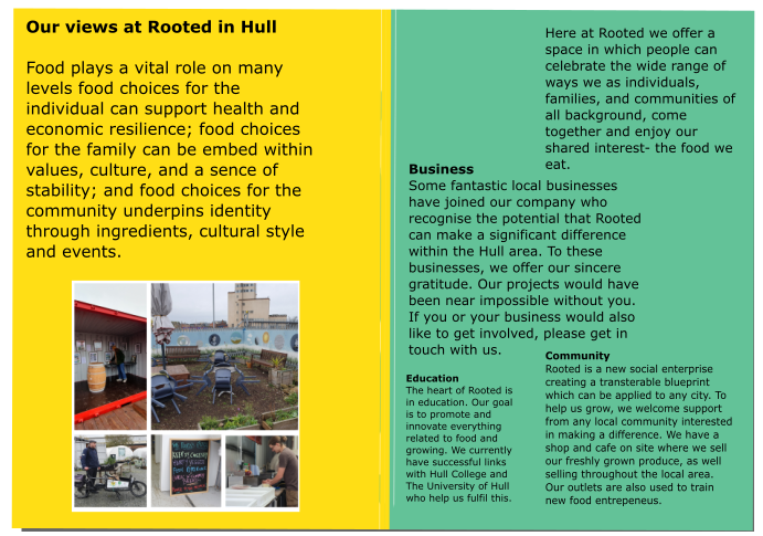
The brochure attracted my eye during my visit to Rooted in Hull because its simple design might be improved and helped to attract customers. The brochure may well be A4 in size, making it readable for customers of all ages. It’s also lightweight and portable, making it ideal for carrying and maybe gifting when delivering food. My first thought was to make a book brochure with a cut out of the Rooted in Hull emblem on the first page. A pocket for a folding calendar and a pocket for a poster will be included on the inside of the brochure. While the structure is made of paper, it can be reused as additional flyer storage. The phrase “Rooted in Hull” is prominent in this brochure, which uses the same colour scheme and style as the logo. Quarter circles will form the pockets, which will be part of a yellow circle within the company’s logo.

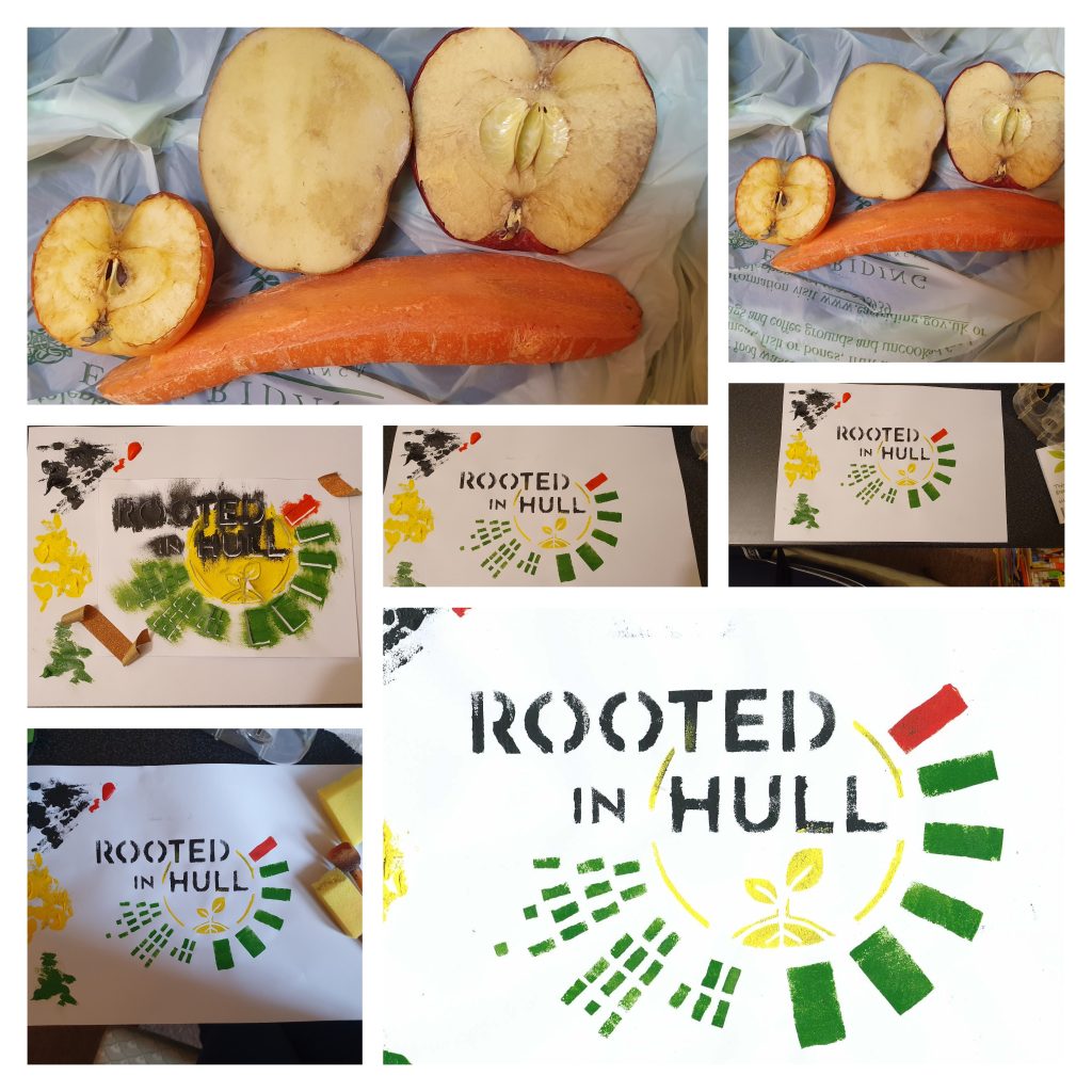
Following the production of the brochure, a foldable calendar will be measured and manufactured so that clients are aware of product trials. A comment on the vegetable and plant growing season will be included each month. For the month’s name, real vegetable stencils will be utilised as the background. Potatoes, carrots, apples, and a small tomato were among the vegetables used to make stencils. The back of the calendar will have recipes related to the vegetable of the month, as well as a few lines for notes. The entire calendar will be green to match the brochure.

Page 2 and 3
A2 page showing the location of every container in Rooted in Hull.
Back page

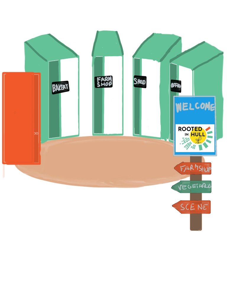
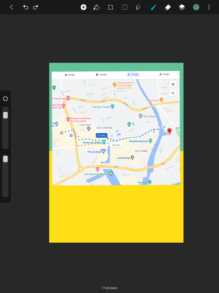
Following the publication of the brochure, an A4 poster will be used to introduce new clients to Rooted in Hull. The Rooted in Hull emblem will be stencilled on the first page. Customers will learn about Rooted in Hull and their beliefs when they open the poster. After that, the customer will fold out an A2 territory map. New customers at the Rail Station or Hull Interchange will be able to determine the most convenient route by looking at the back of the poster, which will include a map.

https://onedrive.live.com/?id=root&cid=F02A161F5E7127FB

Note just in case user name kstonciute22@gmail.com and password karolina20.

Categories
2D visual design Development Log

Pizza Project- Rooted in Hull

Two logo designs were created as part of my pizza project, based on the client’s preferences and my first concepts. To bring customers together, the design incorporates the sickle and hammer from the Russian Revolutionary banner, as requested by the client. By slicing the pizza into five slices, the client’s interpretation was achievable. Based on the history of the English, American, French, Russian, and Chinese Revolutions, each slice will have a distinguishable element. Salad and herbs abundant in the area, however, were used to unify and construct these revolutions. The entire pizza was reduced to a salad, mozzarella, and tomato sauce, making reference to its 19th-century roots during the American-European migration. To complement my historical pizza, Times, New Roman was chosen. A Rooted in Hull transparent logo will be placed to the bottom corners of both designs.

The logo incorporates many pizza slides to form a tomato, which is often used as a base in pizza and grows in the territory, based on my original concept. Tomato design is similar to the design from above as it has a simple design and a well-known colour scheme. The customer provided comments and suggested improvements to my logo ideas during my visit to Rooted in Hull. Following the input, a third logo concept was created, combining pizza slices with a united call to action represented by two sickles joined together. To match Rooted in Hull, the sickle handles will be green. This time, though, the client gave his bakery the name “The People’s Pizza.”

Following the creation of my logos. The flyer’s structure was based on the above-mentioned explanation diagrams. Rather than providing information, each section will include the name of a certain pizza as well as the font. So there will be five parts, four of which will carry the name of the pizza and the bottom box will have the contact information and address. To tie in with the Rooted in Hull campaign, the background will have a light green primary colour border. Each circular box will have a goal that both projects will strive to achieve. Rob Graves font was selected for this poster to tie in with the name labels at Rooted in Hull’s entryway to show where everything is. To associate with revolution, a Times New Roman font was used to the logo name.

The thermal backpack packing was designed as a mobile billboard for passing individuals in order to deliver flyers. Because it is environmentally friendly, this package is made of origami paper. This structure is made up of two folded boxes held together with sellotape. Two more origami boxes will be included in the bag for distributing pizzas vertically and horizontally. The backpack’s walls will be foil-lined as part of the thermal heating system to keep the pizza warm. Pizza will be laminated for delivery in various locations so that the topping does not slide off and the pizza can be reused for other goods after it is consumed.

Categories
2D visual design Development Log

Graphic Standarts

This is my project’s Graphic Standards Manual. The use of logos, colour, and typography is guided by the graphic standards. In every case, the logos must be identical, so it needs to be in the right colours, proportioned correctly, and used in the right situations.

The first page contains the Rooted in Hull logo’s conceptual design as well as its roots. According to CEO Adrian Fisher, the huge containers in the Rooted in Hull region are represented as green boxes around a yellow circle. A red container was interpreted into the territory and logo in collaboration with Hull City Council to complement other colours. Rooted in Hull worked with a professional graphic designer for 6 months to conceive and construct their logo.

On the second page of this manual, there is a list of fonts that are appropriate and can be used throughout the project. As a result, Times New Roman is utilised throughout the assignment for the title and heading fonts due to the typeface’s formality and legibility. Additional writing was done in Calibri and Sans-Serif. The traditional stencil employs an original Futura typeface that has been stencilled. For pizza and container name, Kevin Richey’s Rob Graves Font was used, which relates to entry signs in the Rooted in Hull territory. Primary colours are employed in the Rooted in Hull logo and throughout the assignment to tie the complete thing together in the right hand corner. Yellow, green, black, and dark orange are the main colours. For printing out flyers and posters, each colour has its own hex number, Pantone general colour scheme, and CMYK percentages. Due to several checks in a range of colour sources, every single measurement is precise.

The third page focuses on the acceptably and unacceptably represented Rooted in Hull logo. Every work associated with Rooted in Hull will use the fundamental colours in a recognisable logo form. This also requires sticking to the same font and not altering the logo in any way. The logo can, however, be recreated in a traditional manner as a stencil label for delivery and purchase purposes, but the logo features should remain the same. A logo with high intensity colours that are eye-burning and do not match the authentic Rooted in Hull logo is not acceptable. Another thing that isn’t permitted is utilising a font that isn’t the same as the original or having additional logo elements put wrongly. Another thing that isn’t acceptable is a Rooted in Hull logo that is missing components, such as the green boxes or the name in black. When you fail to hit shift, the logo becomes disproportional and unreadable, which means it can’t be used for commercial purposes.

Categories
2D visual design Development Log

Master Plan

This is my Master Plan for my initial ideas.

This is my project’s Master Plan of potential initial ideas. The goal of this strategy is to carefully organise to attract clients and increasing the number of individuals who are aware of the organisation. Three areas of the corporation will be explored when making this project: Community, Education, and Business. People of all ages gather in the community to enjoy cuisine and have a good time. Sharing knowledge without teaching is part of education, as is an interest in organic farming. Selling high-quality items to people who can afford them is part of business, and helping individuals who can’t afford it is part of it as well. The major focus of this project will be a brochure package that includes a foldable calendar so that the person can learn how to plant vegetables.

Following the brochure’s development, a foldable calendar will be measured and created to keep clients informed about product studies. Every month, there will be a comment about the food and plant growing season. The background for the month’s name will be made up of genuine vegetable stencils. Recipes for the vegetable of the month, as well as a few lines for notes, will be found on the back of the calendar.

An A4 poster will be used to introduce new clients to Rooted in Hull following the distribution of the brochure. On the first page, the Rooted in Hull be stencilled. When customers open the poster, they will learn about Rooted in Hull and their ideals. The buyer will then fold out an A2 territorial map with all of the container names. New clients at the Rail Station or Hull Interchange will be able to choose the most convenient path by looking at the back of the poster, which will feature a map and contact information for places where they can find them on the Internet, such as social media and websites.

The bakery in the Rooted in Hull territory will be another project. This project will contain potential pizza logo designs, a flyer, and additional packaging made of natural materials that may be carried and stored for the days ahead.

One logo is based on my initial concepts, while the other is based on the client’s request. As requested by the client, the design incorporates the sickle and hammer from the Russian Revolutionary banner to bring customers together. The client’s interpretation was achieved by slicing the pizza into five slices. Each slice will contain a particular element based on the history of the English, American, French, Russian, and Chinese Revolutions. The pizza was reduced to a salad, mozzarella, and tomato sauce, alluding to its 19th-century origins during the American-European migration.

The thermal backpack packing was designed as a mobile billboard for passing individuals in order to deliver flyers. To keep the pizza warm, the backpack’s walls will be foil-lined as part of the thermal heating system. Pizza will be laminated for delivery in various regions so that the topping does not fall off and the pizza can be reused for other purposes after it has been consumed.

Categories
2D visual design Development Log

Press Release

Collaboration between Rooted in Hull and the University of Hull to enable new projects and innovative ideas

CEO of Rooted in Hull, Adrian Fisher enlisted the cooperation with the School of Arts in the University of Hull on Tuesday, 2nd of November to contribute unique ideas that will help their organisation expand its influence in Hull City Centre.

Figure 1: Adrian Fisher meets the first cohort of Ba (Hons) Graphic Design new program students in the New Facilities Media Centre.

Adrian Fisher, CEO of Rooted in Hull, requested the assistance of the 25 students in the new BA (Hons) Graphic Design program to present unique solutions which will help their organisation increase its influence in Hull City Centre during the discussion on Tuesday, November 2nd.

Figure 2: Rooted in Hull is an organic food seller and supplier which was founded in 2014 by two friends who wanted to create a unique location in the city where people could celebrate in many different ways, they enjoy food by producing and cooking. (Rooted in Hull, n.d.)

Various community groups become frequent visitors and volunteers at their site, coming not just to learn about food but also to build confidence, enhance their mental health and overall well-being, make friends, or simply take a vacation from the demands of life. Some of the volunteers are learning business skills, assisting with the cafe’s operations, and even handling site maintenance. (Rooted in Hull, n.d.) The farm shop is in the city centre and can be reached by most buses as their terminal stop is at Hull Interchange, which is convenient for visitors who have never been to Hull before.

According to Adrien Fisher, an elderly lady approached the market kiosk and inquired about the tomatoes. He just knew the type of tomato, not the origins or culture of its consumption, though. The old lady kindly specified that she used to eat these tomatoes on a sandwich with oil in Spain.

Adrian Fisher has as well clarified the food produced and supplied by in his organisation isn’t necessary “healthy,” but also a  “good food” which people on a low budget can enjoy in combination with purchasing expensive healthy food. As a reward for their hard work and determination, the CEO of Rooted in Hull received an origami flower art creation from one of the students.

As a Program Leader and Lecturer in Digital Design, Robert Consoli was enthusiastic to find ways to help the organisation while also letting students work with real clients as part of the new programme. With Jason Hayhurst as a Screen Subject Grove Director, Lecturer in Digital Media, and Dr Terry Westby – Nunn as a Film Production Specialist, sees a variety of opportunities in the corporation to go ahead across the School of Arts.

References

Rooted in Hull, n.d. [Online] (n.d.) Available at: https://www.rootedinhull.org.uk [Accessed in 12 November 2021]

Categories
Photoshop Practical Skills 2D

Before and After (Honig Experiment)

Before original photograph of me (Plunge, Lithuania).
Development process of wolf recreation.
After initial result of wolf recreation.

This is a Before and After experiment with transforming me into a wolf in the original shot.

A photograph was used to create this piece. All facial birth spots were eliminated with the healing spot tool and then overlayered with the healing brush tool. After successfully overlayering the mouth and face skin, the dodge tool was utilised to brighten up the eyes and a black pupil was recreated. To make the hair in the photo look like wolf fur, it was overlayered and extra shadows were deepened with a burn tool. A pen brush was used to draw in the ears, nose, and lips, and a charcoal brush was used to create texture. The component was cut out and put onto a background image when the final detail was successfully added. The photo was taken at Plunge, Lithuania, during the Christmas season.

Original background image of winter (Plunge, Lithuania).
Categories
Photoshop Practical Skills 2D

Culture Jammed Anti-Advertisement

This is an Anti-Advertisement collage promorting against smoking with the contrasting colour palette.

To create this piece, I cut out a cigarette (Adam Sherwin, 2016) and a little animal (Campaign n.d.) to demonstrate the hopelessness of smoking and how someone you admire can encourage you in living a healthier lifestyle. With a brush, the original words were masked and the words “I don’t need those” were added on top. Berlin Sans was the typeface used in this advert.

References

Adam Sherwin, Independent, 2016 Top ten most controversial adverts revealed (Hitting the headlines article) [Online] (Updated in 23 Febuary 2016)
Available at: https://www.independent.co.uk/arts-entertainment/tv/news/top-ten-most-controversial-adverts-revealed-a6889726.html
[Accessed 26 November 2021].

Campaign, n.d. Meerkat chooses Facebook to launch latest TV ad ( Hitting the headlines article) [Online] (Updated in 02 October 2009) Available at: https://www.campaignlive.co.uk/article/meerkat-chooses-facebook-launch-latest-tv-ad/942711 [Accessed in 26 November 2021]

Jason Deans, 2010 What was your favourite TV advert in 2010? (Hitting the headlines article) [Online] (Updated in 17 December 2010) Available at: https://www.theguardian.com/media/organgrinder/2010/dec/17/adverts-top-ten-2010 [Accessed in 26 November 2021]

Categories
Illustrator Practical Skills 2D Uncategorized

Culture Jammed Logo T-shirt

This is a Culture Jamming Logo T-shirt with an upside down Nike.

An upside down Nike appears on this Culture Jamming Logo T-shirt. The new logo has the same colour scheme as the old one. Instead of Nike, the design now features Hike, which illustrates a person hiking a hill with a backpack.

In order to create this piece, I used geometric forms to create a figure. The Nike logo was turned 180 degrees after the figure was correctly formed and gathered. Impact was the typography utilised in the new logo. The t-shirt photo was then downloaded from the internet.

References

H and M, n.d. Regular Fit Round-neck T-shirt (Official website) [Online] (n.d.) Available at: https://www2.hm.com/en_gb/productpage.0685816001.html?hier_id=go_cmp-12796663560_adg-126516123092_ad-516052907500_pla-311420097508_dev-c_ext-_prd-en-0685816001003_sig-CjwKCAiArOqOBhBmEiwAsgeLmdTFiNG98I2vML7nzI3H4YkpLBnSWQq-sfK0qvN6yLicTrZlMvfaShoCLtUQAvD_BwE&utm_source=Google&gclid=CjwKCAiArOqOBhBmEiwAsgeLmdTFiNG98I2vML7nzI3H4YkpLBnSWQq-sfK0qvN6yLicTrZlMvfaShoCLtUQAvD_BwE [Accessed in 19 November 2021]

Nike, n.d. (Official website) [Online] (n.d.)
Available at: https://www.nike.com/gb/
[Accessed in 19 November 2021].

Categories
Illustrator Practical Skills 2D

Banner

This is a “You Can Do It” banner encoraging people to believe in their abilities and follow their dreams.

I used a pen tool to trace my own hand with a light brown ink to create this piece. Fill a darker colour with the filling bucket once my hand has been traced properly. Both sides of the banner were copied and transferred by hand. The banner’s typography was bold Sans Serif.

Clenched Fist used in the banner to show requirement to united for similar purpose.
Categories
Illustrator Practical Skills 2D

Propaganda Poster

This is a Propaganda poster with a tree branch sticking out encouraging people to grow more trees.

In order to create this piece, I applied geometric forms to create a hand. Geometric tree branches were gathered together after the hand was successfully formed. However, the poster needed to be improved, thus the geometric construction was replaced with a real hand pointing its finger at the audience. A pen tool was used to sketch in the entire hand and tree branches. This poster’s typography was bold Sans-Serif.

Improved Propaganda poster with a tree branch sticking out as a pointing finger encouraging people to grow more trees.
Original reference image used for the Propaganda poster.