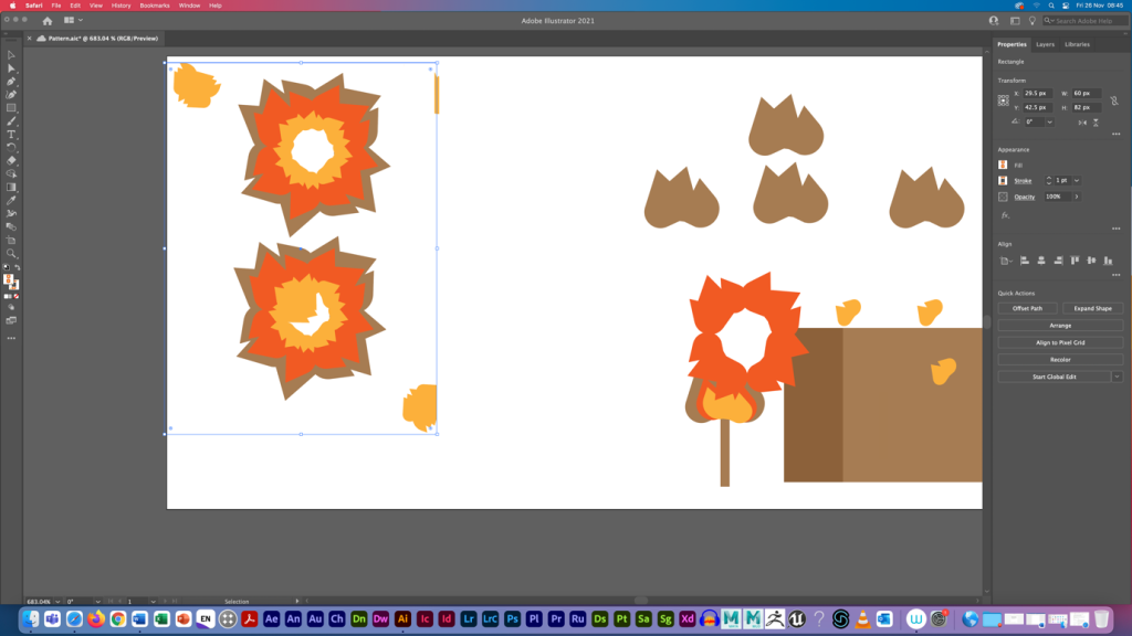
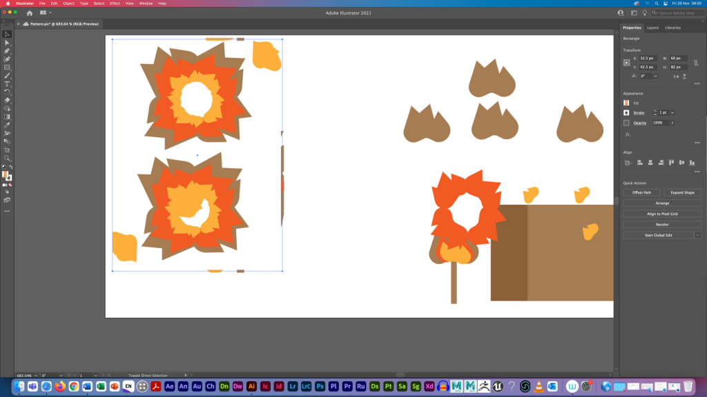
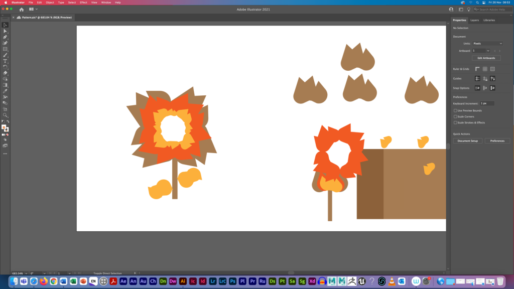
First University of Hull symbol logo reimagined with geometric shapes. Second University of Hull symbol logo reimagined with geometric shapes.Third University of Hull symbol logo reimagined with geometric shapes.
This is a reinvented University of Hull symbol logo with geometric forms. The construction’s original symbol was a fire.
To create the triangles in this painting, I utilised a white arrow to ensure that they are authentic to the actual sign. Then I duplicated them and reassembled them into a flower. However, the fire colour palette must be maintained. The pattern tool was pushed and some shapes were repositioned after the flower and petals were completed. The technique was then performed for two more possible modifications.
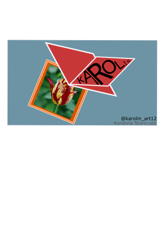
This is a calling card with the interpretation of nature by a butterfly flying its flower.
In order to make this calling card stand out, I interpreted a flower calling my name in black. Tulip will be surrounded by an orange border. So, using a red butterfly with a white outline, the tulip was screaming my name. Outside, the background will be blue, making the flower and butterfly stand out. I used a shape tool in Adobe Illustrator to create rectangles and rhombuses for this card. I used outline and then ungroup to resize each letter for Sans-Serif typography.
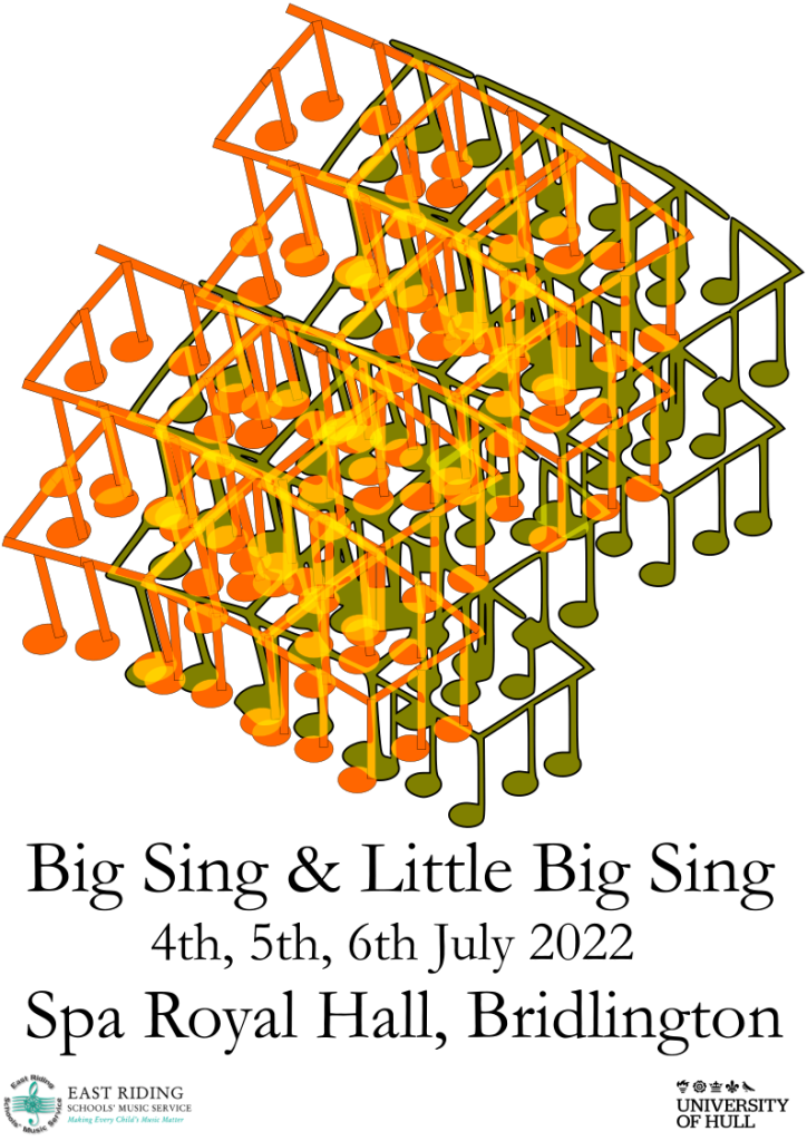
This is a Big Sing- Little Big Sing banner advertisement with note overprinting.
In order to create this piece, I employed geometric forms to create a note. A pattern was created by putting together a few notes. A pattern was successfully multiplied using a group tool. The banner’s typography was Times New Roman. At the bottom of the banner, the name, time, and small icons of music authority were added.
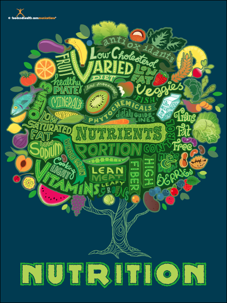
Nutrition tree poster is a great example of typography to describe the importance of nutrients each person requires in their diet. (Nutrition Education Store,n.d.)
Nutrition Tree Poster is a poster produced and sold at Nutrition Education Store which follows the aim of conveying the importance of the nutrients and healthy eating to the person’s daily intake. Proper nutrients need an ability to control your portions and a specific diet which combines more plant-based foods, high fibre and many other required products.
This poster is a great example of typography by implementing different fonts which is the delivery of the typeface to describe the importance of nutrients each person requires in their diets on the daily intake in the form of a tree. In terms of typefaces, the designer used the traditional and in some areas decorative hand lettering which is legible with the help of upper cases and different tones of green. The tree used in poster is representing the life and wisdom to show how the crucial importance of nutrients such as “normal growth, development and ageing, helps to maintain a healthy body weight, and reduces the risk of chronic disease leading to overall health and wellbeing” (NHS, n.d.). So if the person doesn’t receive daily intake of vegetables and protein the consequences could be fatal such as illness and diseases (NHS, 2019). Linking with the an idea of wisdom, tree is just giving knowledge to help the person live longer and enjoy their living by receiving a balanced amount of nutrients as a treatment. In terms of knowledge, this poster would also be used in classrooms to teach children of any age the purpose of nutrients in healthy eating as they are growing mentally and physically. A display of healthy fruits such as vegetables, proteins and dairies give a denotative meaning which links with its purpose such as healthy eating . These small illustrations also reminds us of the accessibility of these nutrients, so you can purchase them in every shop due to being cheap or even grow fruits and vegetables in your garden. Blue and green hues used in the poster visually represents the vintage/retro view to when you first look at it.
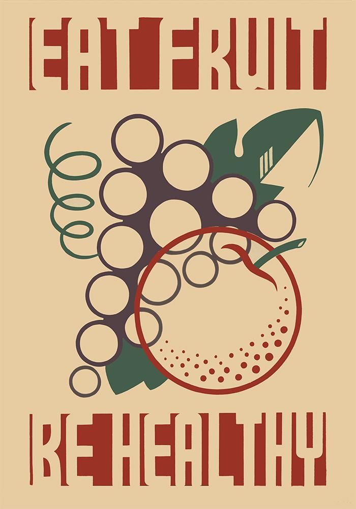
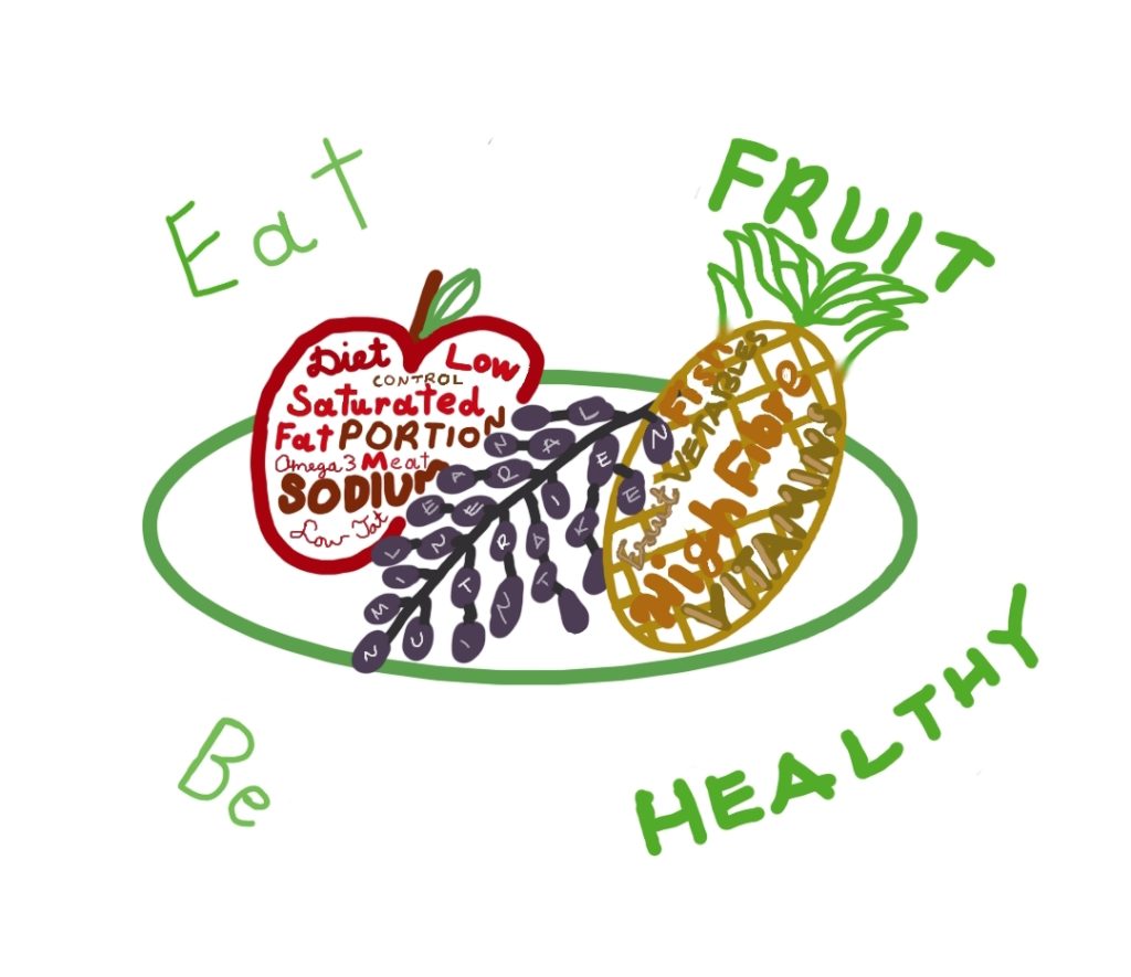
“Eat Fruit-Be Healthy” Poster
“Eat Fruit – Be Healthy” is a bad example of typography by implementing a simple design to promote the importance of healthy eating. (Vintagraph, n.d.)
This poster is a vintage public information poster promoting healthy diet with the slogan “Eat Fruit – Be Healthy” which was created by the Federal Art Project between 1936 and 1938 to promote proper dietary habits by showing stylised fruit (Richard B. Levine, 1936-1938).
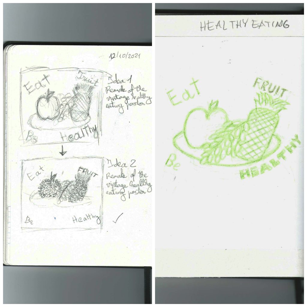
“Eat Fruit – Be Healthy” poster is a good example of typography by implementing with a simple design to promote the important of healthy. However, this poster can be improved by rounding the slogan instead of having it in a rectangle shape, changing to more saturated colour scheme and making the fruit more recognisable because the apple in the poster visually look like an orange, however this poster has an effective use of circles to represent fruit. So, the initial idea was to include typography not only outside the fruit but also the inside the fruit, so the people which are looking at the poster will understand the importance of healthy eating just by looking at the legible hand drawn keywords. In the slogan, the keywords “Fruit” and “Healthy” will be in upper cases only with dark green to highlight the purpose of the poster and in the classrooms to educate pupils of any age. In addition to the apple and grapes on the plate, a pineapple will be added as a circular shaped fruit, and important source of “vitamins and minerals including calcium, manganese, plus vitamins A and C” in our daily diet ( Nicola Shubrook, n.d. ). All fruits and the plate will be drawn using one circular shape which links with the actual poster and have a saturated colour scheme compare to the 20th century poster but at the same time will be recognisable and include uniquely stylised fruit. The hand drawn typography will be drawn, so the keywords will follow the pattern of my hand writing, upper cases and sans script in various tones of reds, purple and yellow ochre which links with the Nutrition Tree Poster in the above. Below, there are my initial sketches, traditional mock up and additional final design ideas.
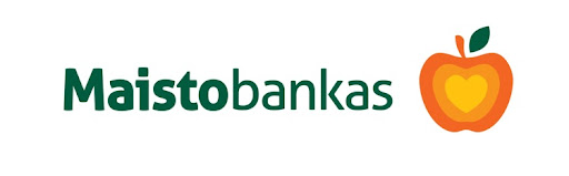
Figure 1 ( Maisto bankas, 2021): Maisto bankas is a great example of conceptual design by implementing an heart to represent a light of hope, trust and trust in an apple which is an important nutrient in our daily diet.
Maisto bankas is a Lithuanian food organisation which do their best to help people who are suffering from shortage of food and decrease the amount of edible food being thrown away.Their logo can be found next to products in shops and stuck on the yellow bins in the airports.
This logo incorporates the heart shape in an apple to indicate the passing of light of hope, trust and kindness to other people which is shown by an effective section gradient from orange to bright yellow. An apple is an important product in the healthy diet as being one of the key nutrients in 5 a day, so if the daily intake decreases, the person becomes less energetic and start to gain a weak immune system by lacking in vitamins, minerals and many other healthy nutrients (NHS, 2018). This shape links with the main focus of this organisation in terms of every good condition but not used or unwanted product can be given to someone who might eat their apple as their dinner. Apple itself is a food product which can be found in any shop or even market and it doesn’t cost much to purchase. So anyone can buy the apple and give it to a person on the street. The logo is also recognisable and explains the idea of this organisation to the people when they look at this logo by having bold letters in a Lithuanian word “food” as a contextual keyword. Use of negative space around the logo plays important role as it makes the logotype and logomark stand out when people look at it.
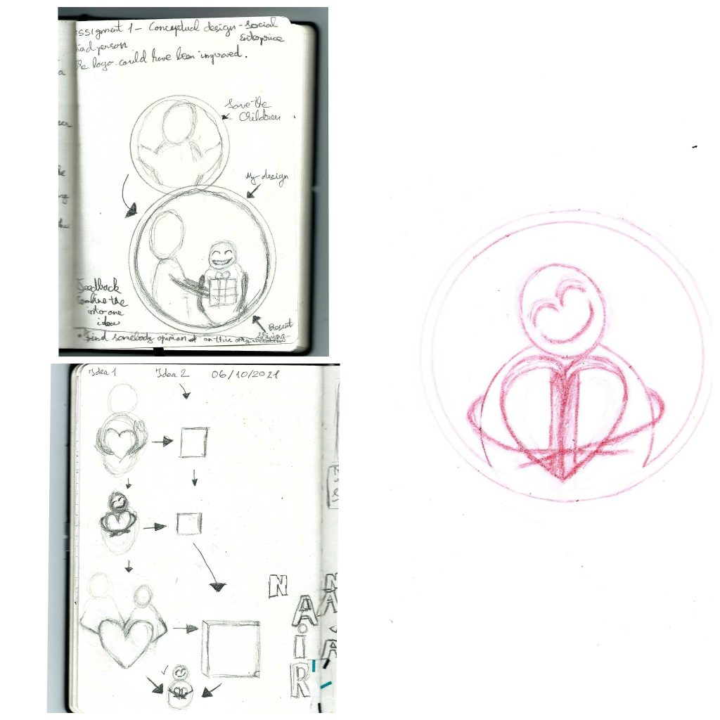
Save the Children
Figure 2 (Save the Children, 2021): Save the Children logo doesn’t specify the child conceptually however this logo uses the colours which makes it recognisable as the helping organisation such as Red Cross and others.
Save the Children is a UK based child helping organisation which delivers food, medicine and protection, and holding governments to account for providing for these basic needs themselves because this organisation believes that every child has the potential to change the world. According to the staff, Save the Children organisation is “Driven by becoming the biggest and shiniest charity, Save the Children has lost sight of values it once held. It’s run like a big corporation and staff working on the ground don’t appear to be treated well. The focus is on quantity not quality, with unrealistic targets set in terms of delivering any quality work. Good work is still happening on the ground due to individuals believing in the work, but I don’t believe that it’s a healthy environment for them.” (Guardian, 2015) which links the poor designing of this logo.
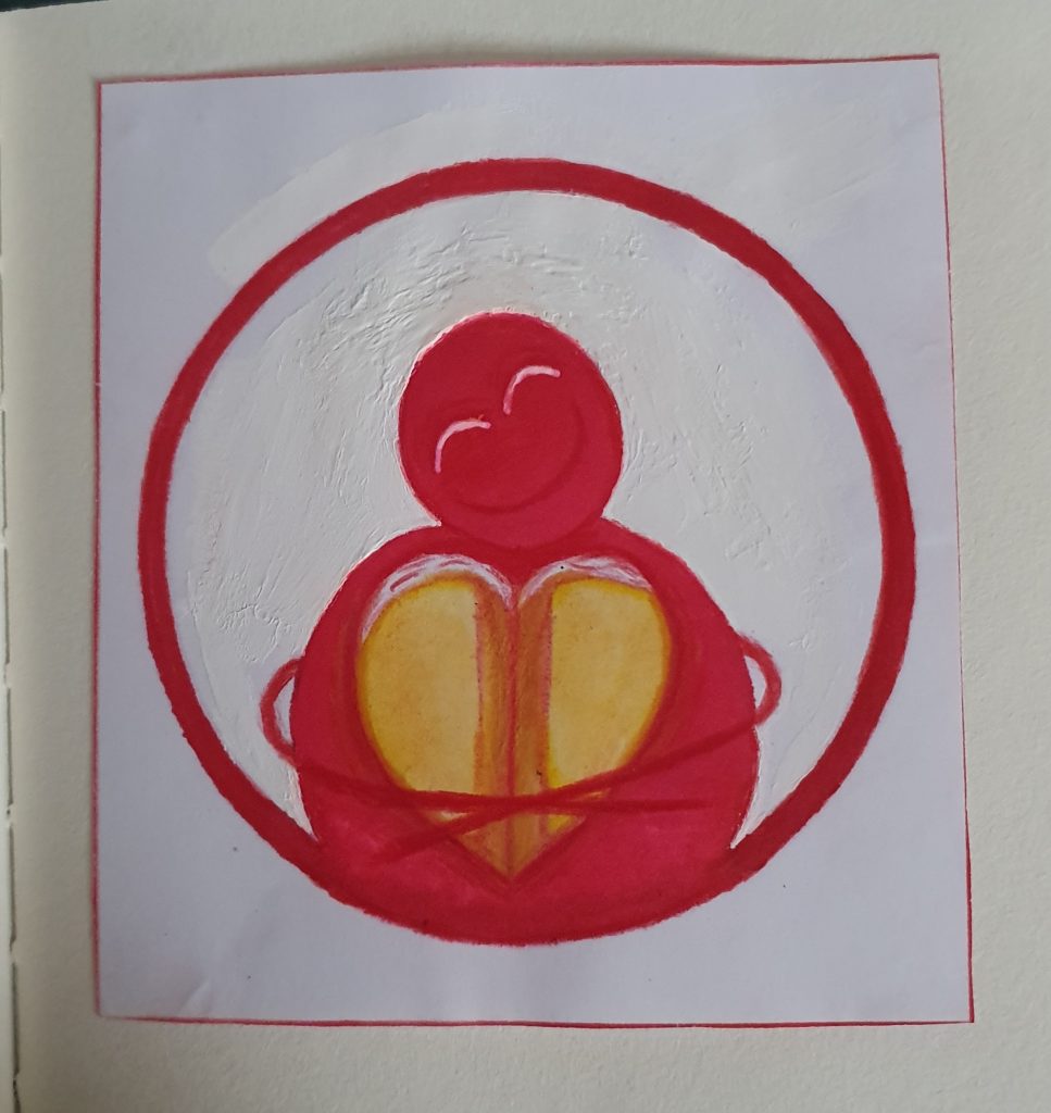
Design process
maller standing straight receiving the present. After few days I analysed my design idea and realised that the idea is too literal, so my greatest mission was to combine the child, adult and present together. So I thought of two similar idea which include hugging a heart or a book with three possible combinations. These combinations include just hugging an item, hugging tightly an item and holding hands with an adult which they hold an item together. I have decided to keep the colour red logomark and black logotype because there isn’t a need to change colours due to their conceptual importance to Save the Children and just the helping organisations in general. However, the item will be shinning to show importance and preciousness to the child which is given from the adult which represents the idea and purpose of the organisation. Then I will sketch the final result with a red erasable pencil and using colour to show visual idea when transitioning into a digital design.
Design sketches
Initial ideas and developments in production of the final design including the pencil outline of final idea. (05-19/10/2021) Mock up of the final design (19/20/2021)
Maisto bankas, 2021 Musu misija (Social enterprise original website) [Online] (n.d.) Available at: :https://www.maistobankas.lt/musu-misija/ [Accessed in 02 October 2021]
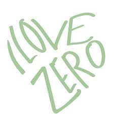
This is a Rebus Logo design for the I Love Zero organisation in Pocklington. This company sells organic products and allows customers to fill up house chemicals.
In order to create this piece, I used geometric elements to create a heart. After successfully constructing the heart, it was grouped and replicated to create a big flower. This piece’s typography was handwritten to complement the flower.
This is “I Love Zero” official logo located in Pocklington.
References
I LOVE ZERO, 2021. (Official website) [Online] (n.d.) Available at: https://www.ilovezero.co.uk [Accessed 28 October 2021].
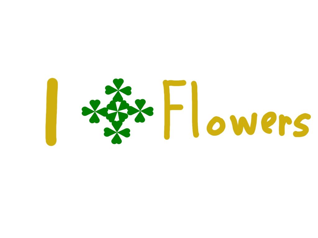
This is I Love Flowers construction by using green hearts.
In order to create this piece, I used geometric elements to create a heart. After successfully constructing the heart, it was grouped and replicated to create a big flower. This piece’s typography was handwritten to complement the flower.
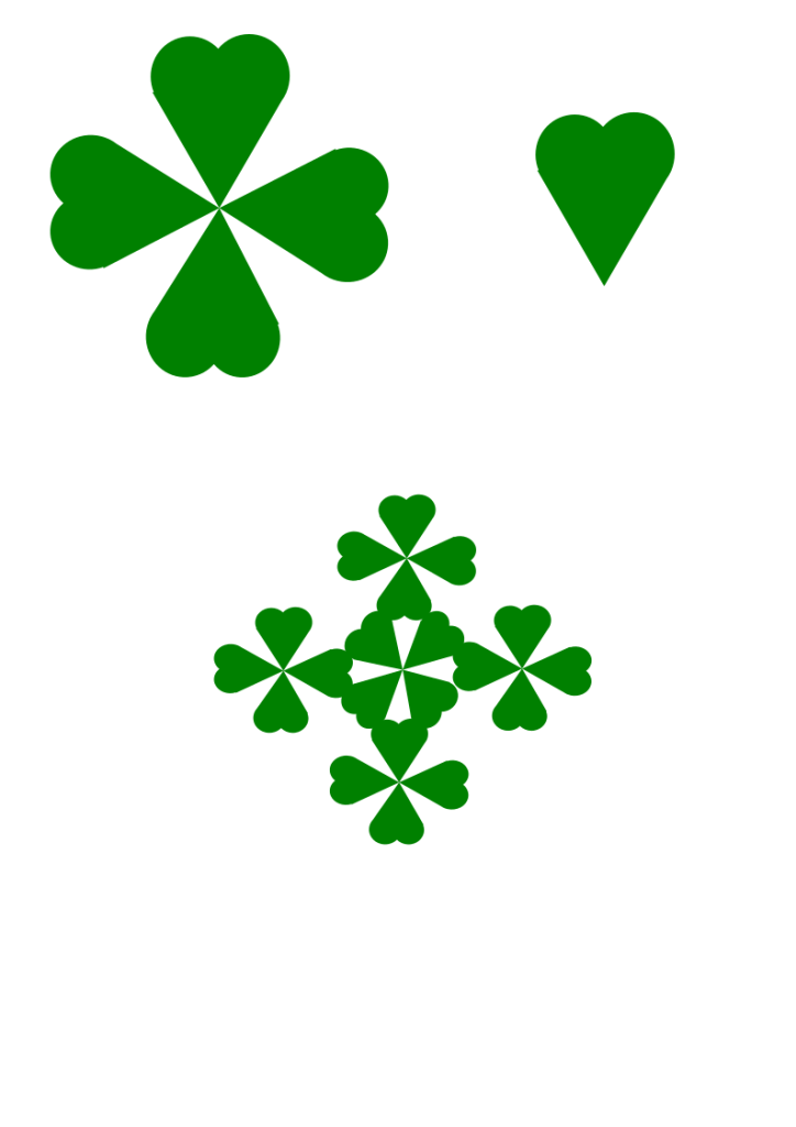
Geometric heart construction stages from a single heart to a flower.
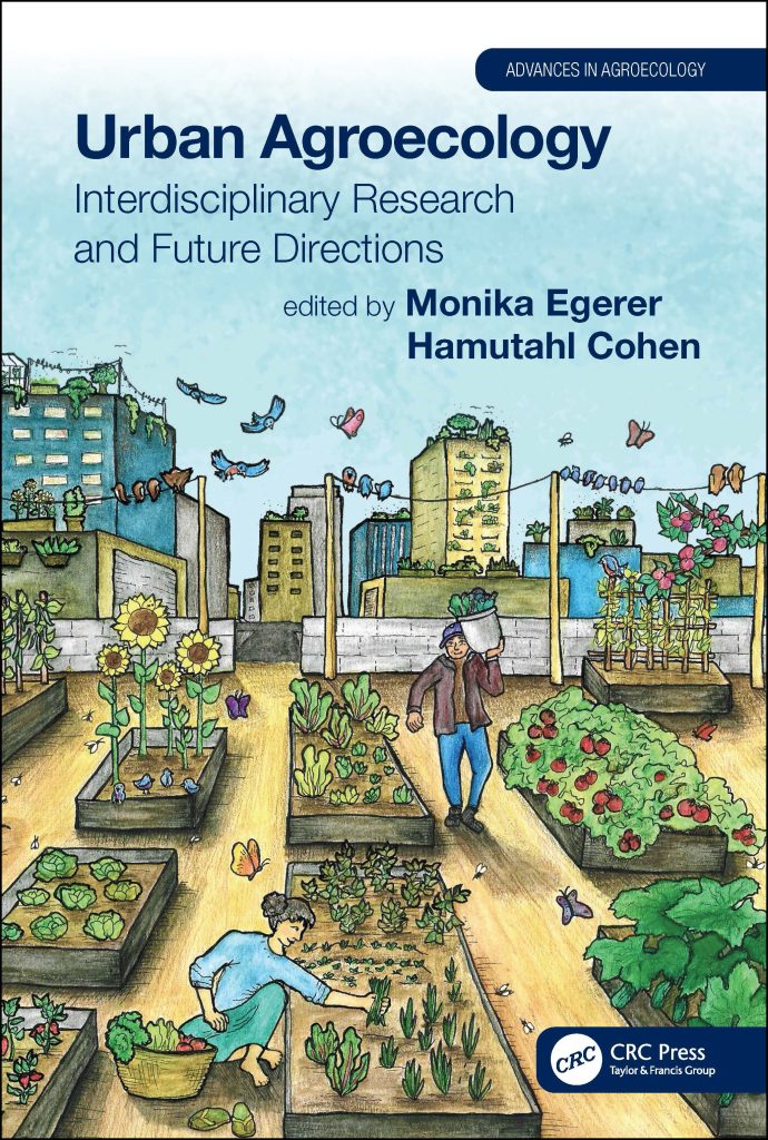
Urban Agroecology is a great example of colour by implementing earthy tones ( Monika Egerer and Hamutahi Cohen, 17 December 2020 ).
Urban Agroecology is a book which people to manage and sustaine the urban farming.
This book cover is a great example of colour by implementing an earthy tones such as blues, browns and greens, and a tint yellows/reds throughout the cover. Background buildings have a balanced amount of blue, yellow and grey tones which refers to thoughtfulness of designer when choosing the colours in terms of links with the sky image by referring to blue as sky, yellow as sun and grey as clouds. Linking with the sky imagery, the shadow blue and larger font typography makes the title and the author to stand out, so when people or even students want to purchase this book for its purpose. The cover itself shows the purpose of urban farming by showing people working in the garden which at first glance might represent a roof top of a three floor building which refers to how people manage and benefit from urban farming. Importance is also shown by growing vegetables in the tops of the buildings such as rooftops, balconies and inside/outside window boxes. Linking back to the first glance, the focal point of this book cover is a shadow yellow building which is further into the city and serves as vanishing point formed “where the orthogonal lines meet” ( Courtney Jordan, n.d. ) for the parallel perspective with a use of blue and tint yellow houses. At the same time, you can also find another focal point which is a post on the right hand side of the exit, however the plant box on the right hand corner isn’t parallel to the tomato box. Visually, the post and the wire could be referred as a place where you would place your laundry for drying which links with nature in terms of using natural resource such as wind to dry your clothes rather than using electricity.
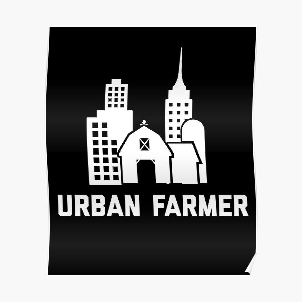
Urban Farmer
Urban is a bad example of colour due to lack of colour in the design. ( ScapegoatPrints, n.d. )
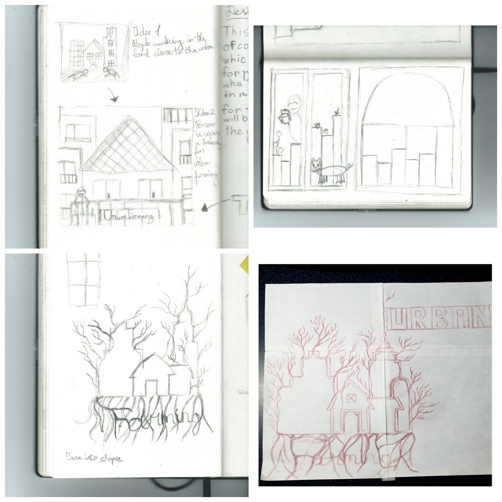
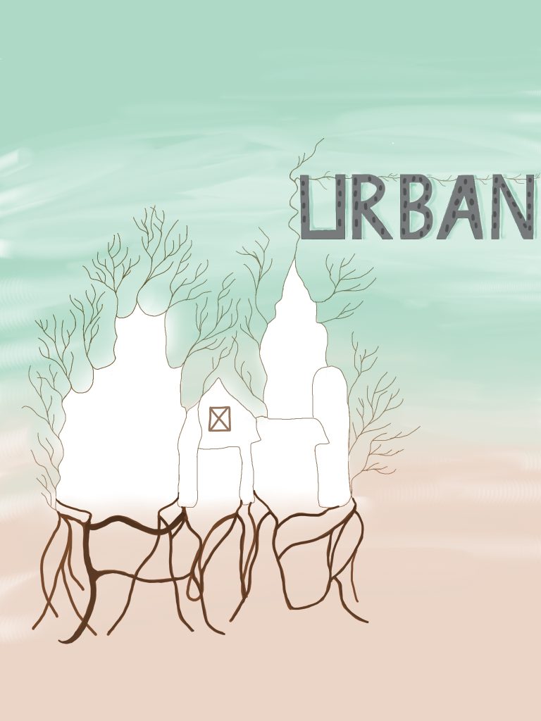
This poster doesn’t take advantage of using colour, however it has a simple and recognisable design. So, my initial idea was to include people working on the land next to the land next to the buildings which will grow fruit and vegetables. However the idea was too literal, so my initial idea was to zoom in into a top of the building and include person placing a plant in the balcony. Once again the idea too literal, I sketched another idea which would involve adding colour and including the typography into the design itself. So I decided to combine five different buildings from the original poster into a one large white tree with branches and roots sticking around to show importance of life in terms of nature in the city. The buildings will be connected by a singular line which will have an imperfection buildings to show a natural growth of buildings rather than perfectly build. I alter my idea by the roots underneath will be spelling “Farmer” which will be identified by darker brown to make the letters stand out and the roots themselves will be placed to form geometric shapes. The top of a skyscraper will have a branch which will spell “Urban” with the windows to represent buildings as letters. Both “Urban” and “Farmer” will be hand drawn in shapes to create a balance between shaped and sharp “Urban”, and smooth and unpredictable “Farmer”. The branches on the left hand side will be in pale brown and smaller to show the growth and natural imperfection of trees. The background will have less saturated green and orange colours which will make the tree and the typography stand out. Below, there is a traditionally drawn mock up and final design of my design idea.
Design sketches
Initial ideas and developments in production of the final design including the pencil outline of final idea. (05-19/10/2021)
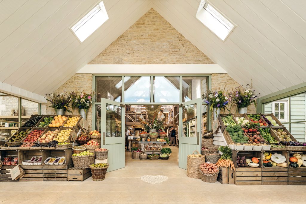
Daylesford Organic is a great example of composition by implementing a parallel perspective.
Daylesford Organic is an organic farm which raises animals and grows vegetables with care and consideration.
The photograph of Daylesford Organic is a great example of composition by implementing table with baskets as a vanishing point formed “where the orthogonal lines meet” ( Courtney Jordan, n.d. ) for the parallel perspective by using the outside baskets filled with fruits and vegetables. These baskets also include repetition by using symmetrically placed baskets at the angle to form rectangles which links with the square windows in the celling and outside, however both sides are asymmetrical due to having different fruits and vegetables on each side. In terms of shapes, the baskets of the side, the flower pots and in the next room represent cones. Linking with shapes, on the floor there is a while heart shape which represents brightness and warm. Photograph itself has a high resolution by all details being really visible and clear due to being taken the professional camera and having a white ceilings. If you zoom in the photograph, you interact with the photograph as though you are walking past these door and find person cooking, as well as customers looking while they are cooking. The photographer has chosen a perfect angle by the baskets and ceiling creating a perfect triangle. On the left hand side, the angled baskets have an analogous transition from a yellow to red and the side baskets have an analogous transition from a tint orange to greenish yellow. However on the right hand side and in the other room, the straight and angled baskets have a complimentary transition between red and green. The side baskets of this side have an analogues transition from orange to yellow. The rooms themselves are extremely bright, so if the weather is horrible, the customer can just come in and get the positive energy.
The image explaining the parallel perspective.
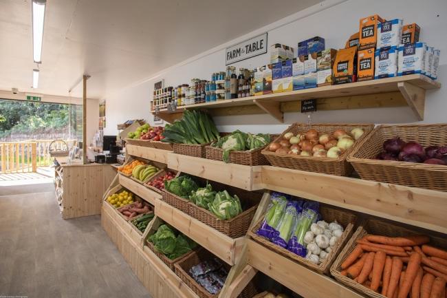
Colwith Farm Shop
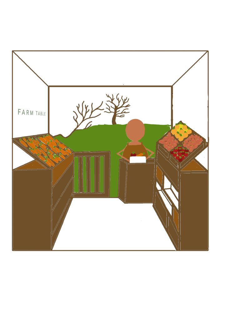
Colwith Farm shop image is a bad example of composition by having darker image. ( Colwith Farm Shop, 2021 )
Colwith Farm shop is a farm food shop which was formed to deliver fresh products to the local community. The shop itself is really small but “plentiful stocked farm shop.” (Colwith Farm Shop, 2021)
This image lack in perspective and lighting compare to the Daylesford Organic Farm above. Fruits and vegetables are placed randomly without using a specific colour scheme, however the first column from the customer service has a complimentary set of reds and green. This image could be improved by adding a tree in the outside garden to as a focal point which will represent the parallel perspective which will allow the viewer to zoom in as if they are walking through the farm shop and represent the compatibility of a small show. So, my initial idea is to add a wall on the left hand side to create symmetry. The “FARM TABLE” plate will be in a green sans script and moved to the left hand side which will include baskets with the carrots and draws in the tones of brown. Vegetables in the baskets will use an analogues transition from tint yellow to shadow red. In the customer service desk will have a person preparing a white vegetable box for a delivery to show the care and consideration in the organisation. The simple design of working person can interest the child of any age which will make their parents travel the shop. On top a small fence in the outside, will have a small branch sticking out to represent natural materials. Wall will stay white which give brightness to the vegetables and makes the store wider than it actually is. The drawn image will a use an earthy tones such as greens, blues and browns to link with the nature.
Design sketches
Initial ideas and developments in production of the final design including the pencil outline of final idea. (05-19/10/2021)
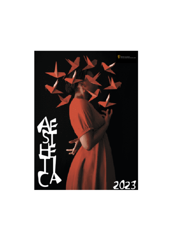
An “AESTHETICA 2023” book cover with the use of illegibility in typography and contrasting photograph.
This is an AESTHETICA 2023 cover with unreadable typography and an image. Fares Micue, a self-taught Spanish photographer, took this shot of a woman with floating origami butterflies all around her (Fares Micue, 2021). A distorted Sans Serif typeface was utilised for the cover typography.
A shot from a stock was used to create this piece. The utilising letter symbol then outlined the word “AESTHETICA.” The letters were placed in the column and deformed with a white arrow after hitting ungroup. The letters were then regrouped and made white. The numbers “2023” were likewise twisted in the same way. At the right-hand side edge is a little BAFTA logo.
References
BAFTA, 2021 (Official website) [Online] (n.d.) Available at: https://www.bafta.org [Accessed in 21 October 2021]
Fares Micue, 2021, ITSLIQUID, Featured Artist: Fares Micue. (Hitting the headlines article) [Online] (Updated 02 December 2021) Available at: https://www.itsliquid.com/featuredartist-faresmicue.html [Accessed 21 October 2021].
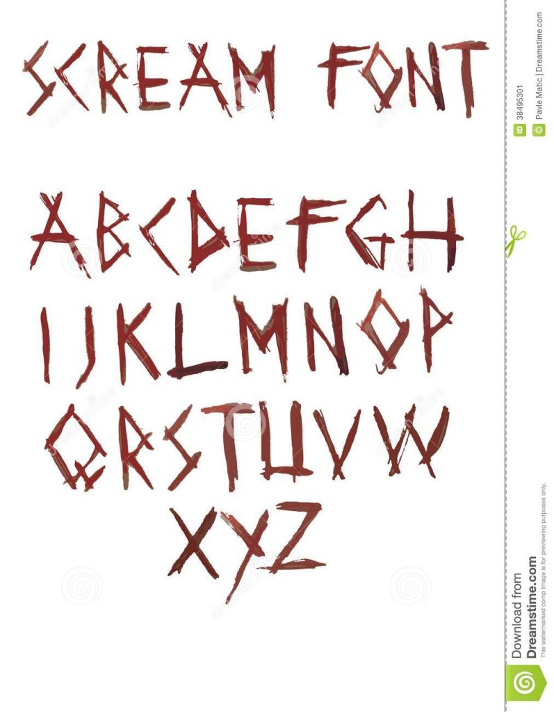
This is an Exit Velocity.22 Postcard with an original images and scream typography.
This is an original image Exit Velocity.22 Postcard with scream typography. The original photograph of a Duke Castle on the front of the postcard was taken during my summer vacation in Lithuania. The back of the postcard features a photograph of the Graduate School building with screaming black writing.
Paper was halved and two pictures were imported to create this piece. The typography was handwritten to ensure that the typeface was accurate.
Scream Font used in the Exit Velocity.22 Postcard which contrasts with the name of showcase. (Dreamstime n.d.)