During the coding experiments, Google Chrome Experiments caught my curiosity in the use of HTML codes to build transitions using items of my choice if the code is done correctly.
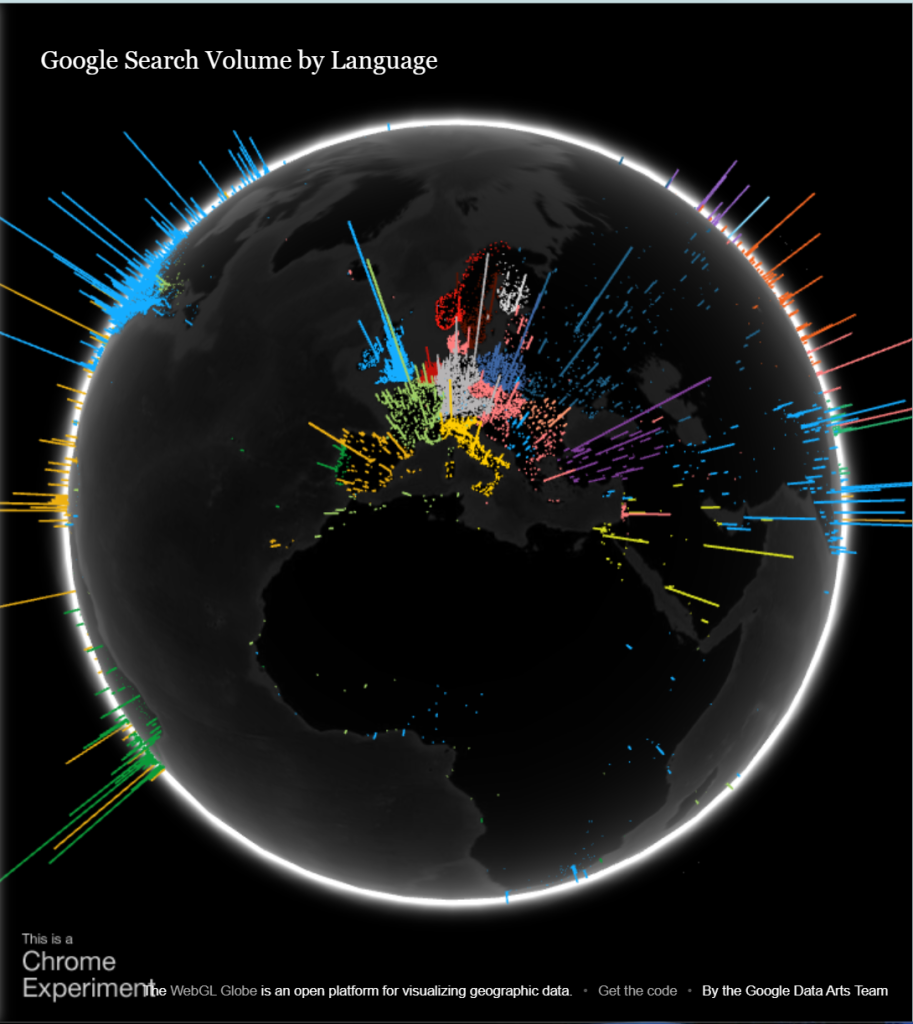
First Experimentation – Google Search Volume by Language
Figure 1 : This interactive experimental displays the languages that are often used worldwide in Google Search. The globe can be navigated using the mouse, thus in addition to providing accurate facts, it also draws the visitor in with its visual appeal and encourages them to stay on the website longer (Google Data Arts Team, n.d. ).
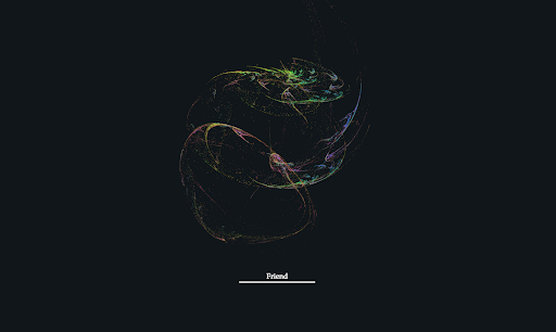
Second Experimentation – Webgl Particle Audio Visualizer
Figure 2: This amazing particle goes together with the audio’s linguistic movement thanks to the verbal audio visualiser. The Web Audio API is used in this experiment to hear input from your microphone. Based on this information, a WebGL visualization changes its shape and creates a particle system (Sehyun Av Kim, Experiments with Google, Februaby 2018 ).
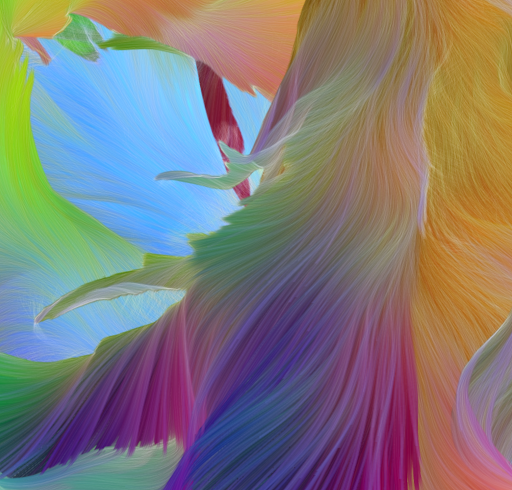
Third Experimentation – Flame
Figure 3: A 3D fractal flame that is created by inputting letters is called a lovely flame; unfortunately, I am unable to test it, but the results are excellent. a word or phrase you write in serves as the seed for a 3D generating fractal flame and a generative music piece. Users’ typing causes the fractal flame to change (Xiaohan Zhang, Experiments with Google, March 2018).
Fourth Experimentation – Tendrils
Figure 4 : These flower waves are interactive music visualizations that use your webcam, but because of its potential for personal data, which may worry users who don’t often use their webcams for personal purposes, Moving forms naturally interact, creating new connections. a continuous reflexive process that repeats through cycles of entropy and order and coheres through progressively higher levels of complexity. Scaling through and evoking organic forms: Animal ovums are formed from primordial materials (Eoghan O’Keeffe, Experiments with Google, February 2018).
Fifth Experimentation – Colorful Fluid
Figure 5: This intriguing silhouette was created using a fluid simulation and a web camera, as was previously noted as being risky. Users can build vibrant, flowing simulations of your silhouette as you move using their webcam (Yuichiroh Arai, Experiments with Google, November 2017).
In terms of advancing these experiments, consideration was made to add code components to the design portfolio if they prove successful.
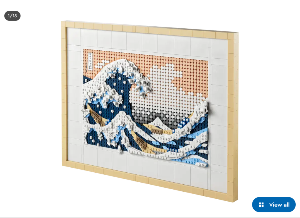
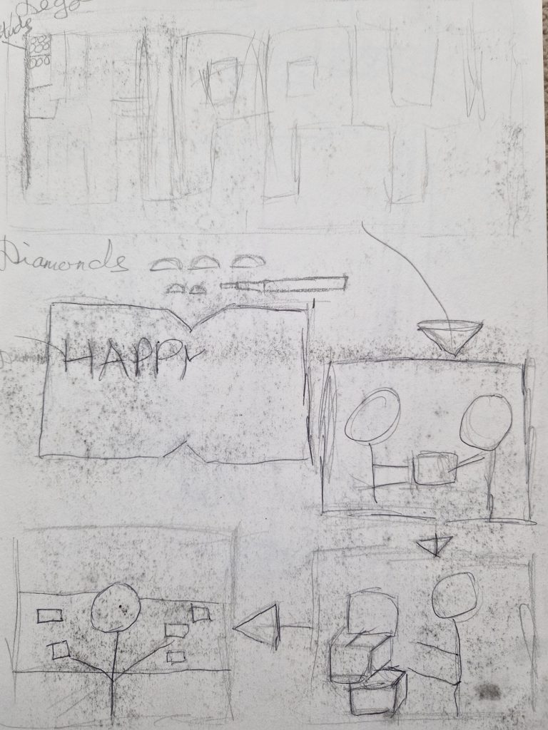
When we were considering Christmas card ideas for our group project, my suggestion was making a card that looked like pixel art, specifically Lego pixel art. As a result, when the buyer buys the card and the user makes it, it will be more memorable than simply receiving one. I next investigated several types of pixel art, such as diamond art, which is commonly used to make inventive artworks and has risen in popularity over time. Along with diamond art, Lego stud art has arisen as a second form of creation.
Figure 1 : A recreation of an iconic piece symbolising Hokusai’s The Great Wave that is a perfect gift for any audience and a wonderful reference for prospective pixel art greeding card. As this type of pixel art keeps the present exposed rather than in storage.
Following our discussion, it was decided to conduct some research and look into the many types of narrative sequences that would have been useful while constructing onboarding.
This idea was expanded into a logo design and narrative that communicates successfully without the need of text. As a result, the product customer gets the primary idea. Although our group was generally productive, everyone was working independently on my proposed approach.
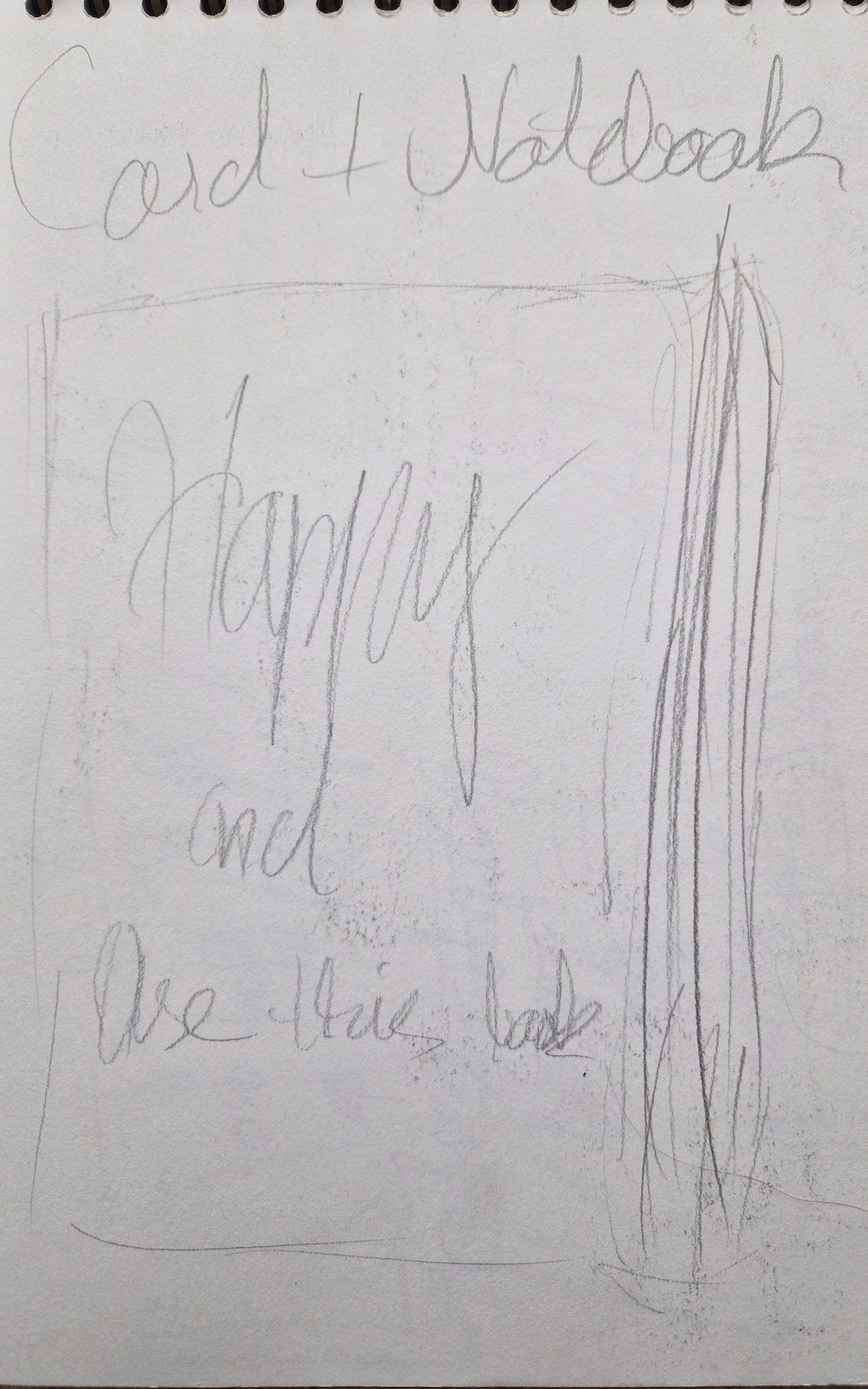
Figure 2 : After some group brainstorming, everyone was sketching out there ideas and thinking of ways representing the pixel art gift idea to the people.Figure 3 : Additional idea was to create a greating card as a notebook, so people could be able to write there ideas.
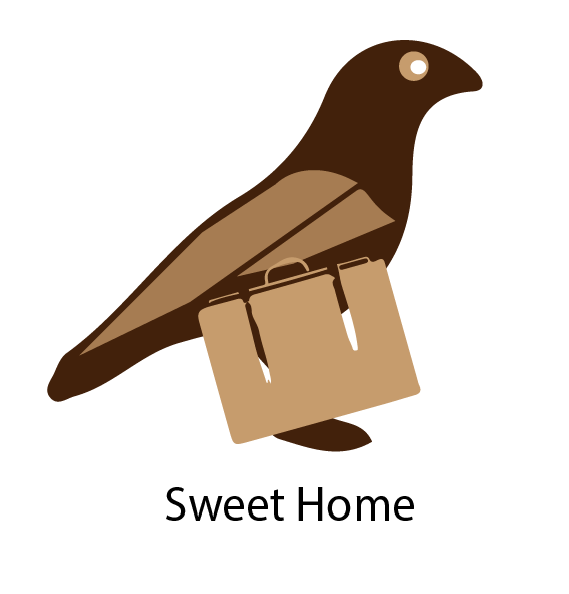
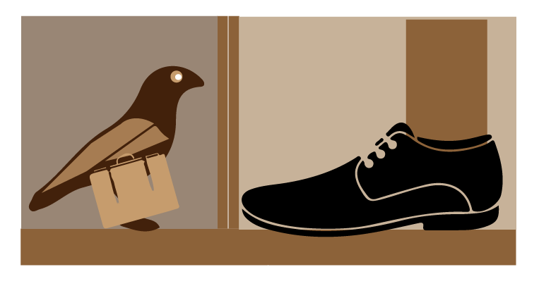
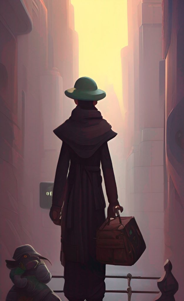
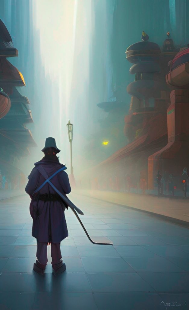
The group project for today was to design a birdhouse, which could be anything based on the artist’s preference. My task was to research the significance of birds and what they stand for as we came together to brainstorm methods to promote the birdhouse. After doing some study, I came up with some viable concepts. The first one was to create a bird that enters someone’s home carrying a suitcase because the bird stands for wanting to be with someone rather than being alone.
They stand for many things, according to Clinton Atkins, including freedom, grace, love, strength, longevity, eternity, happiness, and love. Depending on the culture and religion, different birds have different symbolism. Even having a dream involving birds has significance. Indeed, birds have a significant impact on how people perceive the world. This demonstrates the significance of birds in a person’s life.(Clinton Atkins and George Dukes, Thayer Birding, 2 January 2023.)Everyone needs a friend they can talk to or turn to for assistance in times of need, especially those who have felt abandoned because of the coldness of those around them.
Figure 1: Logo design of bird with a suitcase which represents the travelling bird with a suitcase because the bird doesn’t have a home.Figure 2: Illustration of bird entering a person’s house with a suitcase. So everyone wants to live somewhere they would call a home. (Vector Stock, n.d. Crow bird poultry….) (Vector Stock, n.d. Men shoe vector image) (Vector Stock, n.d. Suitcase with world travel….)
This could be taken further as the promotion branding for the birdhouse and using emotional designs to interest the user.
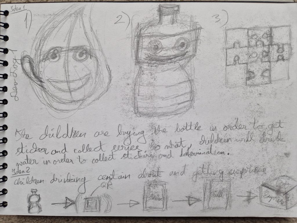
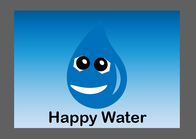
We discussed many strategies for getting young children to drink water, which is crucial for their health, during the group discussion. I took my sketchbook after our conversation to process some thoughts. The original concept was to create puzzle stickers that kids would want to collect and purchase the water bottles to assemble. Superheroes, who are well-known to the younger generation and pique their interest, could be potential puzzles. They won’t have an issue drinking water bottles as their curiosity grows.
Figure 1 : Brainstorming some ideas which could interest the children to drink water. Figure 2: Happy Water logo to encourage children to drink water.
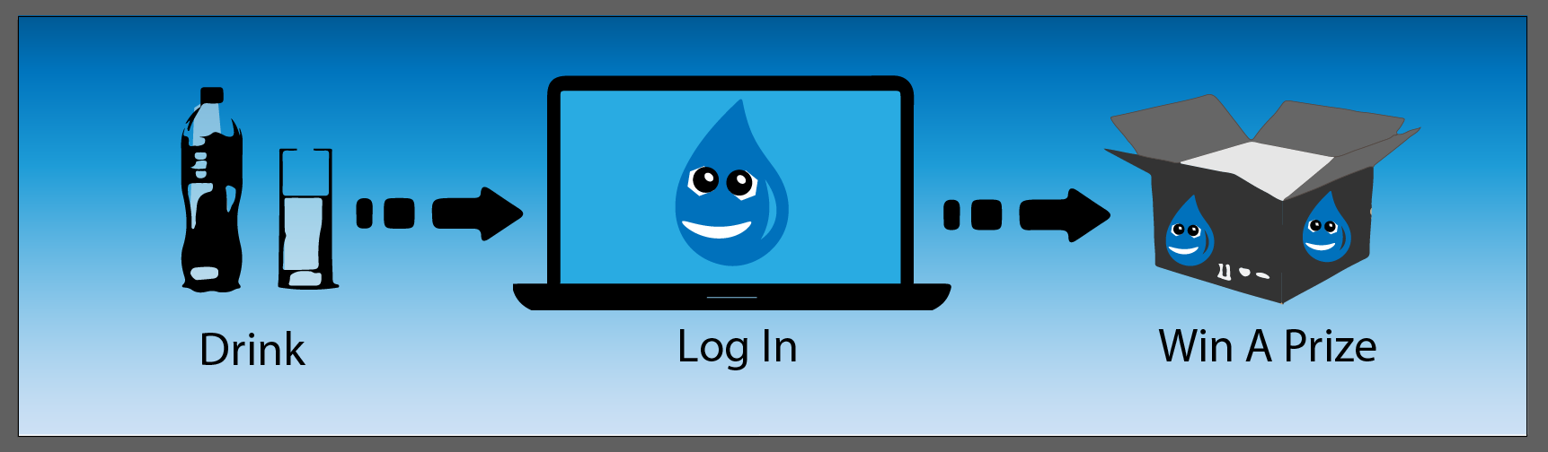
The second possible solution was to attach two stickers, one of which would be a section of the picture and a QR code that would link to the webpage. The adult might access the website and log in using the special code that can be found with QR code. The child may receive awards from the corporation if they consume more drink bottles than expected. The child could compete against other kids in challenges on the internet. Such contests heightened the rivalry between kids, which boosted sales and inspired kids to drink more water.
Figure 3: A second method for encouraging kids to drink water involves collecting stickers and receiving rewards from the firm for consuming a specified amount of water. (Kaanbagci, Vector Stock, n.d.) (Vector Stock, n.d. Cardboard box vector image), (Vector Stock, n.d. Water bottle glass vector image)
My ideas were taken into consideration when I pitched them to the group, and they helped contribute. We made the decision to continue with this and present our thoughts to the class as a whole.
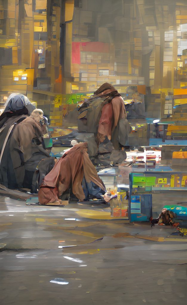
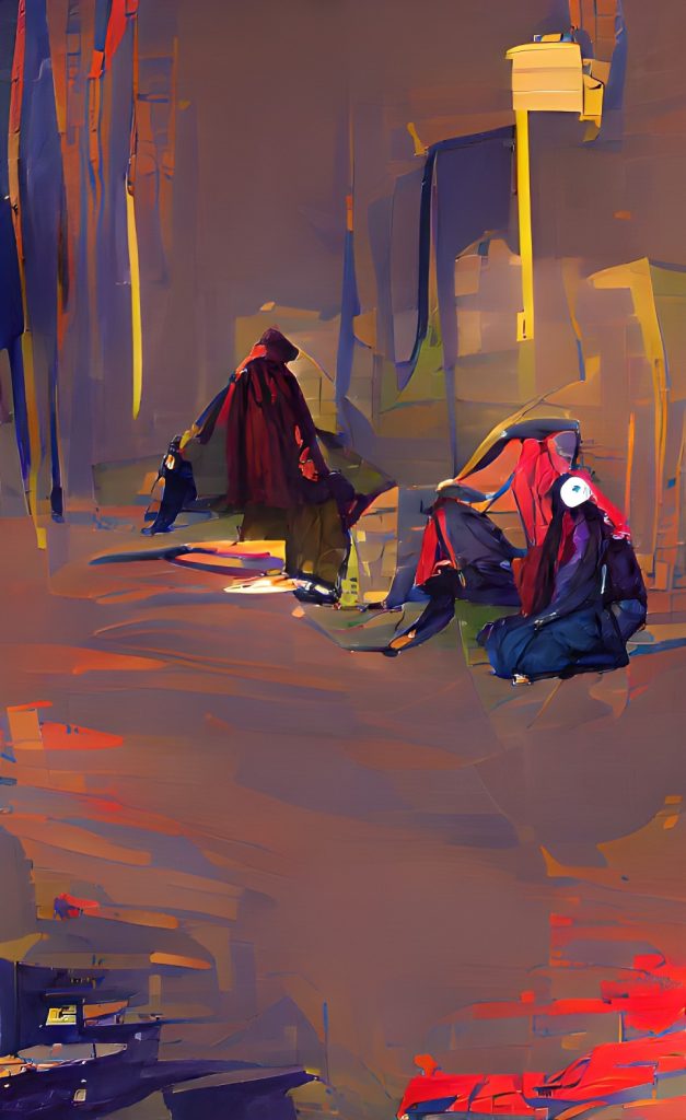
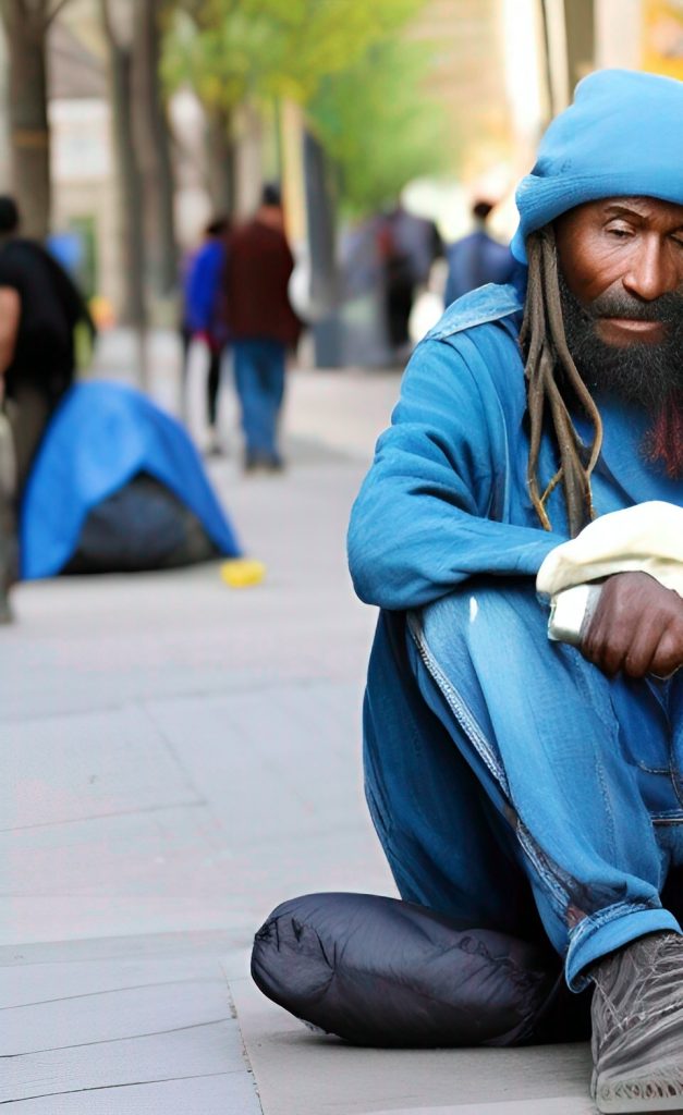
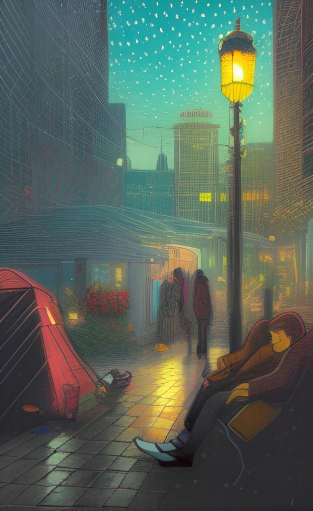
In order to protect the privacy of the homeless persons I planned not to photograph them , I chose instead to use AI-generated art that was redrawn in my style to convey feelings.
Establish a social media presence for the sale of goods that will assist in raising money for a facility where the homeless can stay for free and compassionate people who care for them. Since there are more homeless persons sitting on the streets of Hull, the local community would be the intended audience for this.
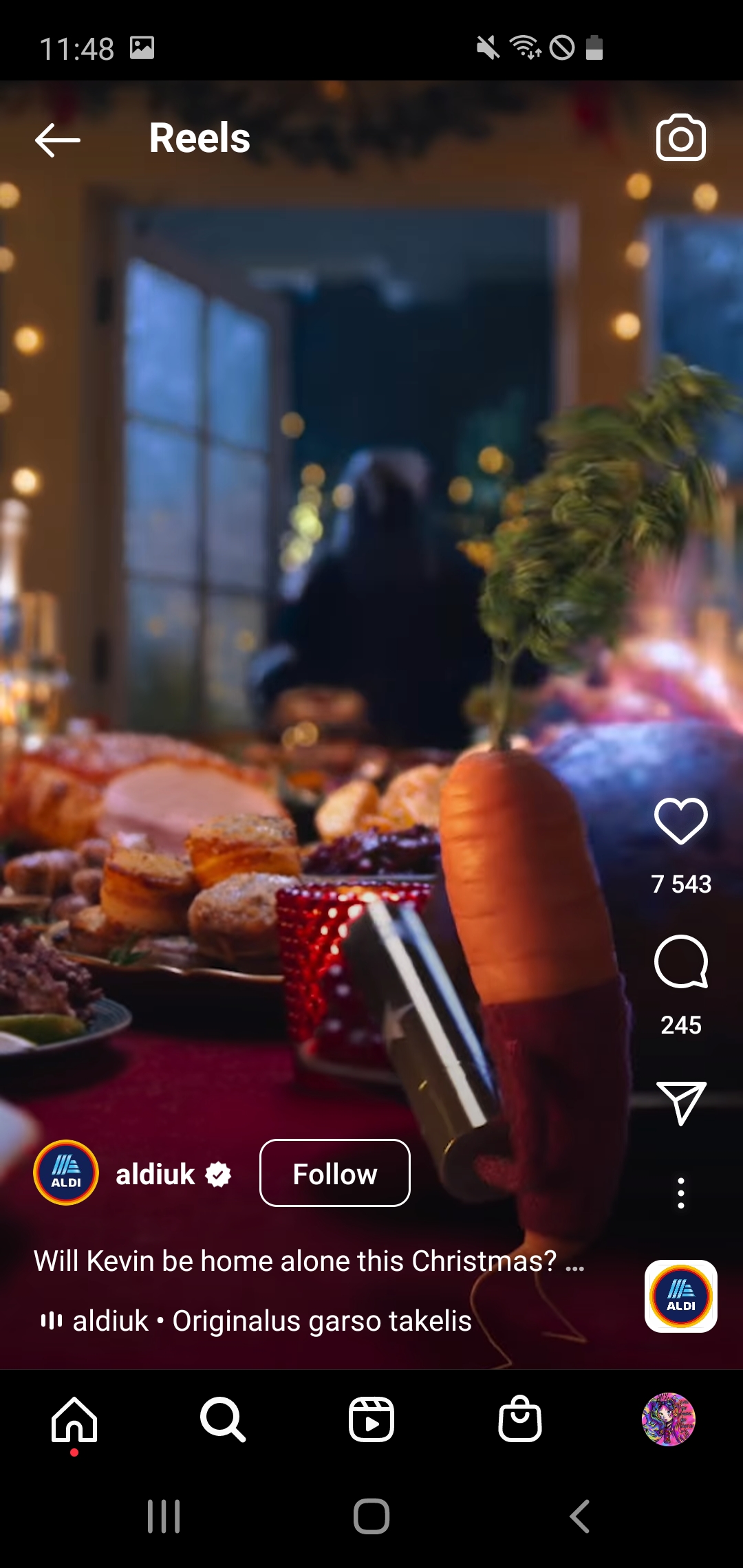
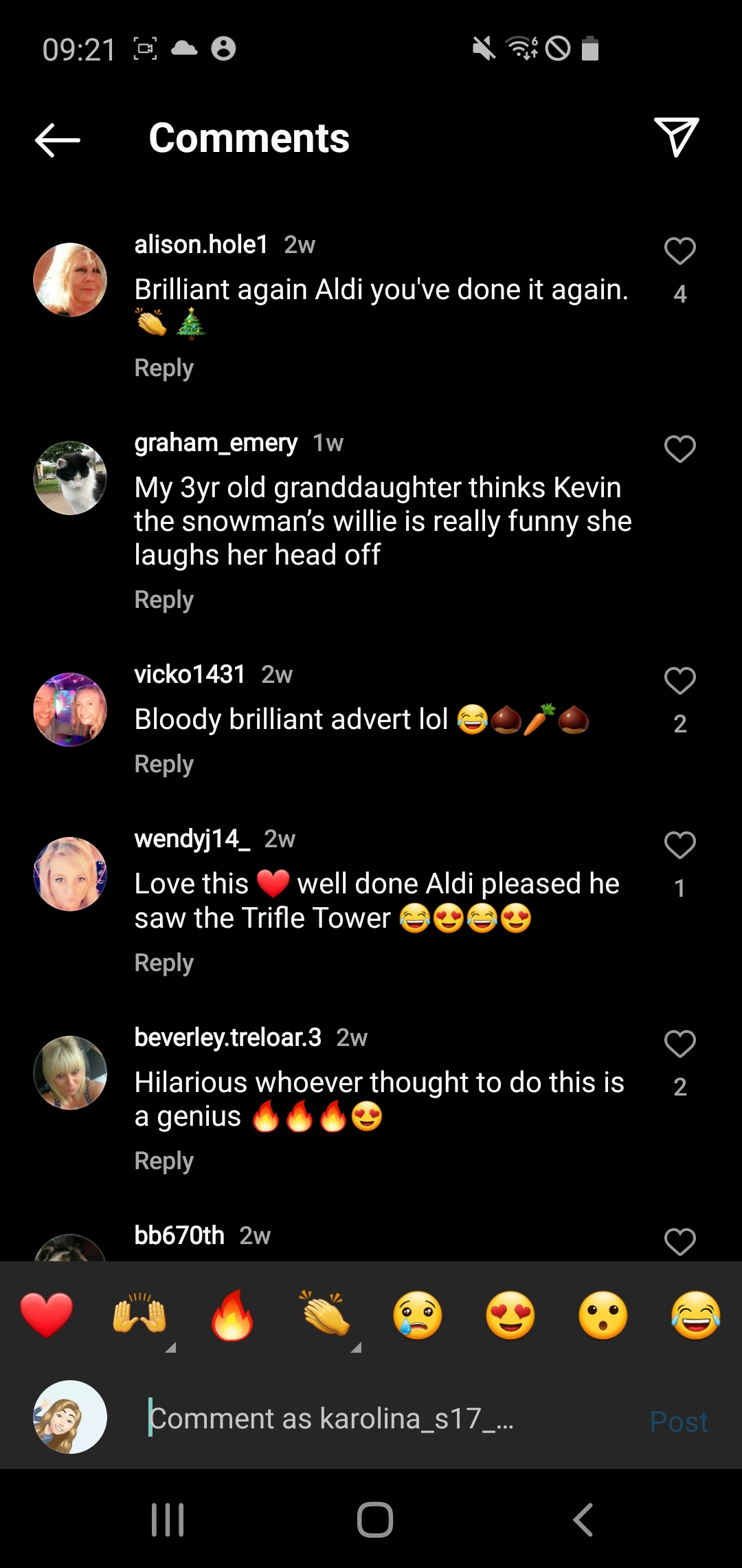
Figure 1 : Aldi Christmas advert which gives a nostalgia to Home Alone. (Olivia Heath and Lisa Joyner 10 November 2022)
Aldi is a German grosery store located in most of parts UK which provides a large variety of products at a cheaper price.
While viewing the advert, the core message is the importance of the family and especially family reunion during Christmas . A nostalgia can also be found to the classic Christmas films such as Home Alone which for some people starts the Christmas season.
The target audience of this video advertisement would be families who go to Aldi, as well as adults and children which would later want to purchase the products related to this character.
Advert has received a lot of positive feedback and even made someones day due to having already well known character to the store with he’s version of a nostalgic movie.
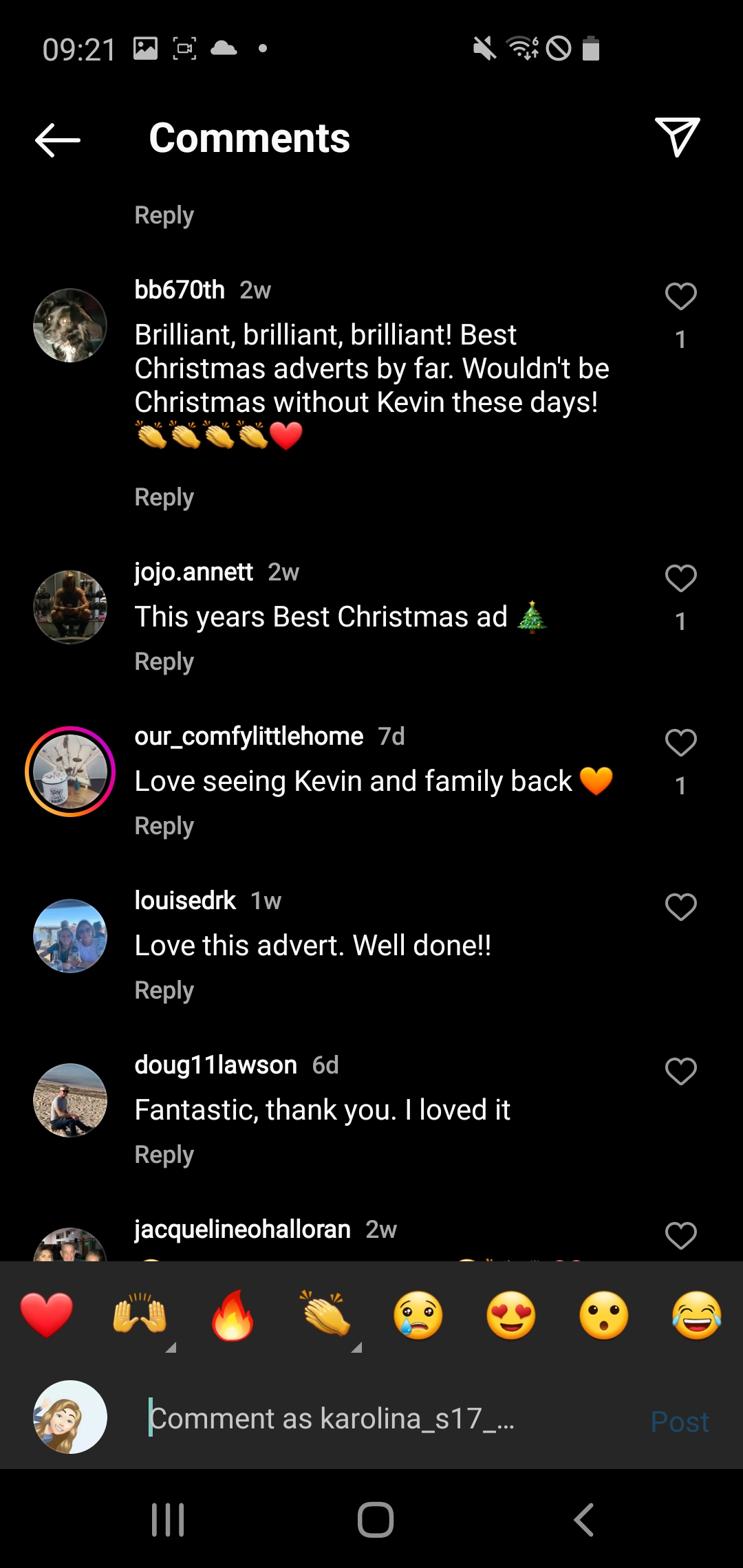
Figure 2: Audience engagement under the post (Part 1)Figure 3: Audience engagement under the post (Part 2)
Dyson Hair
While viewing the campaign, the core message is to explore the individuality of each women and creating an universal products for every women.
The target audience of this promotion would be women of any age and their partner’s as a gift for any acassion.
Video has received a lot of positive feedback and even an interest to purchase this product in order to make their hair look like women in the video. However, it has a massive engagement in Tik Tok where people are reviewing the hair driyer which even determined to purchase this product as the audience have seen it in use.
Figure 5: Audience engagement under the post (Part 1)Figure 6: Audience engagement under the post (Part 2)
Moonster
Moonster, the brand behind genuine leather products with are hand made.
While viewing the campaign, the core message is to buy a handmade which will last a very long time, so the campaign is called “Purchase with a Purpose” in 2017. Percentage from this campaign will be donated to the non-profit organisation Zambia that promotes the prevention of cruelty towards children.
The target audience of this campaing are aimed at women because most women use handbag and in general have more bags than men. ” The female of age group ranging 15-64 years is the main consumer of the handbags market, with the gender demographics portraying the share of the female population of more than 50% “.(Business Wire n.d.) However, the company started producing notebooks which interest the male and female audience as good opportunity to give as a gift for some one.
Although the company doesn’t receive massive angagement on social media, most people expremely want to purchase.
Figure 7 : Moonster campaign which they follow up to today. (Moonster n.d.)Figure 8 : Audience engagement under the post (Part 1)Figure 9: Audience engagement under the post (Part 2)
A design approach known as “brutalism” in digital media aims to appear unpolished, careless, or bare. It resembles webpages from the early 1990s. This feature of brutalism can occasionally be seen in the form of a sparse, nearly naked HTML website with blue links and Monospace typography. (Kate Moran, 5 November 2017)
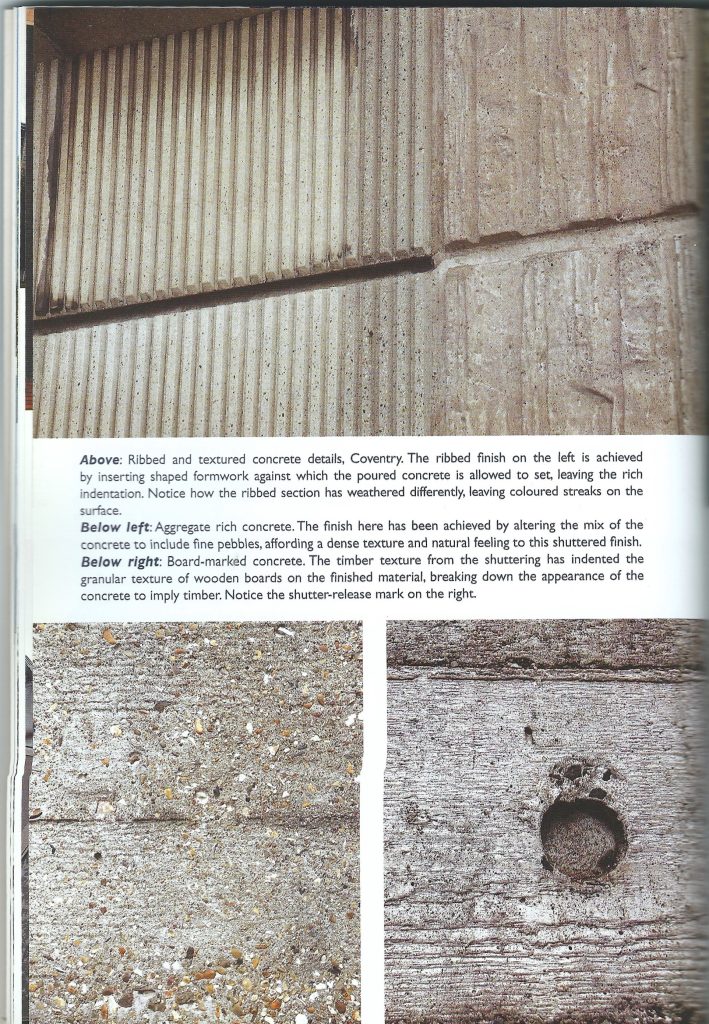
Figure 1 : Materials used in the Brutalism architecture (Reading, B. (2018)).Figure 2 : An example of Brutalism architecture (Reading, B. (2018)).
The use of brutalism is considered as a reaction to artificiality and lightness in both architectural and digital design. Its supporters view it for being brave and honest. (Kate Moran, 5 November 2017)
Examples of Brutalism in websites
Too Much.Studio
A website that once employed brutalism to create a straightforward interactive Christmas card now features an interactive website portfolio of the creators’ works. (Brutalist Websites, n.d.) Not so much column grids are used on the Too Much.Studio website’s “Work” page to display the pieces. A mouse pointer is used to move the 3D objects on a website’s welcome page in to demonstrate interaction. There is a place where people can sketch their works of art. The website makes use of vibrant visuals and subtle movement to maintain audience attention. The majority of the interaction was created by using HTML code to modify the selected objects.
Figure 4 : The interactive items wouldn’t move freely when the website was converted to a mobile layout. Other little animations, however, adjusted rather well. (TooMuch.Studio, n.d.)
Johannes Strüber
According to Johannes Strüber, during the course of his job, he encountered the “brutalitic” approach. It became increasingly obvious that the provided URL serves as the foundation for the layout itself. He reasoned that his minimalist approach demonstrates his commitment to focused labour. It’s focused in a way, but it’s also playful. (Brutalist Websites, n.d.)
Figure 5 : Johannes Struber website (Johannes Strüber, n.d.).
Figure 6 : Testing responsives of Johannes Struber website (Johannes Strüber, n.d.).
Last Heavy
Figure 7 : Last Heavy website (Last Heavy, 2019).
According to Last Heavy, they were interested in developing a sort of environment for the brand that promotes exploration and discovery by presenting content in this completely overwhelming and distinctive manner. We required a website that fit our (schizophrenic) sense of design and had a particular taste for the kind of material that would help to promote and highlight their creative work. When a user hovers their mouse over the website’s welcoming page, Last Heavy uses modular grids with minimal interactivity. Items are arranged in a modular grid as soon as the user clicks “Shop,” using brutalism while yet adhering to accessibility guidelines.
Figure 8 : Testing responsive design of Last Heavy (Last Heavy, 2019).
References
Brutalist Websites, n.d. Brutalist Websites [Online] (n.d.) Availiable at : https://brutalistwebsites.com [Accessed in 03 November 2022]
Johannes Strüber n.d. [Online] (n.d.) Availiable at: http://www.l-i-l.de/intro [Accessed in 03 November 2022]
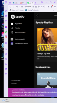
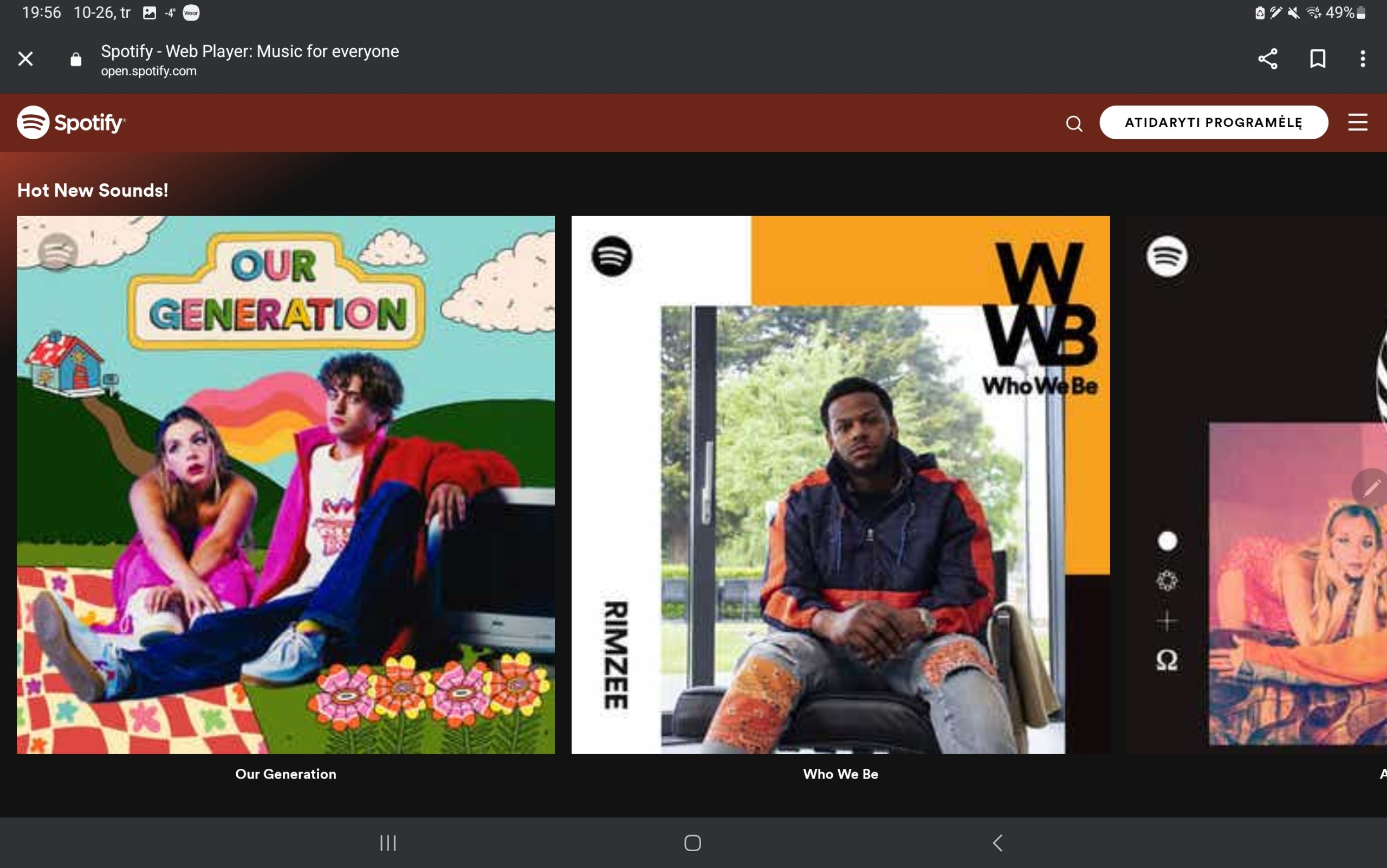
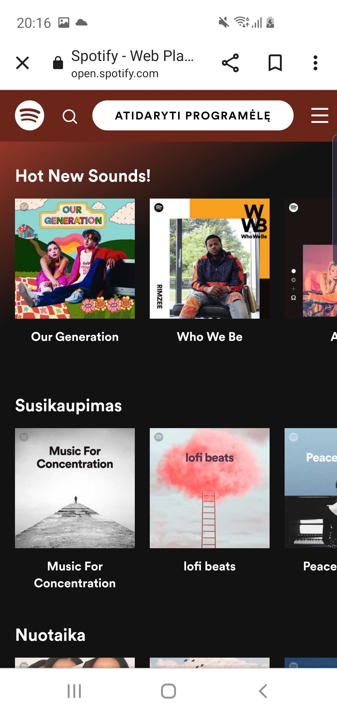
Figure 1 : Spotify is a music streaming service that enables users to listen to music from any location. This is a desktop screenshot of Spotify’s website. (Spotify, n.d.)Figure 2 : Shrunk down version of Spotify’s website. (Spotify, n.d.)Figure 3 : Screenshot of Spotify’s website on my tablet to show responsive design. (Spotify, n.d.)Figure 4 : Screenshot of Spotify’s website on a android phone Samsung Galaxy S10e. (Spotify, n.d.)
These screenshots display various layouts that then welcome the user with a banner including a call to action or use modular blocks to display various genre groups. The banner has been cropped to fit displays with bigger resolutions.
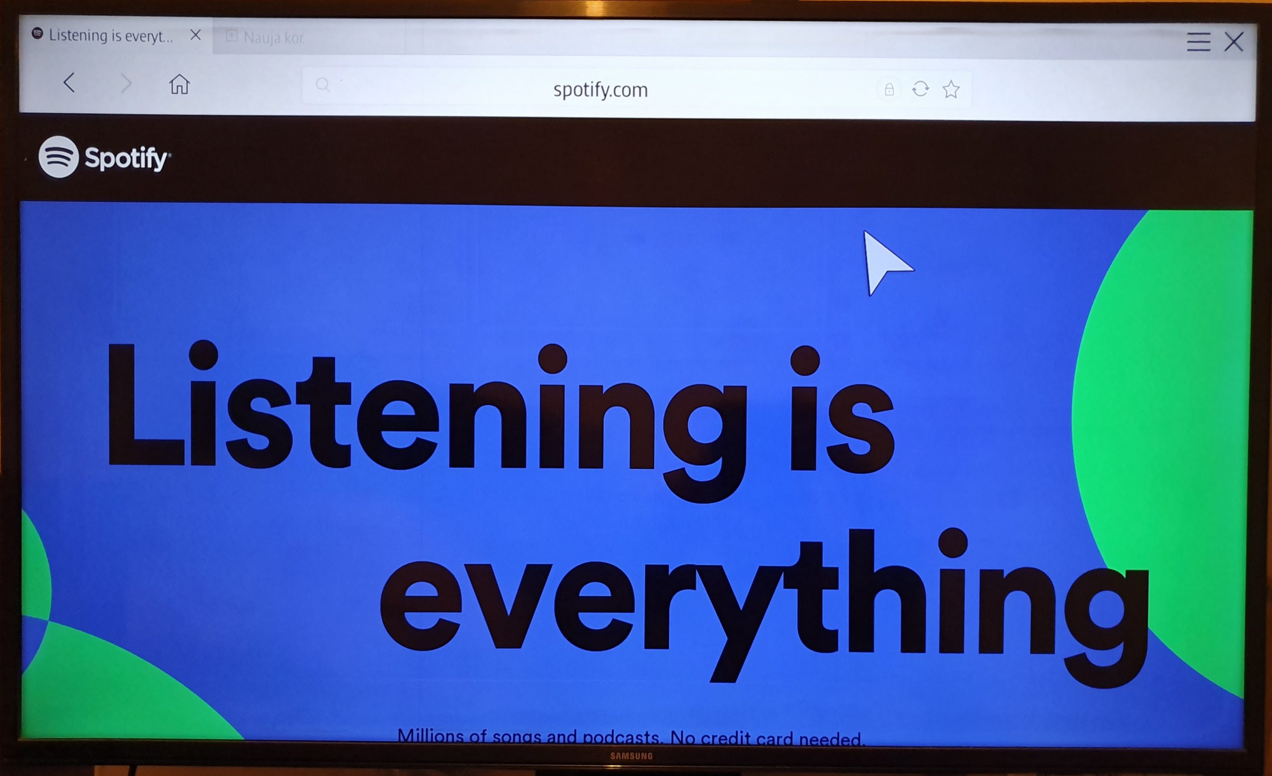
Figure 5 : Photograph of my families Smart TV to different responsive design. (Spotify, n.d.)
This website’s responsiveness might be further enhanced by using modular blocks for each component to enable a smooth transition as you scroll down the page and prevent the call to action from closing the border as it does in the TV example. Over time, the TV has evolved into a device for both searching for content and enjoying favourite shows. According to “A growing number of UK citizens use Smart TVs to access the internet, with up to 26% of all online time being spent on Smart TVs. ” (Federica Laricchia, statista, 14 February 2022) The navigation bar can be found on the left side of the website.
BBC
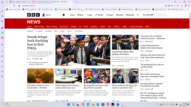
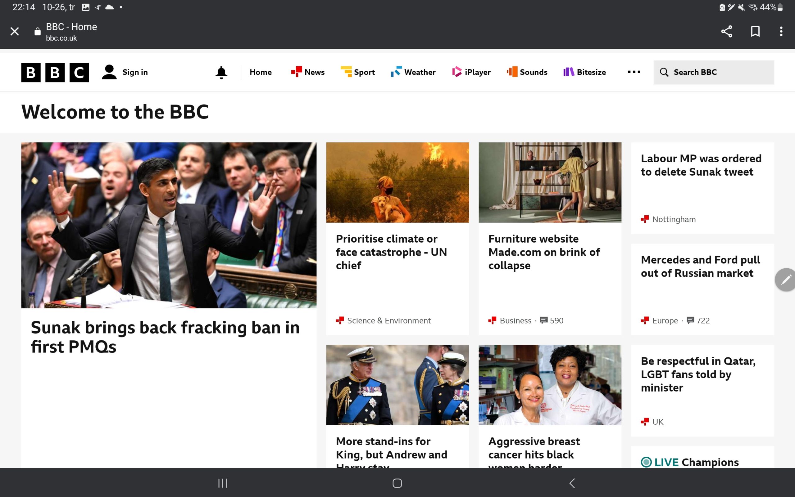
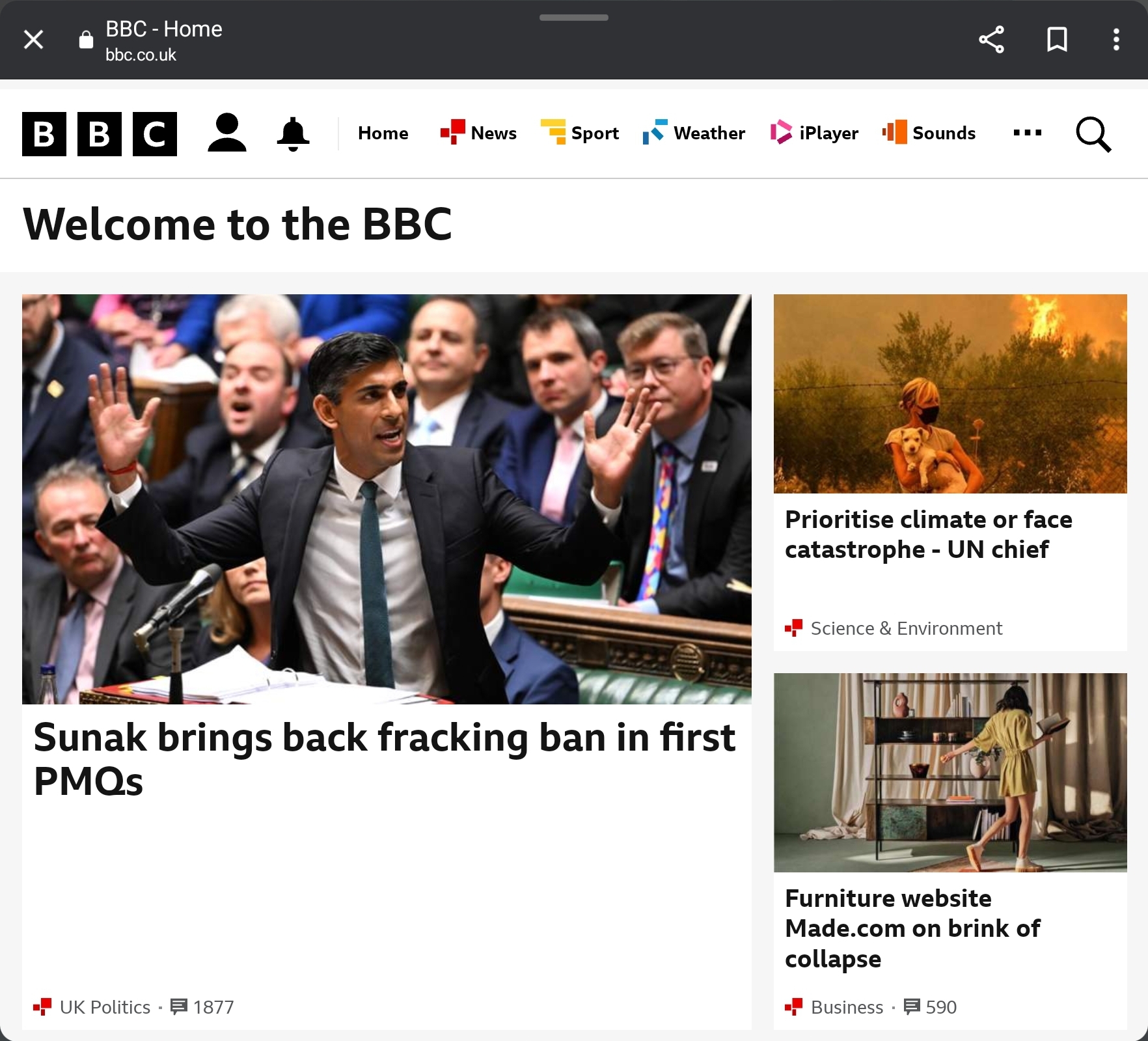
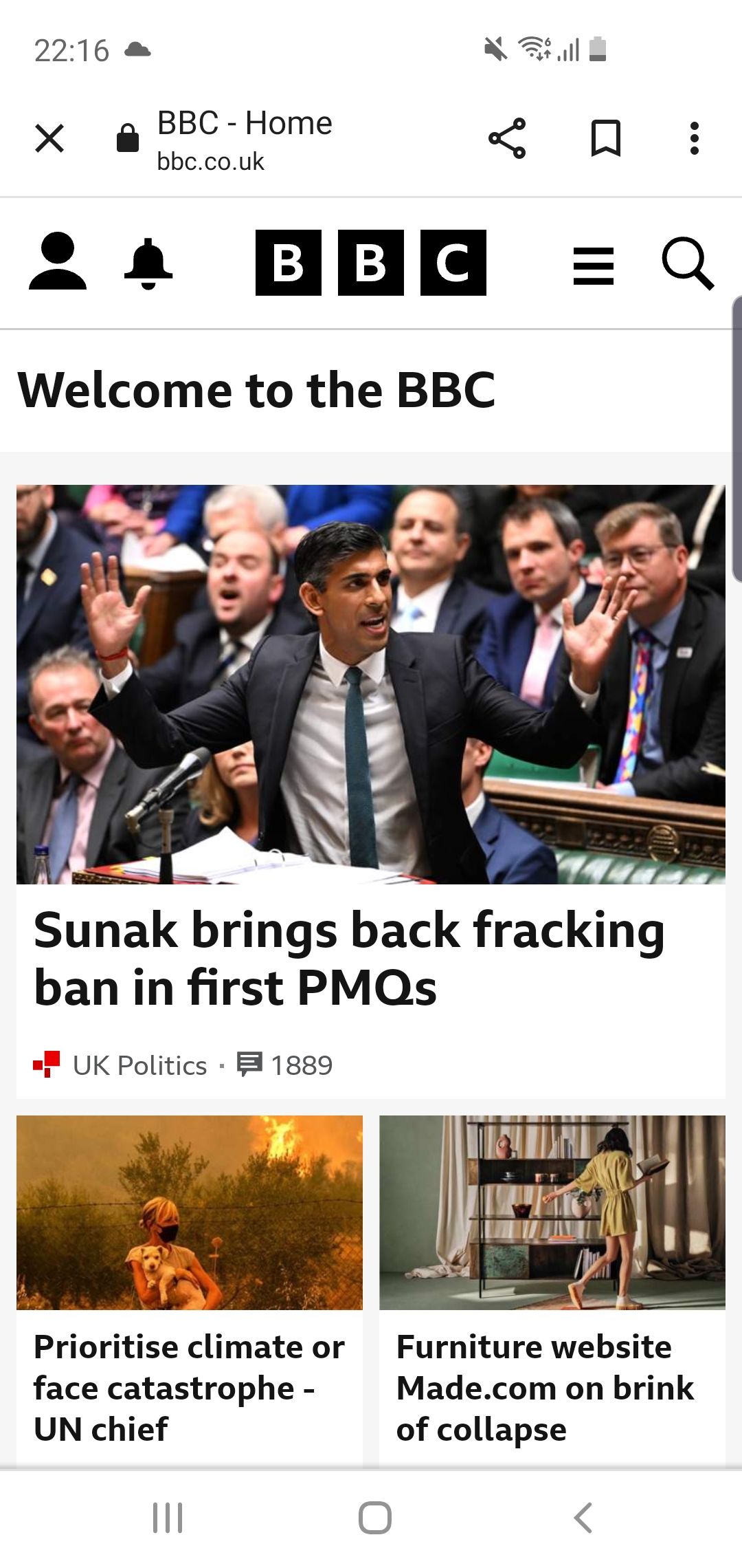
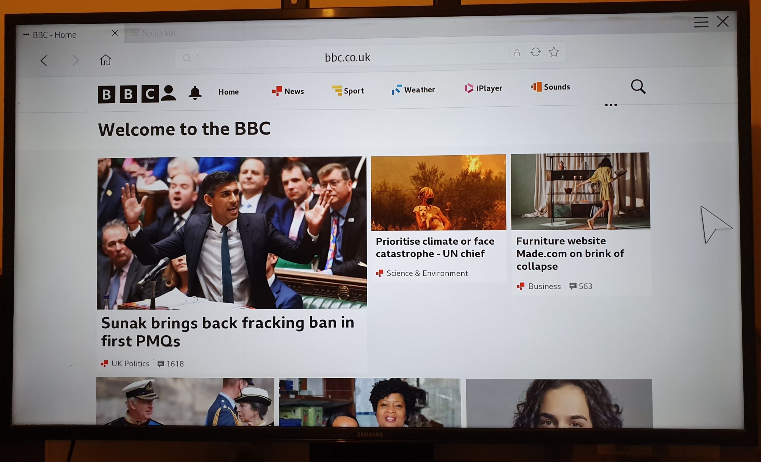
Figure 6 : The BBC is a good example of a responsive website. For consumers to stay current on the world, BBC offers a wide variety of news. This is a desktop screenshot of BBC’s website. (BBC, n.d.)Figure 7 : Screenshot of Spotify’s website on a tablet to show responsive design. (BBC, n.d.)Figure 8 : Screenshot of BBC’s website shrunken my tablet to show responsive design. (BBC, n.d.)Figure 9 : Screenshot of BBC’s website on a android phone Samsung Galaxy S10e. (BBC, n.d.)Figure 10 : Photograph of my families Smart TV to different responsive design. (BBC, n.d.)
These screenshots demonstrate various layouts that greet viewers with small column blocks for each news segment and a huge landscape box for larger screens that displays breaking news. However, smaller displays employ a single column hierarchy with each news item in its own box. Additionally, websites use hamburger menus rather than normal menus to keep everything simple and allow for complete focus on the news.
Depending on the user’s selections, the BBC website employs a navigation bar to direct visitors to topics like weather or sports in addition to news. When you click on a page, like Weather, it moves as the area gets smaller and fits precisely into the designated spot.
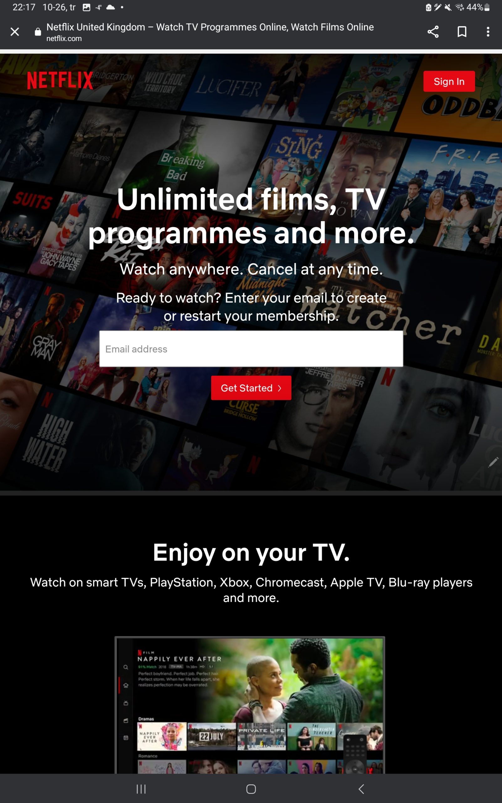
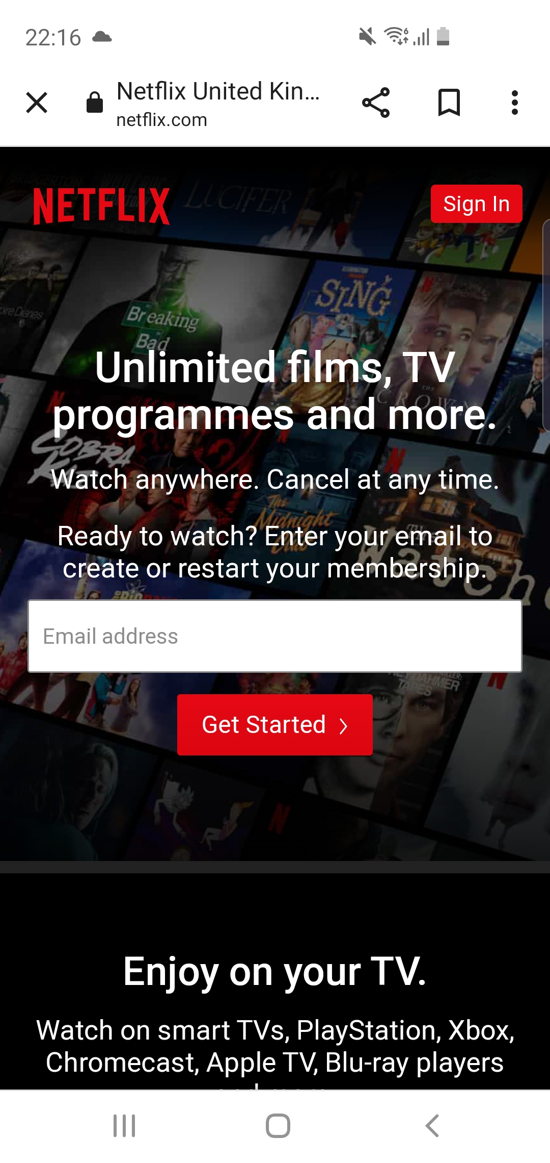
Netflix
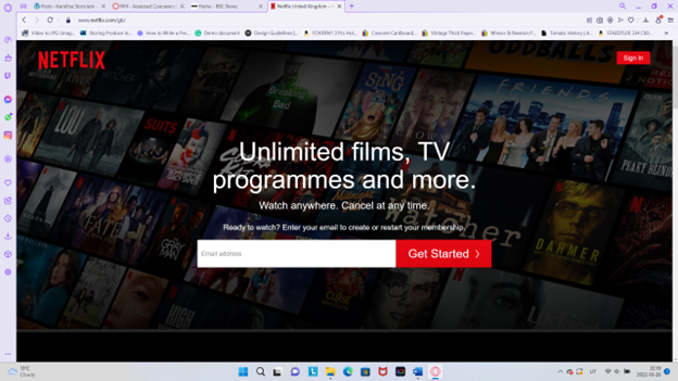
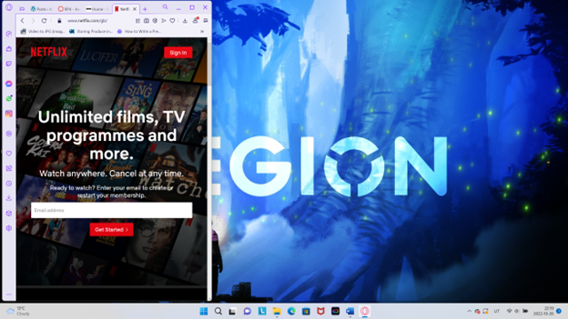
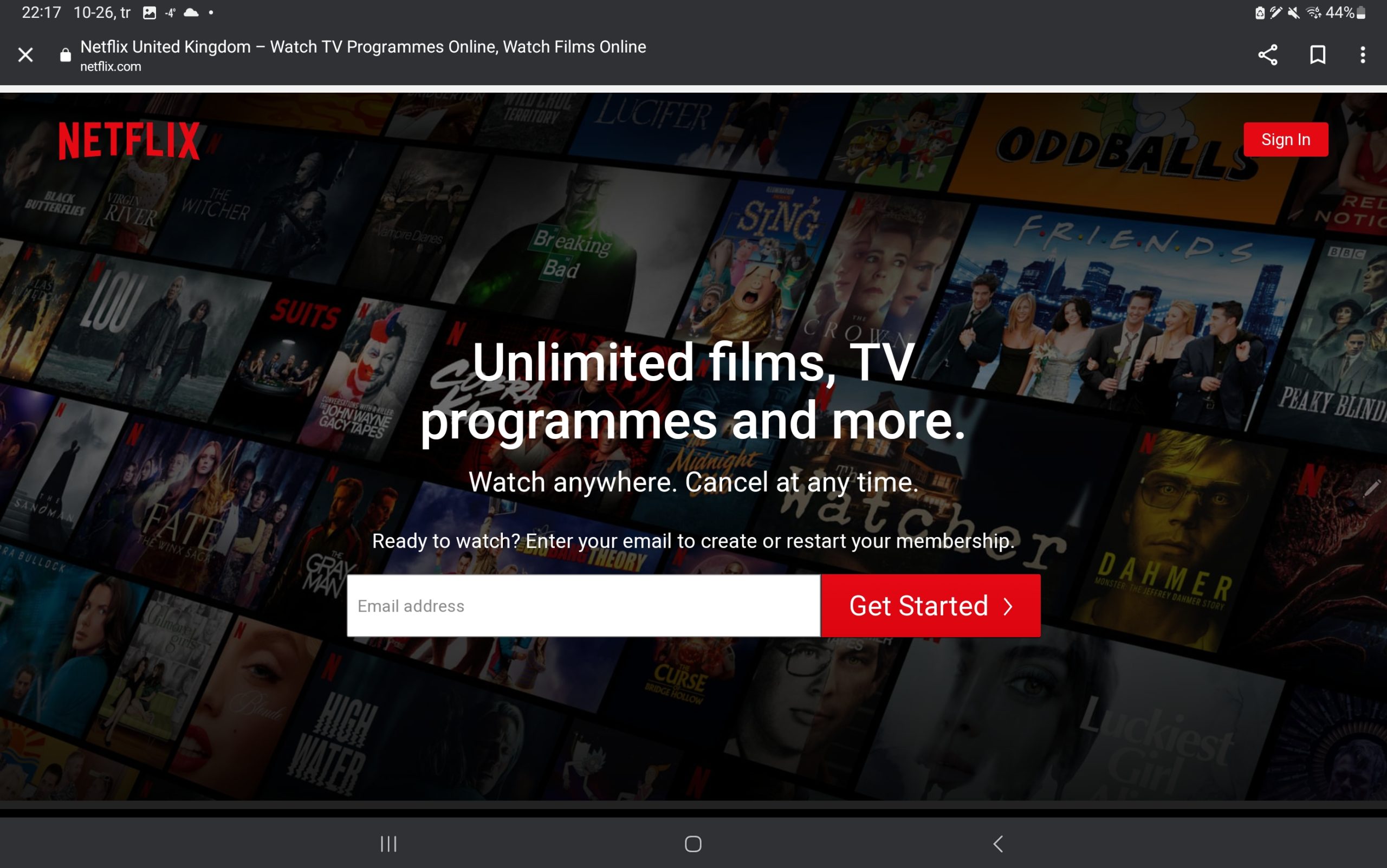
Figure 11 : There is a tonne of movie content on Netflix for every genre, the streaming service allows not olny their own content but also well known series. This is a desktop screenshot of Netflix website. (Netflix, n.d.)Figure 12 : Screenshot of Netflix website shrunken my laptop to show responsive design. (Netflix, n.d.)Figure 13 : Screenshot of Netflix website on my tablet to show responsive design. (Netflix, n.d.)Figure 14 : Screenshot of Netflix website shrunken my tablet to show responsive design. (Netflix, n.d.)Figure 15 : Screenshot of Netflix website on a android phone Samsung Galaxy S10e. (Netflix, n.d.)
These screenshots demonstrate various layouts that greet users with a sizable banner and a call to action pushing them to sign up as members instead of just having the logo and a sign-in area. On a huge screen, the website is perfectly sized with a single, expansive landscape box.
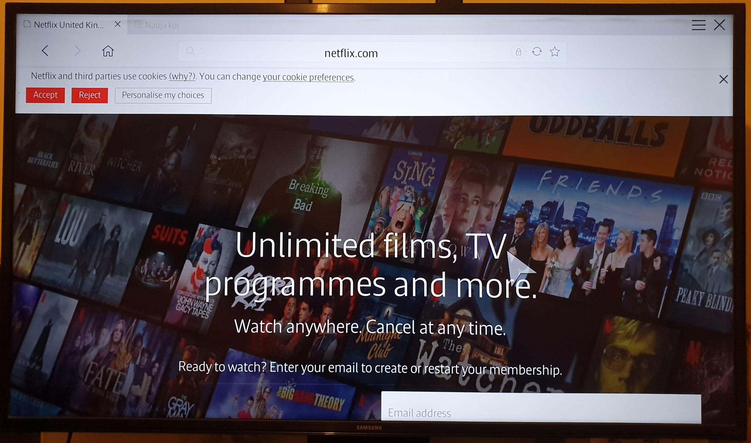
Figure 16 : Photograph of my families Smart TV to different responsive design. (Netflix, n.d.)
The next column doesn’t appear cropped when browsing the website on a smaller screen, therefore by spreading out the next column, the responsiveness of this website might be further improved by allocating more space in the column block.
References
BBC, n.d. Welcome to the BBC [Online] (2022) Availiable at: https://www.bbc.co.uk/ [Accessed in 26 October 2022]