Creative Life Website is able to adapt to a different screen size such as Desktop, Tablet and Mobile. In order to respond to different sizes, the website becomes smaller and the elements have decreased to the screen. Some of the previously researched websites weren’t able to adapt to different screen sizes.
However Creative Life’s Website has movable features which allows the website adapt to any screen size and seamless transmission between the omnichannels.
Creative Life Website and an companion app will launch at 15th of May, so the users will be well aware on the website and have prepared plans in advance.
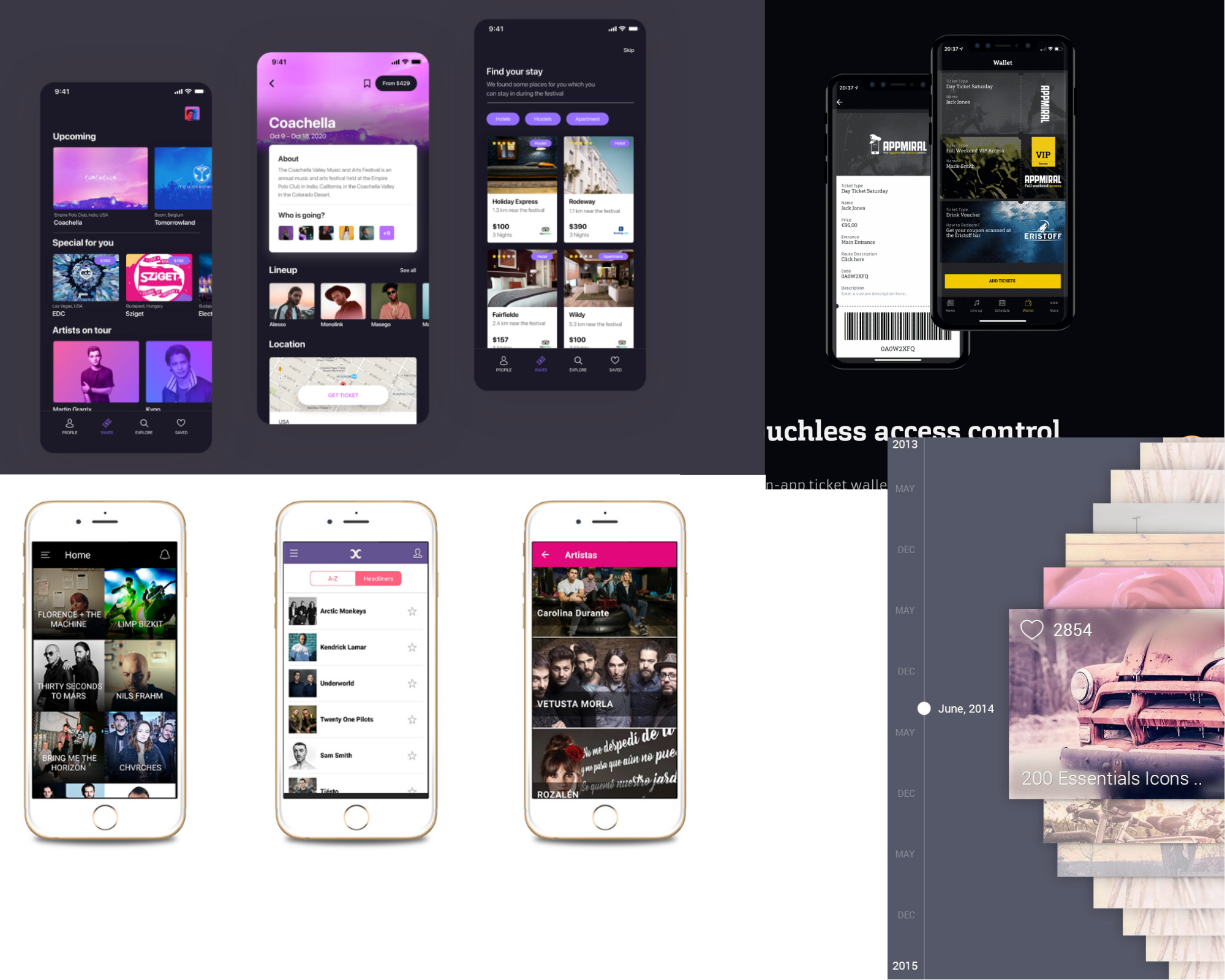
These are the layouts of screen and icons which are used as an inspiration for my website.
Colour planning +Typography
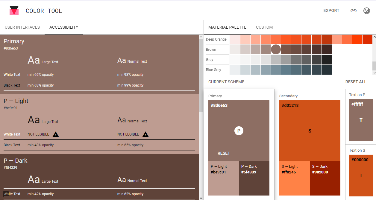
To select an accessible colour palette, I used Adobe Colour new accessibility section. New feature had contrast section to check the legibility of text on the chosen colour. Another section was colour blindness to check three different types of colour blindness and colour conflict. The chosen colour was brown-ish orange because its very optimistic and user friendly in terms of legibility. While using the Google Guidelines for the app construction, an updated version came out with a Colour Tools to check contract and legibility of my chosen colour palette from Adobe Colour.
However, in order to select an accessible typography for the companion app, the black were change to white to help users see the text clearly and some users have problems reading black text. Roboto was chosen as a body and title font for the Creative Life App because its a standard font used for the android users and it allow a good legibility in different sizes. This app will also have Ocr A typeface for the realistic debit card number input.
Creative Life Website uses Cambria as it’s mostly used in Windows computer and allows a very legible text reading.
User flow
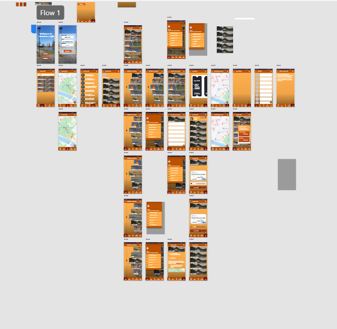
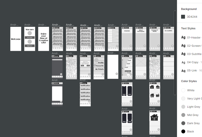
This is an user process of Fred Jackson (Persona) visiting the website to plan the journey and buying a ticket.
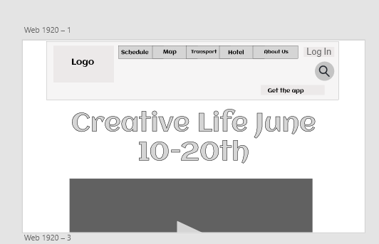
As the app will be downloaded, the “Welcome” screen will appear and the user will choose between attendees, volunteers, and employees because the interface will be slightly different depending on the stakeholder. The user will see a home with five relevant buttons and six menu sections. This app will not only allow map embedded maps but also will be able to purchase a ticket depending on the attendee and book a hotel, so attendees from far away will not have difficulties going to the festival.
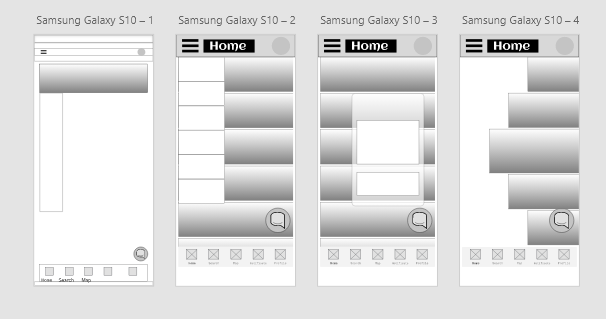
Low fidelity
The „Welcome“ screen was changed to „Attendee“ and „Employee“ so, the user can easily access without pressing the additional buttons and a simple sign up section . Home page of the companion app has the fillterd events choosen by the user after the they have successfully signed up.
Medium fidelity
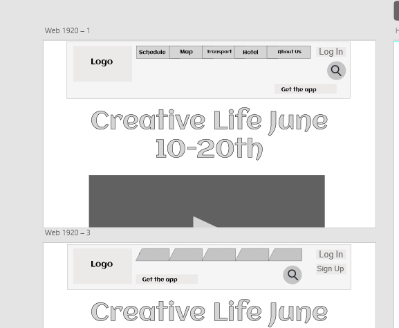
However, after meeting with UX and UI professional Anna Singer made me reconsider my app design. So her suggestions were to add a „LOG IN“ button with comments as action was successfully completed. After doing an additional research, the schedule turned into a carousel with moving events as you go down the timetable. Each event will its own description and call to action button “BUY TICKETS”. During the iteration process, my classmates were testing the app and were giving ways to improve the app to become user friendly. My parents also participated in the process, as they relay in the symbolic representation due to not being able to read in English.
High fidelity
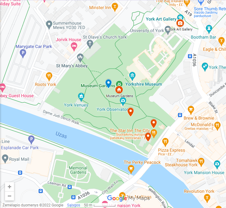
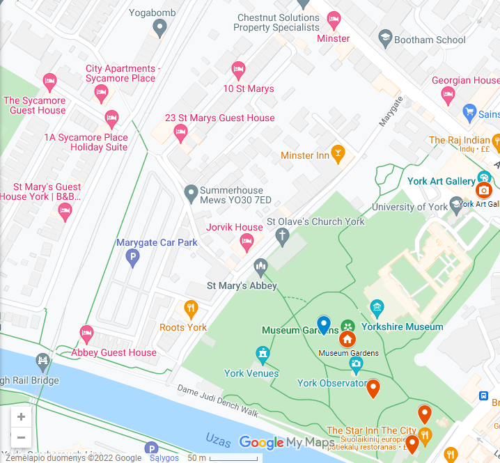
While doing the additional research, a Google UI kit was downloaded with Spacing guidelines for each icon and text. An icon requirements for an android users should be 24 x 24 pixels with 48 x 48 pixels touch space. Bottom navigation bar had accurately measured and working five small icons such as “Home”, “Search”, ”Map”, ”Notificate”, and ”Profile”. As you press the “Map” button, the existing map with existing pin point created and added by me on Google “My Maps ” with a small description of each event. The map is scrollable to give the realitic Google Maps effect.
Most of the moving components such as carousel and maps were prototyped to allow efficient access. All of the app buttons and icons follow the professional Google Guidelines and Accessibility needs for different users. Payment process of Creative Life App was made efficient by including skeoucard such as realistic card to let users add the correct bank details into the specified sections when buying tickets. The help button will allow the users to message in the live chat to talk to other people and ask for help by messaging the employees. The profile icons on the side of each screen will have the person’s photograph and will give feedback wheather the task was successful. This icon will also have a small button “BUY TICKETS” as call to action when scrolling through the event screen. At the top navigation panel with the “Profile” icon, the Menu Burger icon was added with sections to help user find what they are looking for.
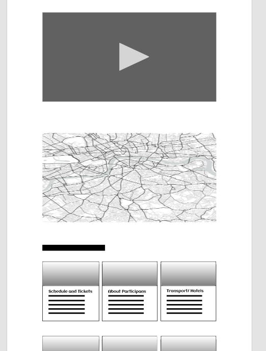
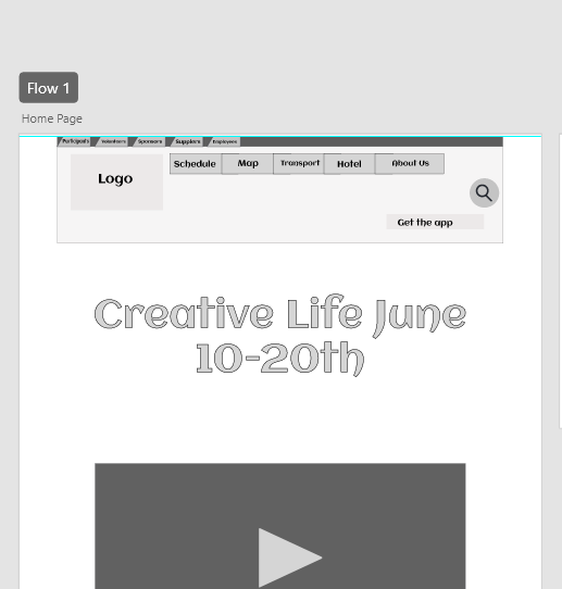
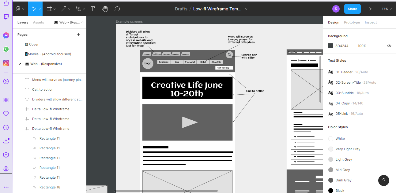
At the top of the website, each stakeholder is separated with the divider used to specify the stakeholder’s purposes for entering the website. The Header also has menu buttons with quick access to the important sections of the website and additional information about the festival. As the user scrolls down, the search bar of this website will transform into a help point and live message, so users can efficiently get help and engage in conversations if wanted. Under stakeholder dividers, the website will also have a menu and a call-to-action video introducing Creative Life and an opportunity to download a companion app by clicking a white button. Engaging video will be embedded link from YouTube which follows Laws of UX with a small description. Under the small description, the user will find an embedded Google Maps which was created with all events and small information about the participants.
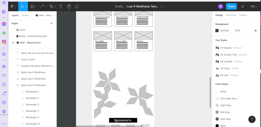
Low fidelity
Top header of my website was changed after looking for additional references such as „York Ice Trail“ to allow efficiency and accessibility. Dividers were decreased and had a dark background box to meet the Laws of UX. However, after meeting with UX/UI professional Anna Singer made me reconsider the layout of the whole website with three different potential layouts.
Medium fidelity
Through iteration process, classmates were taking the tallies for which layout works the best in terms of usability. The chosen layout involved removing the dividers and adding the “LOG IN”/ “SIGN IN” buttonS allowing users to be automatically identified just by entering the details. However, menu buttons turns into dividers to keep the unique shape. The search button was removed from the home page and added to the event page to show the proper need of the search bar.
High fidelity
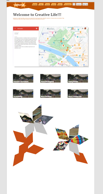
In order to make the website more profesional, the layout of the dividers and bitmap elements were adjusted to the right size with the help of the standard guidelines which were 12 columns wide and 16 gutter width. The boxed header was changed to a header with zig zag border with pen tool and the video was made under the divider with large call to action naming the festival with the dates. By scrolling down, the header “Welcome to Creative Life!!!” was added and a small description was attached. As you scroll down, the background map was changed to the existing map with existing pin point created by me on Google “My Maps ” with a small description of each event. The large buttons were changed to the a smaller and instead of the description, the title of each button was made descriptive. At the bottom the flower construction was masked with primary and secondary photographs with zooming in as you press down the petal. The sponsors were adapted to the footer the website and site map was added to help users efficiently lcate the website.
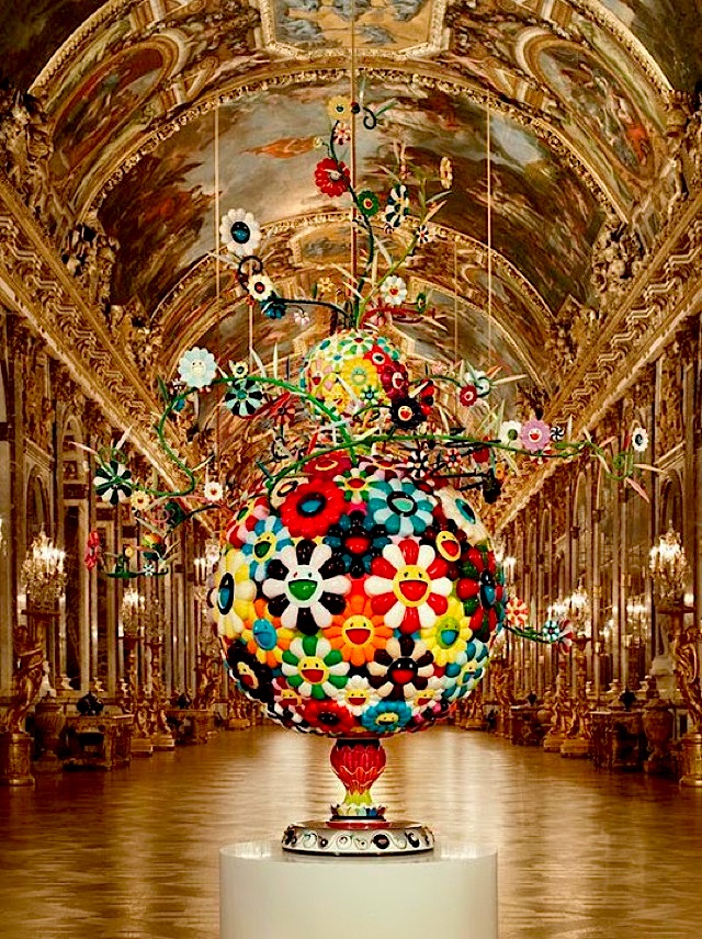
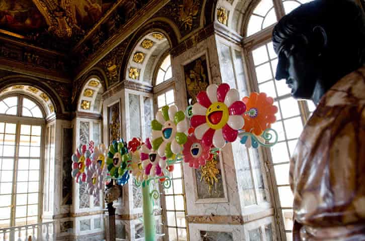
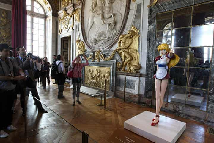
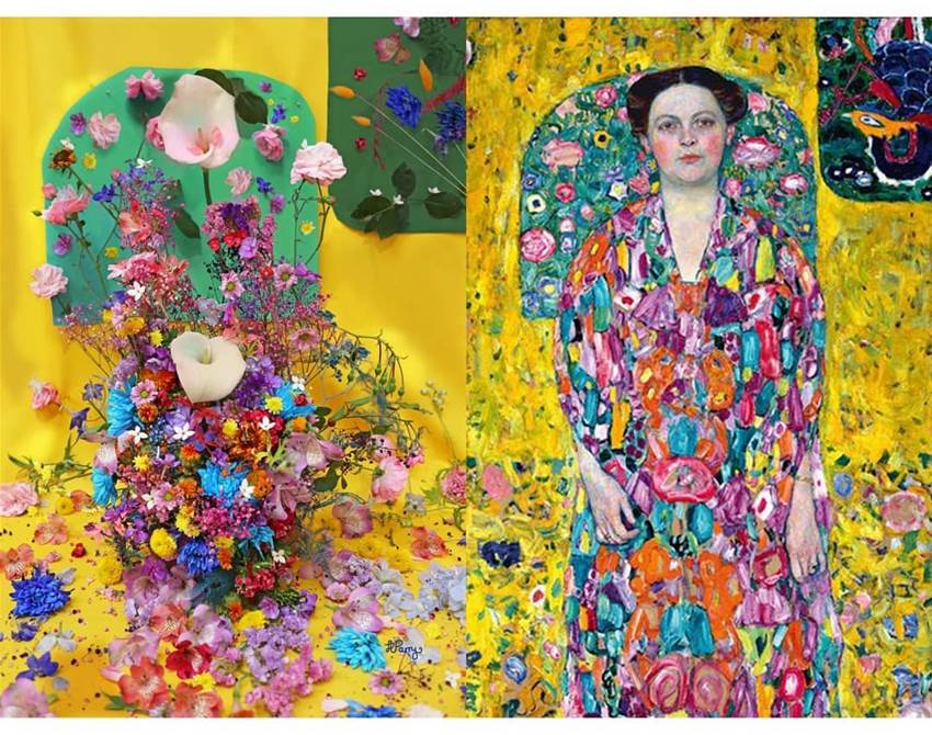
Smiling Flowers construction in Versailles Palace by Takashi Murakami.
Takashi Murakami is a modern Japanese artist who works in each quality arts media, which includes painting, in addition to virtual and industrial media. He appropriates famous issues from mass media and pop culture, then turns them into massive sculptures, “Superflat” paintings, or industrial items which includes collective figures.
Murakami’s sickly-sweet art pieces which are playful Japanese characters decorated in a cutesy technicolour palette, known as “Superflat”. Murakami’s art style, referred to as Superflat, is characterised through flat planes of colour and image photographs related to a individual art style derived from anime and manga. The Japanese have a phrase for this strand of their well-known culture such as Kawaii, which surely represents cuteness or lovability, and lends itself to the whole thing from toys, cartoons and pencil cases to clothing, personal appearance and behavioural patterns. Japanese kawaii additionally may be dark, though, and having grown up withinside the aftermath of the Second World War and the American occupation of Japan, it’s far not often sudden to discover that for every saccharine smile that Murakami paints, there can be an ominous looking evil eye or fang which gives a diffused feel of horror. (Jonathan Wingfield, 16 October 2010)
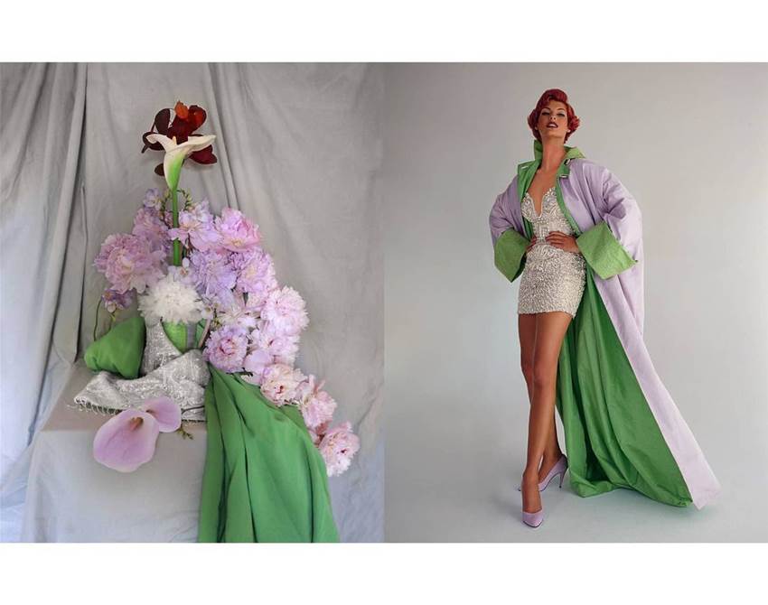
London florist Harriet Parry isn’t content material with simply assembling bouquets all day. With a historical past in best art, she wields an array of blooms, foliage and props like brushes and paints. When she’s now no longer running as a floral stylist (she as soon as organized posies for the Queen), Harriet creates jaw-losing compositions for her series ‘Flower Interpretations’. Each layout is modelled on a well-known painting, a movie nonetheless or style editorial, that is why you may spot her interpretation of a Picasso subsequent to a shot from Bridgerton on her feed. She hopes her creations make visitors pause and admire nature’s wonders (Frankie Team, Frankie, 3 May 2021).
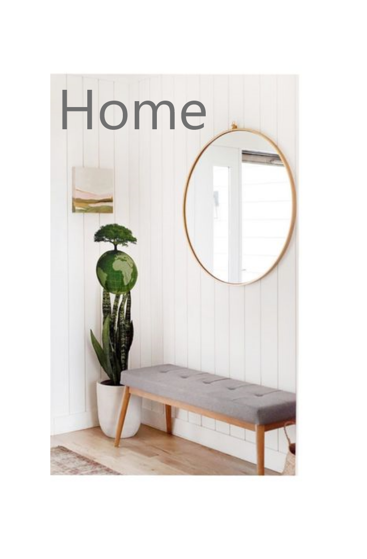
Minimalist indoors layout may be very similar to modern indoors layout and includes the use of the bare essentials to create a easy and uncluttered space. It’s characterized through simplicity, smooth lines, and a monochromatic palette with shade used as an accent. It typically combines an open ground plan, plenty of light, and purposeful furniture, and it makes a speciality of the shape, shade and texture of only a handful of important elements. (Tarkett, n.d.)
Minimastistic interrior design with grown world in the plant world.The neighbourhood of Vilnius, in Raugyklos, Lithuania, a dilapidated local warehouse has been transformed into a beautiful building of studio apartments by DO Architects as part of a revival project. (HomeDSGN team, 7 May 2019)