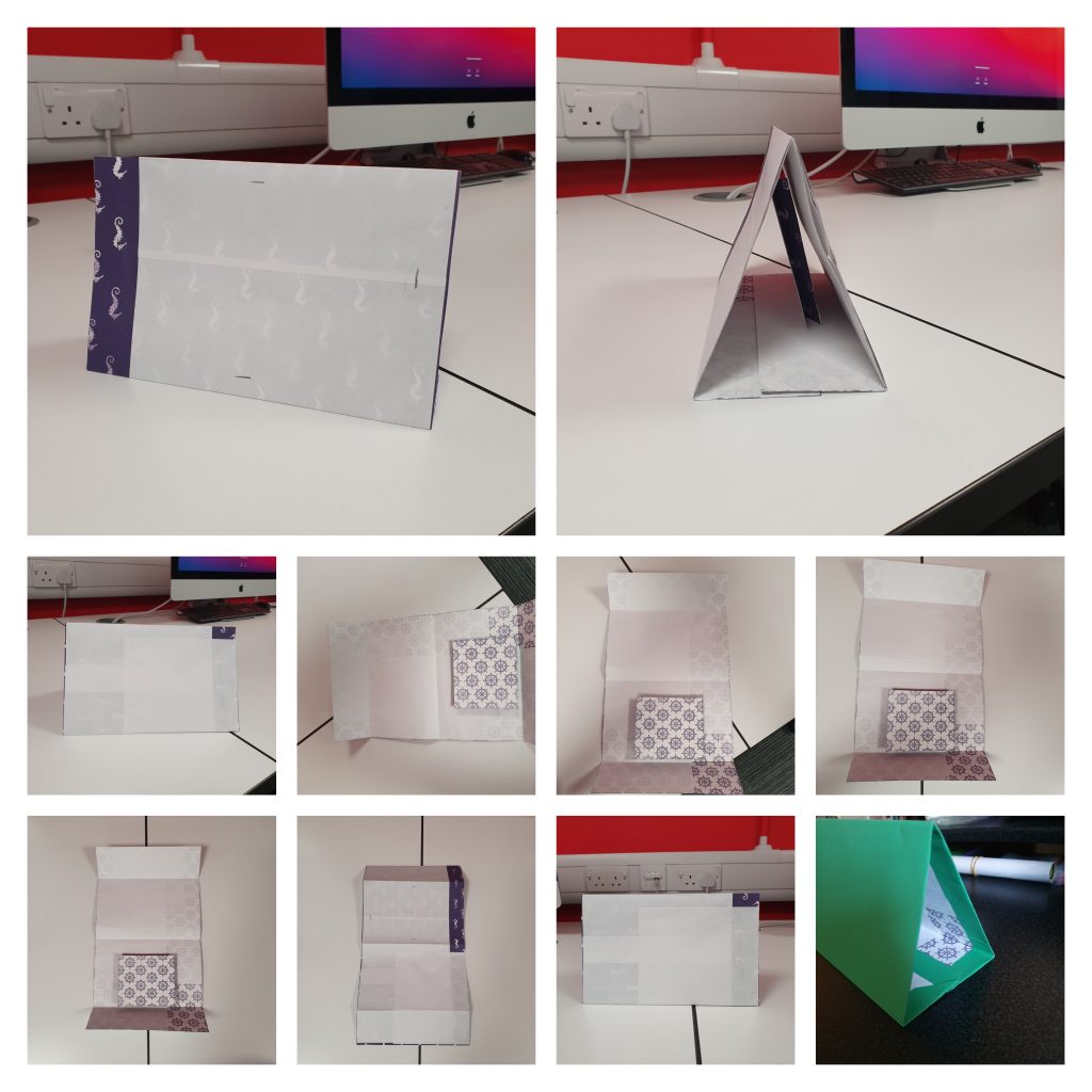
The brochure attracted my eye during my visit to Rooted in Hull because its simple design might be improved and helped to attract customers. The brochure may well be A4 in size, making it readable for customers of all ages. It’s also lightweight and portable, making it ideal for carrying and maybe gifting when delivering food. My first thought was to make a book brochure with a cut out of the Rooted in Hull emblem on the first page. A pocket for a folding calendar and a pocket for a poster will be included on the inside of the brochure. While the structure is made of paper, it can be reused as additional flyer storage. The phrase “Rooted in Hull” is prominent in this brochure, which uses the same colour scheme and style as the logo. Quarter circles will form the pockets, which will be part of a yellow circle within the company’s logo.
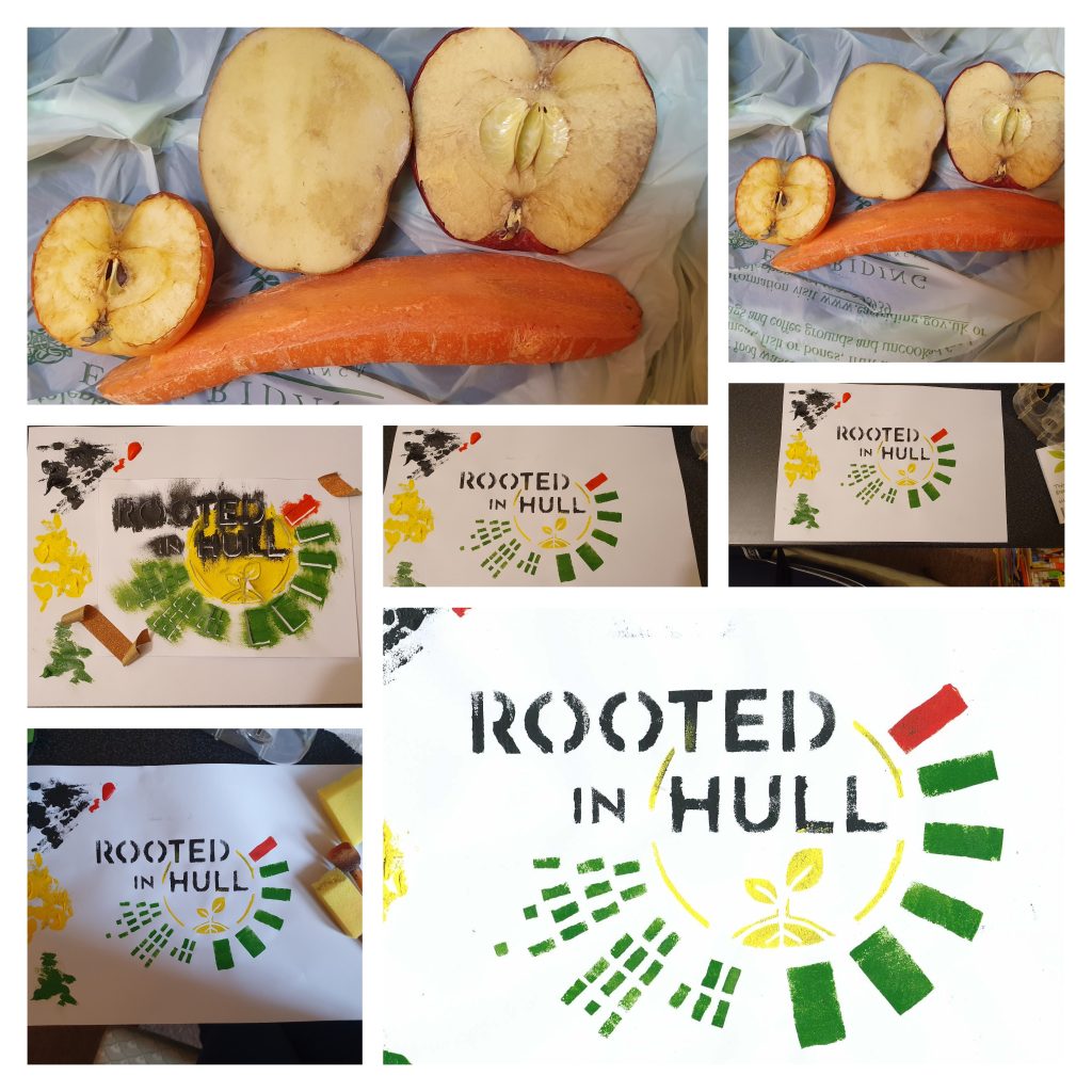
Following the production of the brochure, a foldable calendar will be measured and manufactured so that clients are aware of product trials. A comment on the vegetable and plant growing season will be included each month. For the month’s name, real vegetable stencils will be utilised as the background. Potatoes, carrots, apples, and a small tomato were among the vegetables used to make stencils. The back of the calendar will have recipes related to the vegetable of the month, as well as a few lines for notes. The entire calendar will be green to match the brochure.
Page 2 and 3A2 page showing the location of every container in Rooted in Hull.Back page
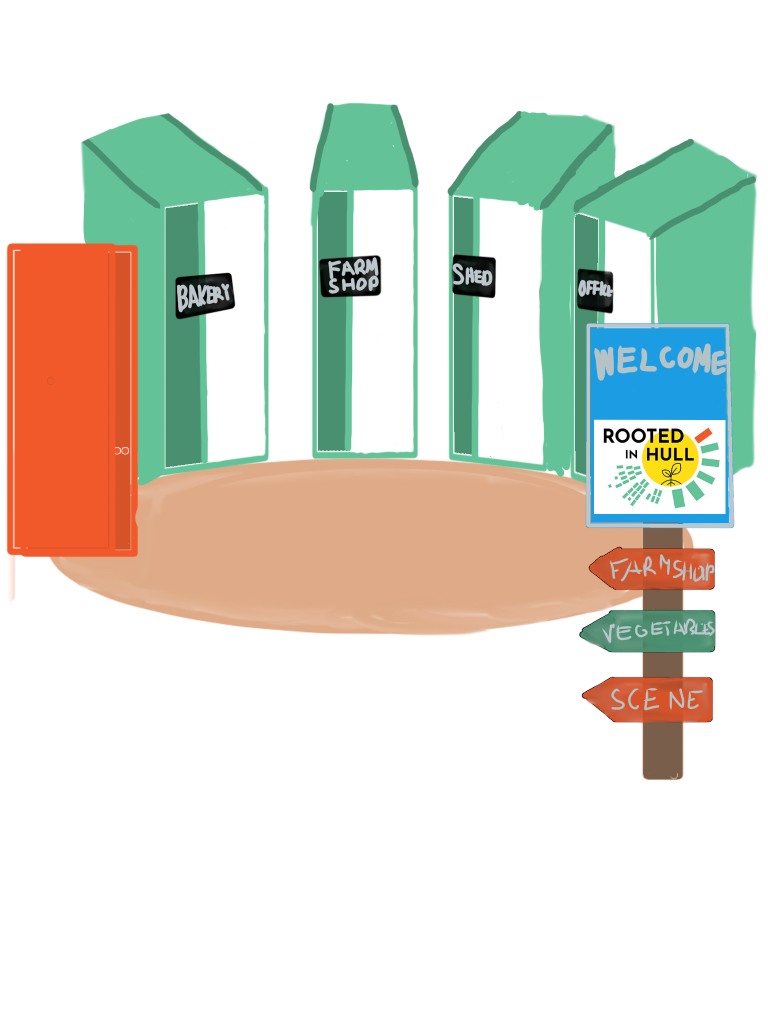
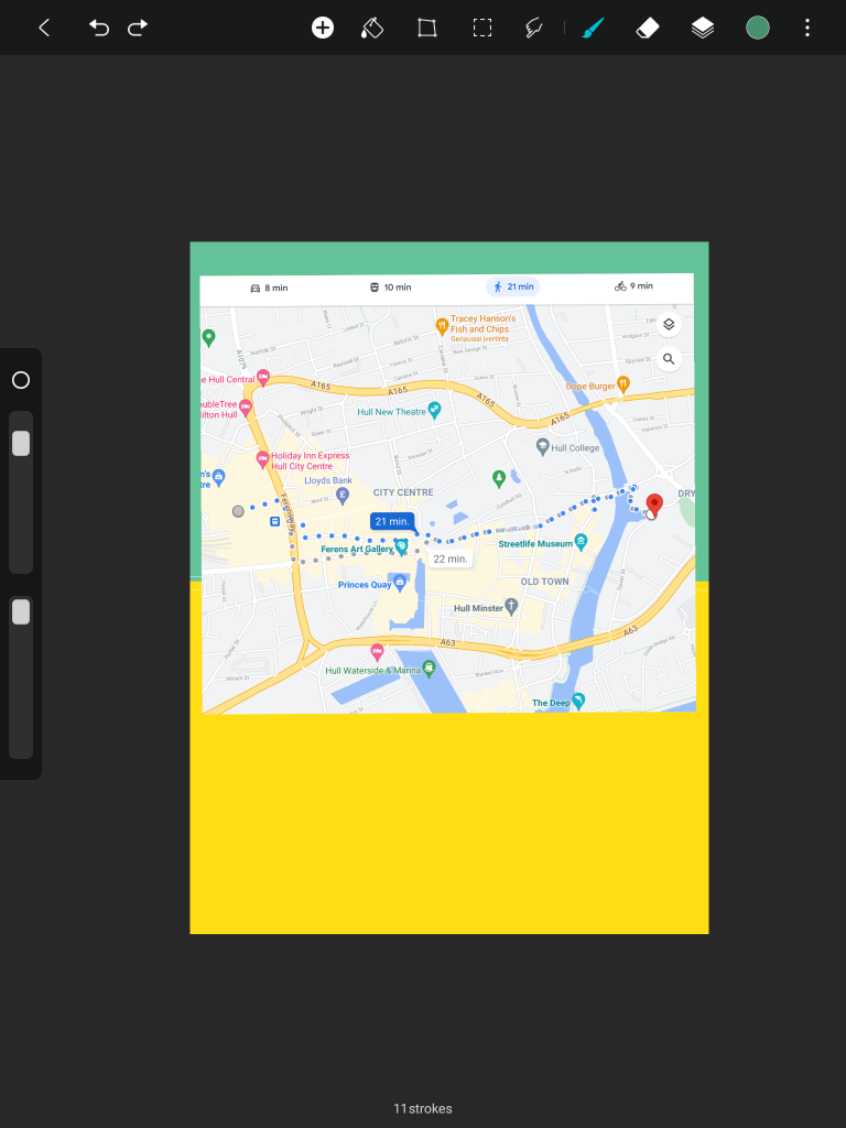
Following the publication of the brochure, an A4 poster will be used to introduce new clients to Rooted in Hull. The Rooted in Hull emblem will be stencilled on the first page. Customers will learn about Rooted in Hull and their beliefs when they open the poster. After that, the customer will fold out an A2 territory map. New customers at the Rail Station or Hull Interchange will be able to determine the most convenient route by looking at the back of the poster, which will include a map.
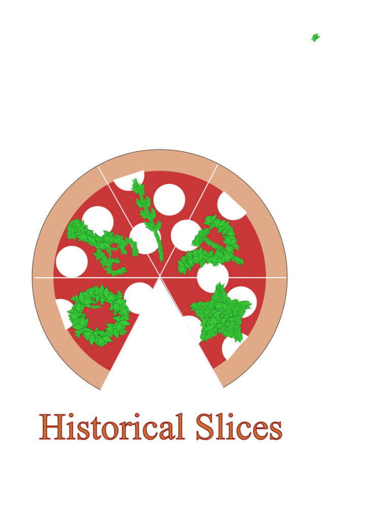
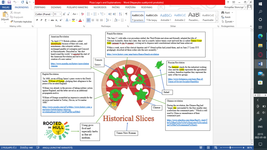
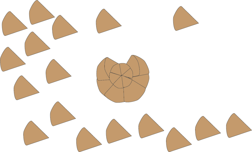
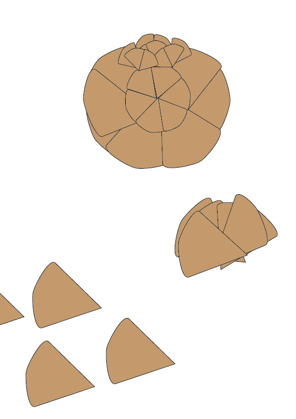
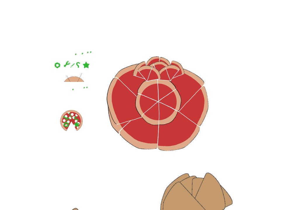
Two logo designs were created as part of my pizza project, based on the client’s preferences and my first concepts. To bring customers together, the design incorporates the sickle and hammer from the Russian Revolutionary banner, as requested by the client. By slicing the pizza into five slices, the client’s interpretation was achievable. Based on the history of the English, American, French, Russian, and Chinese Revolutions, each slice will have a distinguishable element. Salad and herbs abundant in the area, however, were used to unify and construct these revolutions. The entire pizza was reduced to a salad, mozzarella, and tomato sauce, making reference to its 19th-century roots during the American-European migration. To complement my historical pizza, Times, New Roman was chosen. A Rooted in Hull transparent logo will be placed to the bottom corners of both designs.
The logo incorporates many pizza slides to form a tomato, which is often used as a base in pizza and grows in the territory, based on my original concept. Tomato design is similar to the design from above as it has a simple design and a well-known colour scheme. The customer provided comments and suggested improvements to my logo ideas during my visit to Rooted in Hull. Following the input, a third logo concept was created, combining pizza slices with a united call to action represented by two sickles joined together. To match Rooted in Hull, the sickle handles will be green. This time, though, the client gave his bakery the name “The People’s Pizza.”
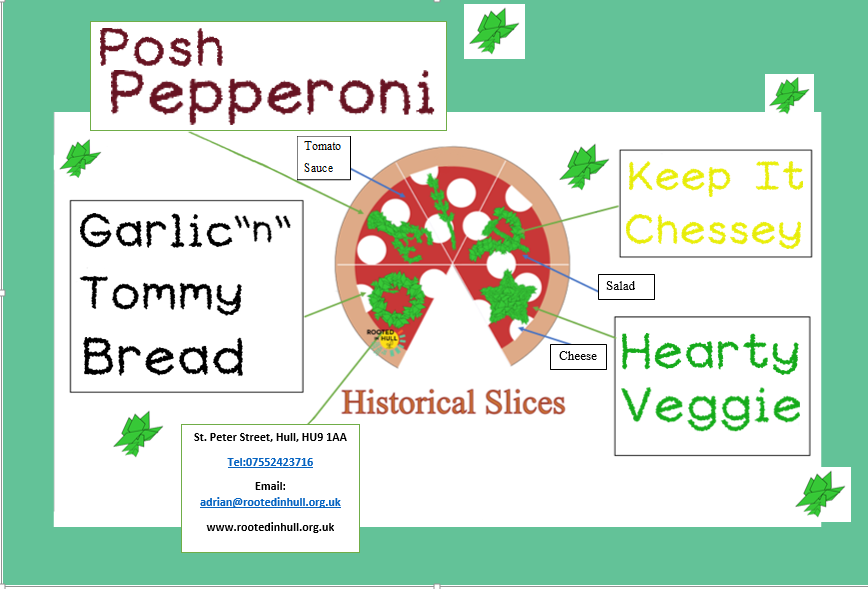
Following the creation of my logos. The flyer’s structure was based on the above-mentioned explanation diagrams. Rather than providing information, each section will include the name of a certain pizza as well as the font. So there will be five parts, four of which will carry the name of the pizza and the bottom box will have the contact information and address. To tie in with the Rooted in Hull campaign, the background will have a light green primary colour border. Each circular box will have a goal that both projects will strive to achieve. Rob Graves font was selected for this poster to tie in with the name labels at Rooted in Hull’s entryway to show where everything is. To associate with revolution, a Times New Roman font was used to the logo name.
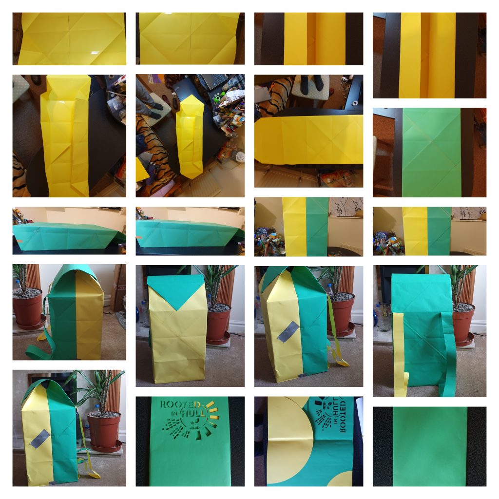
The thermal backpack packing was designed as a mobile billboard for passing individuals in order to deliver flyers. Because it is environmentally friendly, this package is made of origami paper. This structure is made up of two folded boxes held together with sellotape. Two more origami boxes will be included in the bag for distributing pizzas vertically and horizontally. The backpack’s walls will be foil-lined as part of the thermal heating system to keep the pizza warm. Pizza will be laminated for delivery in various locations so that the topping does not slide off and the pizza can be reused for other goods after it is consumed.
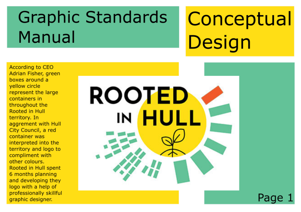
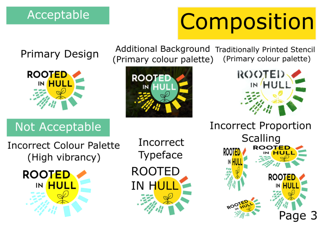
This is my project’s Graphic Standards Manual. The use of logos, colour, and typography is guided by the graphic standards. In every case, the logos must be identical, so it needs to be in the right colours, proportioned correctly, and used in the right situations.
The first page contains the Rooted in Hull logo’s conceptual design as well as its roots. According to CEO Adrian Fisher, the huge containers in the Rooted in Hull region are represented as green boxes around a yellow circle. A red container was interpreted into the territory and logo in collaboration with Hull City Council to complement other colours. Rooted in Hull worked with a professional graphic designer for 6 months to conceive and construct their logo.
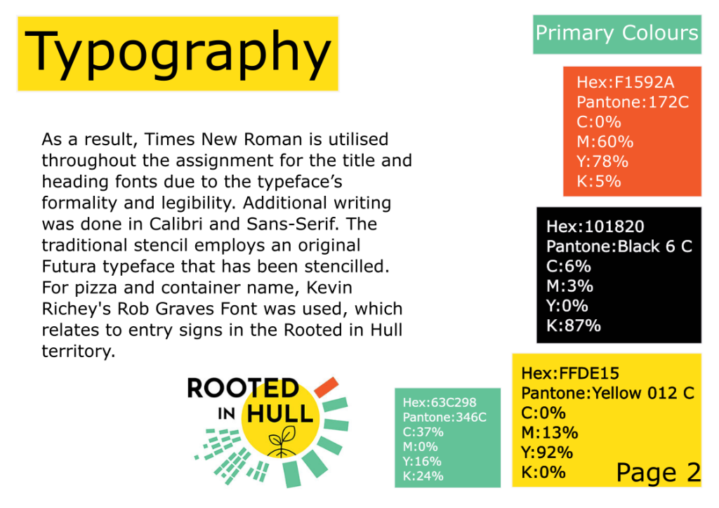
On the second page of this manual, there is a list of fonts that are appropriate and can be used throughout the project. As a result, Times New Roman is utilised throughout the assignment for the title and heading fonts due to the typeface’s formality and legibility. Additional writing was done in Calibri and Sans-Serif. The traditional stencil employs an original Futura typeface that has been stencilled. For pizza and container name, Kevin Richey’s Rob Graves Font was used, which relates to entry signs in the Rooted in Hull territory. Primary colours are employed in the Rooted in Hull logo and throughout the assignment to tie the complete thing together in the right hand corner. Yellow, green, black, and dark orange are the main colours. For printing out flyers and posters, each colour has its own hex number, Pantone general colour scheme, and CMYK percentages. Due to several checks in a range of colour sources, every single measurement is precise.
The third page focuses on the acceptably and unacceptably represented Rooted in Hull logo. Every work associated with Rooted in Hull will use the fundamental colours in a recognisable logo form. This also requires sticking to the same font and not altering the logo in any way. The logo can, however, be recreated in a traditional manner as a stencil label for delivery and purchase purposes, but the logo features should remain the same. A logo with high intensity colours that are eye-burning and do not match the authentic Rooted in Hull logo is not acceptable. Another thing that isn’t permitted is utilising a font that isn’t the same as the original or having additional logo elements put wrongly. Another thing that isn’t acceptable is a Rooted in Hull logo that is missing components, such as the green boxes or the name in black. When you fail to hit shift, the logo becomes disproportional and unreadable, which means it can’t be used for commercial purposes.
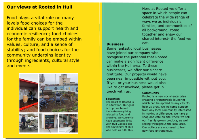
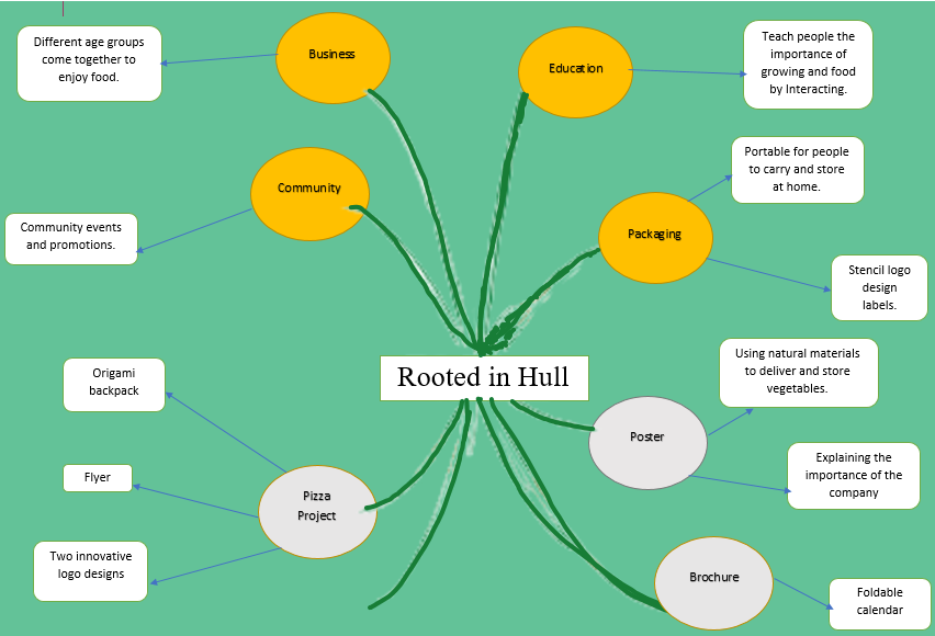
This is my project’s Master Plan of potential initial ideas. The goal of this strategy is to carefully organise to attract clients and increasing the number of individuals who are aware of the organisation. Three areas of the corporation will be explored when making this project: Community, Education, and Business. People of all ages gather in the community to enjoy cuisine and have a good time. Sharing knowledge without teaching is part of education, as is an interest in organic farming. Selling high-quality items to people who can afford them is part of business, and helping individuals who can’t afford it is part of it as well. The major focus of this project will be a brochure package that includes a foldable calendar so that the person can learn how to plant vegetables.
Following the brochure’s development, a foldable calendar will be measured and created to keep clients informed about product studies. Every month, there will be a comment about the food and plant growing season. The background for the month’s name will be made up of genuine vegetable stencils. Recipes for the vegetable of the month, as well as a few lines for notes, will be found on the back of the calendar.
An A4 poster will be used to introduce new clients to Rooted in Hull following the distribution of the brochure. On the first page, the Rooted in Hull be stencilled. When customers open the poster, they will learn about Rooted in Hull and their ideals. The buyer will then fold out an A2 territorial map with all of the container names. New clients at the Rail Station or Hull Interchange will be able to choose the most convenient path by looking at the back of the poster, which will feature a map and contact information for places where they can find them on the Internet, such as social media and websites.
The bakery in the Rooted in Hull territory will be another project. This project will contain potential pizza logo designs, a flyer, and additional packaging made of natural materials that may be carried and stored for the days ahead.
One logo is based on my initial concepts, while the other is based on the client’s request. As requested by the client, the design incorporates the sickle and hammer from the Russian Revolutionary banner to bring customers together. The client’s interpretation was achieved by slicing the pizza into five slices. Each slice will contain a particular element based on the history of the English, American, French, Russian, and Chinese Revolutions. The pizza was reduced to a salad, mozzarella, and tomato sauce, alluding to its 19th-century origins during the American-European migration.
The thermal backpack packing was designed as a mobile billboard for passing individuals in order to deliver flyers. To keep the pizza warm, the backpack’s walls will be foil-lined as part of the thermal heating system. Pizza will be laminated for delivery in various regions so that the topping does not fall off and the pizza can be reused for other purposes after it has been consumed.
Collaboration between Rooted in Hull and the University of Hull to enable new projects and innovative ideas
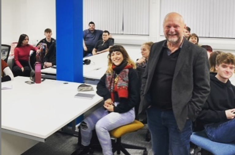
CEO of Rooted in Hull, Adrian Fisher enlisted the cooperation with the School of Arts in the University of Hull on Tuesday, 2nd of November to contribute unique ideas that will help their organisation expand its influence in Hull City Centre.
Figure 1: Adrian Fisher meets the first cohort of Ba (Hons) Graphic Design new program students in the New Facilities Media Centre.
Adrian Fisher, CEO of Rooted in Hull, requested the assistance of the 25 students in the new BA (Hons) Graphic Design program to present unique solutions which will help their organisation increase its influence in Hull City Centre during the discussion on Tuesday, November 2nd.
Figure 2: Rooted in Hull is an organic food seller and supplier which was founded in 2014by two friends who wanted to create a unique location in the city where people could celebrate in many different ways, they enjoy food by producing and cooking. (Rooted in Hull, n.d.)
Various community groups become frequent visitors and volunteers at their site, coming not just to learn about food but also to build confidence, enhance their mental health and overall well-being, make friends, or simply take a vacation from the demands of life. Some of the volunteers are learning business skills, assisting with the cafe’s operations, and even handling site maintenance. (Rooted in Hull, n.d.) The farm shop is in the city centre and can be reached by most buses as their terminal stop is at Hull Interchange, which is convenient for visitors who have never been to Hull before.
According to Adrien Fisher, an elderly lady approached the market kiosk and inquired about the tomatoes. He just knew the type of tomato, not the origins or culture of its consumption, though. The old lady kindly specified that she used to eat these tomatoes on a sandwich with oil in Spain.
Adrian Fisher has as well clarified the food produced and supplied by in his organisation isn’t necessary “healthy,” but also a “good food” which people on a low budget can enjoy in combination with purchasing expensive healthy food. As a reward for their hard work and determination, the CEO of Rooted in Hull received an origami flower art creation from one of the students.
As a Program Leader and Lecturer in Digital Design, Robert Consoli was enthusiastic to find ways to help the organisation while also letting students work with real clients as part of the new programme. With Jason Hayhurst as a Screen Subject Grove Director, Lecturer in Digital Media, and Dr Terry Westby – Nunn as a Film Production Specialist, sees a variety of opportunities in the corporation to go ahead across the School of Arts.
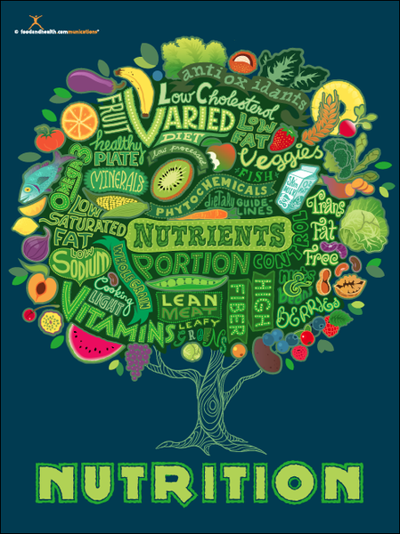
Nutrition tree poster is a great example of typography to describe the importance of nutrients each person requires in their diet. (Nutrition Education Store,n.d.)
Nutrition Tree Poster is a poster produced and sold at Nutrition Education Store which follows the aim of conveying the importance of the nutrients and healthy eating to the person’s daily intake. Proper nutrients need an ability to control your portions and a specific diet which combines more plant-based foods, high fibre and many other required products.
This poster is a great example of typography by implementing different fonts which is the delivery of the typeface to describe the importance of nutrients each person requires in their diets on the daily intake in the form of a tree. In terms of typefaces, the designer used the traditional and in some areas decorative hand lettering which is legible with the help of upper cases and different tones of green. The tree used in poster is representing the life and wisdom to show how the crucial importance of nutrients such as “normal growth, development and ageing, helps to maintain a healthy body weight, and reduces the risk of chronic disease leading to overall health and wellbeing” (NHS, n.d.). So if the person doesn’t receive daily intake of vegetables and protein the consequences could be fatal such as illness and diseases (NHS, 2019). Linking with the an idea of wisdom, tree is just giving knowledge to help the person live longer and enjoy their living by receiving a balanced amount of nutrients as a treatment. In terms of knowledge, this poster would also be used in classrooms to teach children of any age the purpose of nutrients in healthy eating as they are growing mentally and physically. A display of healthy fruits such as vegetables, proteins and dairies give a denotative meaning which links with its purpose such as healthy eating . These small illustrations also reminds us of the accessibility of these nutrients, so you can purchase them in every shop due to being cheap or even grow fruits and vegetables in your garden. Blue and green hues used in the poster visually represents the vintage/retro view to when you first look at it.
“Eat Fruit-Be Healthy” Poster
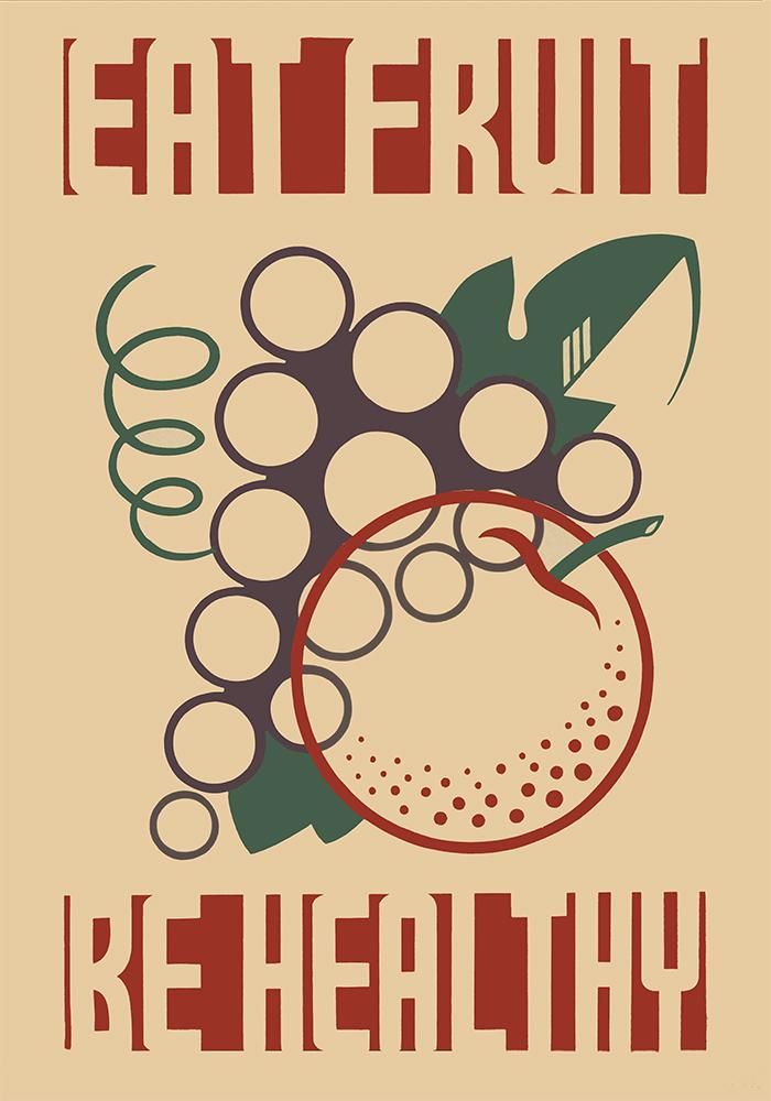
“Eat Fruit – Be Healthy” is a bad example of typography by implementing a simple design to promote the importance of healthy eating. (Vintagraph, n.d.)
This poster is a vintage public information poster promoting healthy diet with the slogan “Eat Fruit – Be Healthy” which was created by the Federal Art Project between 1936 and 1938 to promote proper dietary habits by showing stylised fruit (Richard B. Levine, 1936-1938).
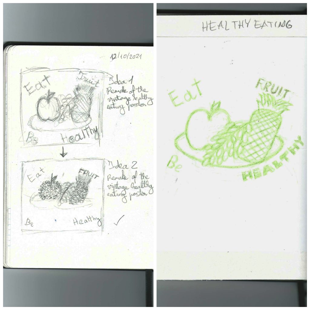
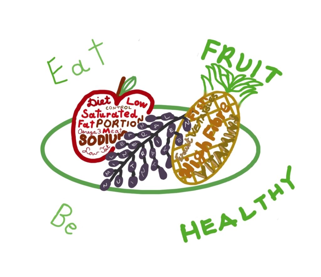
“Eat Fruit – Be Healthy” poster is a good example of typography by implementing with a simple design to promote the important of healthy. However, this poster can be improved by rounding the slogan instead of having it in a rectangle shape, changing to more saturated colour scheme and making the fruit more recognisable because the apple in the poster visually look like an orange, however this poster has an effective use of circles to represent fruit. So, the initial idea was to include typography not only outside the fruit but also the inside the fruit, so the people which are looking at the poster will understand the importance of healthy eating just by looking at the legible hand drawn keywords. In the slogan, the keywords “Fruit” and “Healthy” will be in upper cases only with dark green to highlight the purpose of the poster and in the classrooms to educate pupils of any age. In addition to the apple and grapes on the plate, a pineapple will be added as a circular shaped fruit, and important source of “vitamins and minerals including calcium, manganese, plus vitamins A and C” in our daily diet ( Nicola Shubrook, n.d. ). All fruits and the plate will be drawn using one circular shape which links with the actual poster and have a saturated colour scheme compare to the 20th century poster but at the same time will be recognisable and include uniquely stylised fruit. The hand drawn typography will be drawn, so the keywords will follow the pattern of my hand writing, upper cases and sans script in various tones of reds, purple and yellow ochre which links with the Nutrition Tree Poster in the above. Below, there are my initial sketches, traditional mock up and additional final design ideas.
Figure 1 ( Maisto bankas, 2021): Maisto bankas is a great example of conceptual design by implementing an heart to represent a light of hope, trust and trust in an apple which is an important nutrient in our daily diet.
Maisto bankas is a Lithuanian food organisation which do their best to help people who are suffering from shortage of food and decrease the amount of edible food being thrown away.Their logo can be found next to products in shops and stuck on the yellow bins in the airports.
This logo incorporates the heart shape in an apple to indicate the passing of light of hope, trust and kindness to other people which is shown by an effective section gradient from orange to bright yellow. An apple is an important product in the healthy diet as being one of the key nutrients in 5 a day, so if the daily intake decreases, the person becomes less energetic and start to gain a weak immune system by lacking in vitamins, minerals and many other healthy nutrients (NHS, 2018). This shape links with the main focus of this organisation in terms of every good condition but not used or unwanted product can be given to someone who might eat their apple as their dinner. Apple itself is a food product which can be found in any shop or even market and it doesn’t cost much to purchase. So anyone can buy the apple and give it to a person on the street. The logo is also recognisable and explains the idea of this organisation to the people when they look at this logo by having bold letters in a Lithuanian word “food” as a contextual keyword. Use of negative space around the logo plays important role as it makes the logotype and logomark stand out when people look at it.
Save the Children
Figure 2 (Save the Children, 2021): Save the Children logo doesn’t specify the child conceptually however this logo uses the colours which makes it recognisable as the helping organisation such as Red Cross and others.
Save the Children is a UK based child helping organisation which delivers food, medicine and protection, and holding governments to account for providing for these basic needs themselves because this organisation believes that every child has the potential to change the world. According to the staff, Save the Children organisation is “Driven by becoming the biggest and shiniest charity, Save the Children has lost sight of values it once held. It’s run like a big corporation and staff working on the ground don’t appear to be treated well. The focus is on quantity not quality, with unrealistic targets set in terms of delivering any quality work. Good work is still happening on the ground due to individuals believing in the work, but I don’t believe that it’s a healthy environment for them.” (Guardian, 2015) which links the poor designing of this logo.
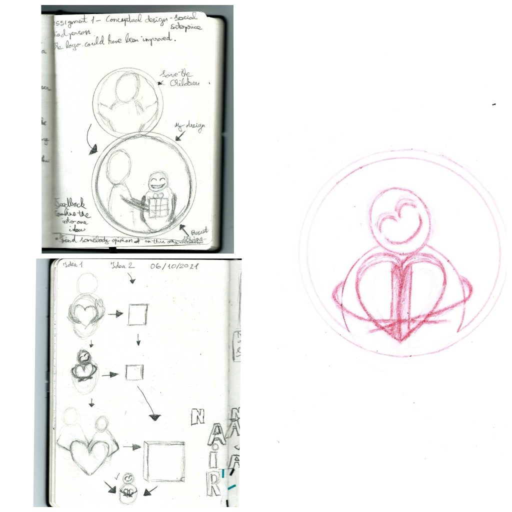
Design process
maller standing straight receiving the present. After few days I analysed my design idea and realised that the idea is too literal, so my greatest mission was to combine the child, adult and present together. So I thought of two similar idea which include hugging a heart or a book with three possible combinations. These combinations include just hugging an item, hugging tightly an item and holding hands with an adult which they hold an item together. I have decided to keep the colour red logomark and black logotype because there isn’t a need to change colours due to their conceptual importance to Save the Children and just the helping organisations in general. However, the item will be shinning to show importance and preciousness to the child which is given from the adult which represents the idea and purpose of the organisation. Then I will sketch the final result with a red erasable pencil and using colour to show visual idea when transitioning into a digital design.
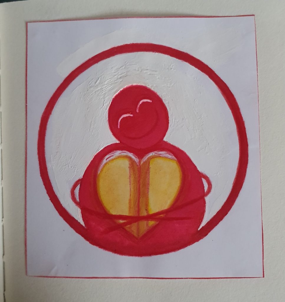
Design sketches
Initial ideas and developments in production of the final design including the pencil outline of final idea. (05-19/10/2021) Mock up of the final design (19/20/2021)
Maisto bankas, 2021 Musu misija (Social enterprise original website) [Online] (n.d.) Available at: :https://www.maistobankas.lt/musu-misija/ [Accessed in 02 October 2021]
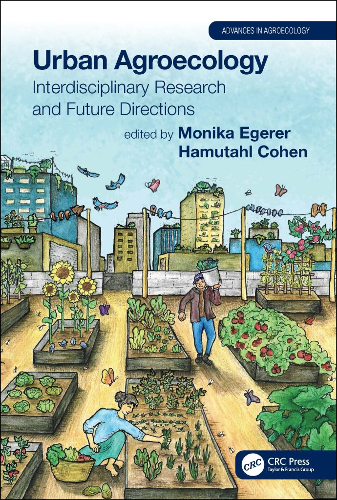
Urban Agroecology is a great example of colour by implementing earthy tones ( Monika Egerer and Hamutahi Cohen, 17 December 2020 ).
Urban Agroecology is a book which people to manage and sustaine the urban farming.
This book cover is a great example of colour by implementing an earthy tones such as blues, browns and greens, and a tint yellows/reds throughout the cover. Background buildings have a balanced amount of blue, yellow and grey tones which refers to thoughtfulness of designer when choosing the colours in terms of links with the sky image by referring to blue as sky, yellow as sun and grey as clouds. Linking with the sky imagery, the shadow blue and larger font typography makes the title and the author to stand out, so when people or even students want to purchase this book for its purpose. The cover itself shows the purpose of urban farming by showing people working in the garden which at first glance might represent a roof top of a three floor building which refers to how people manage and benefit from urban farming. Importance is also shown by growing vegetables in the tops of the buildings such as rooftops, balconies and inside/outside window boxes. Linking back to the first glance, the focal point of this book cover is a shadow yellow building which is further into the city and serves as vanishing point formed “where the orthogonal lines meet” ( Courtney Jordan, n.d. ) for the parallel perspective with a use of blue and tint yellow houses. At the same time, you can also find another focal point which is a post on the right hand side of the exit, however the plant box on the right hand corner isn’t parallel to the tomato box. Visually, the post and the wire could be referred as a place where you would place your laundry for drying which links with nature in terms of using natural resource such as wind to dry your clothes rather than using electricity.
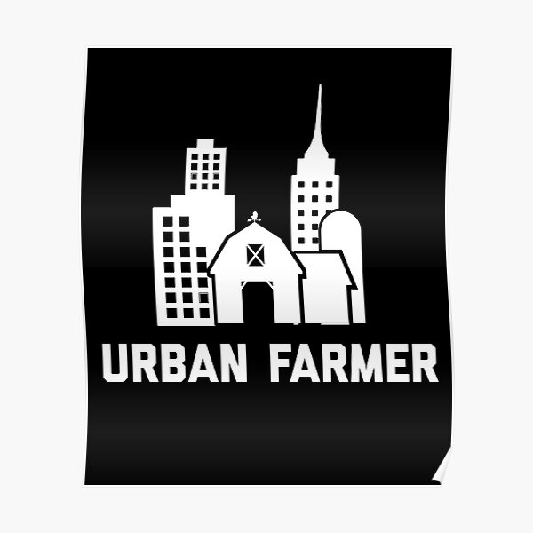
Urban Farmer
Urban is a bad example of colour due to lack of colour in the design. ( ScapegoatPrints, n.d. )
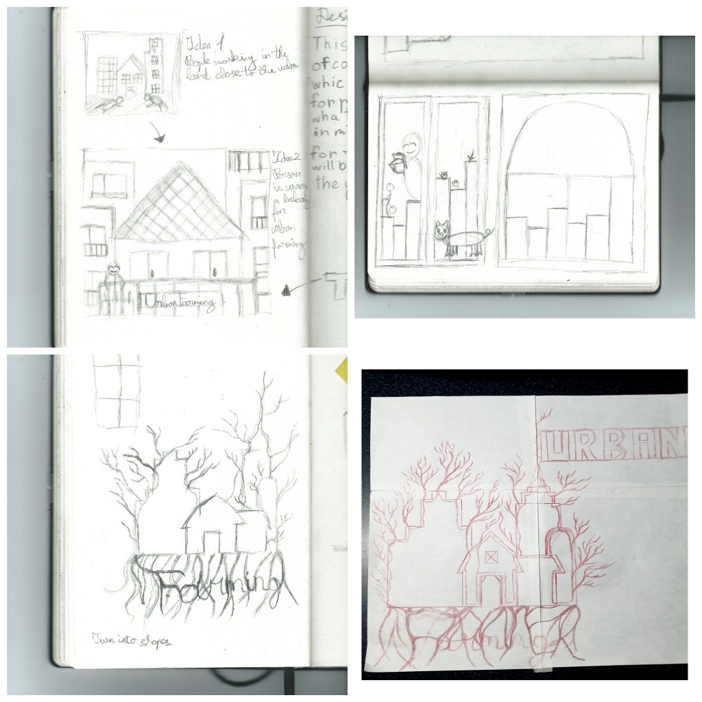
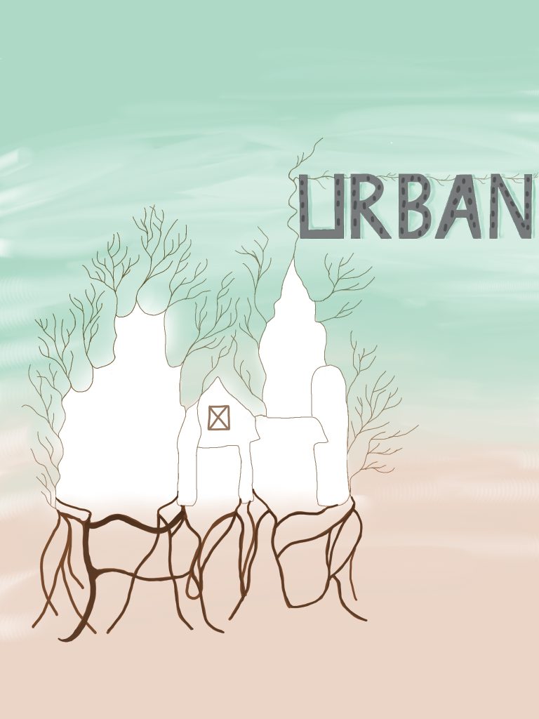
This poster doesn’t take advantage of using colour, however it has a simple and recognisable design. So, my initial idea was to include people working on the land next to the land next to the buildings which will grow fruit and vegetables. However the idea was too literal, so my initial idea was to zoom in into a top of the building and include person placing a plant in the balcony. Once again the idea too literal, I sketched another idea which would involve adding colour and including the typography into the design itself. So I decided to combine five different buildings from the original poster into a one large white tree with branches and roots sticking around to show importance of life in terms of nature in the city. The buildings will be connected by a singular line which will have an imperfection buildings to show a natural growth of buildings rather than perfectly build. I alter my idea by the roots underneath will be spelling “Farmer” which will be identified by darker brown to make the letters stand out and the roots themselves will be placed to form geometric shapes. The top of a skyscraper will have a branch which will spell “Urban” with the windows to represent buildings as letters. Both “Urban” and “Farmer” will be hand drawn in shapes to create a balance between shaped and sharp “Urban”, and smooth and unpredictable “Farmer”. The branches on the left hand side will be in pale brown and smaller to show the growth and natural imperfection of trees. The background will have less saturated green and orange colours which will make the tree and the typography stand out. Below, there is a traditionally drawn mock up and final design of my design idea.
Design sketches
Initial ideas and developments in production of the final design including the pencil outline of final idea. (05-19/10/2021)
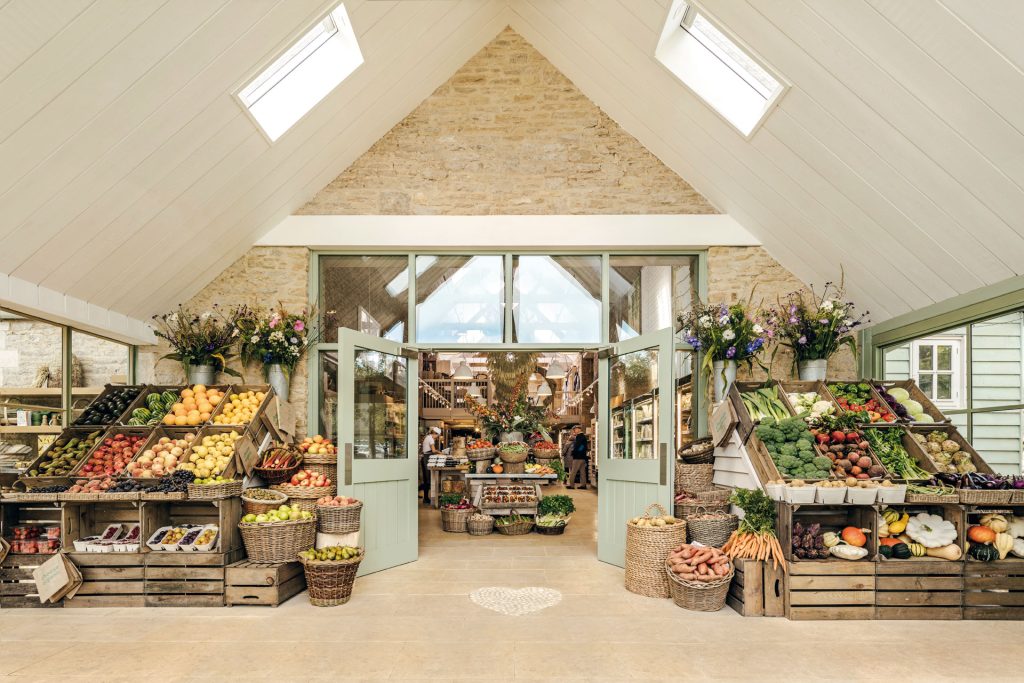
Daylesford Organic is a great example of composition by implementing a parallel perspective.
Daylesford Organic is an organic farm which raises animals and grows vegetables with care and consideration.
The photograph of Daylesford Organic is a great example of composition by implementing table with baskets as a vanishing point formed “where the orthogonal lines meet” ( Courtney Jordan, n.d. ) for the parallel perspective by using the outside baskets filled with fruits and vegetables. These baskets also include repetition by using symmetrically placed baskets at the angle to form rectangles which links with the square windows in the celling and outside, however both sides are asymmetrical due to having different fruits and vegetables on each side. In terms of shapes, the baskets of the side, the flower pots and in the next room represent cones. Linking with shapes, on the floor there is a while heart shape which represents brightness and warm. Photograph itself has a high resolution by all details being really visible and clear due to being taken the professional camera and having a white ceilings. If you zoom in the photograph, you interact with the photograph as though you are walking past these door and find person cooking, as well as customers looking while they are cooking. The photographer has chosen a perfect angle by the baskets and ceiling creating a perfect triangle. On the left hand side, the angled baskets have an analogous transition from a yellow to red and the side baskets have an analogous transition from a tint orange to greenish yellow. However on the right hand side and in the other room, the straight and angled baskets have a complimentary transition between red and green. The side baskets of this side have an analogues transition from orange to yellow. The rooms themselves are extremely bright, so if the weather is horrible, the customer can just come in and get the positive energy.
The image explaining the parallel perspective.
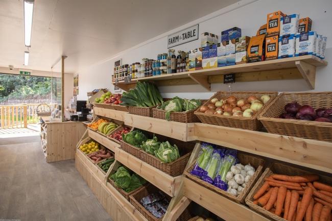
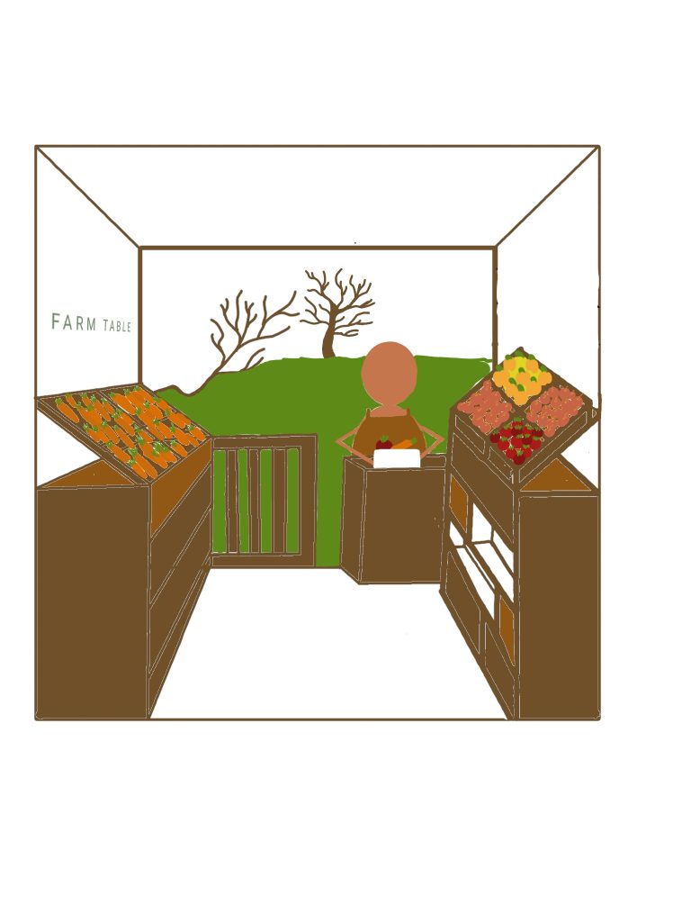
Colwith Farm Shop
Colwith Farm shop image is a bad example of composition by having darker image. ( Colwith Farm Shop, 2021 )
Colwith Farm shop is a farm food shop which was formed to deliver fresh products to the local community. The shop itself is really small but “plentiful stocked farm shop.” (Colwith Farm Shop, 2021)
This image lack in perspective and lighting compare to the Daylesford Organic Farm above. Fruits and vegetables are placed randomly without using a specific colour scheme, however the first column from the customer service has a complimentary set of reds and green. This image could be improved by adding a tree in the outside garden to as a focal point which will represent the parallel perspective which will allow the viewer to zoom in as if they are walking through the farm shop and represent the compatibility of a small show. So, my initial idea is to add a wall on the left hand side to create symmetry. The “FARM TABLE” plate will be in a green sans script and moved to the left hand side which will include baskets with the carrots and draws in the tones of brown. Vegetables in the baskets will use an analogues transition from tint yellow to shadow red. In the customer service desk will have a person preparing a white vegetable box for a delivery to show the care and consideration in the organisation. The simple design of working person can interest the child of any age which will make their parents travel the shop. On top a small fence in the outside, will have a small branch sticking out to represent natural materials. Wall will stay white which give brightness to the vegetables and makes the store wider than it actually is. The drawn image will a use an earthy tones such as greens, blues and browns to link with the nature.
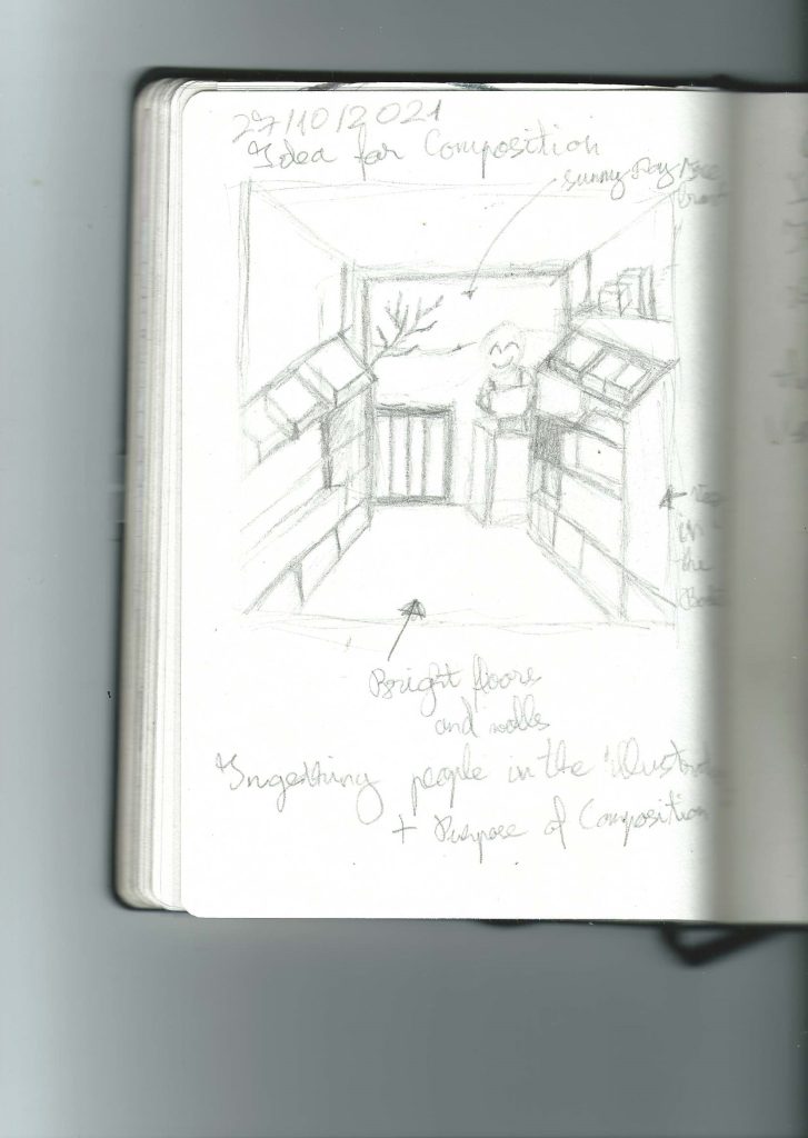
Design sketches
Initial ideas and developments in production of the final design including the pencil outline of final idea. (05-19/10/2021)