Colour
Urban Agroecology
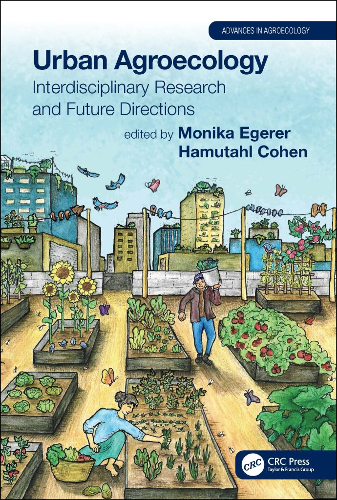
Urban Agroecology is a book which people to manage and sustaine the urban farming.
This book cover is a great example of colour by implementing an earthy tones such as blues, browns and greens, and a tint yellows/reds throughout the cover. Background buildings have a balanced amount of blue, yellow and grey tones which refers to thoughtfulness of designer when choosing the colours in terms of links with the sky image by referring to blue as sky, yellow as sun and grey as clouds. Linking with the sky imagery, the shadow blue and larger font typography makes the title and the author to stand out, so when people or even students want to purchase this book for its purpose. The cover itself shows the purpose of urban farming by showing people working in the garden which at first glance might represent a roof top of a three floor building which refers to how people manage and benefit from urban farming. Importance is also shown by growing vegetables in the tops of the buildings such as rooftops, balconies and inside/outside window boxes. Linking back to the first glance, the focal point of this book cover is a shadow yellow building which is further into the city and serves as vanishing point formed “where the orthogonal lines meet” ( Courtney Jordan, n.d. ) for the parallel perspective with a use of blue and tint yellow houses. At the same time, you can also find another focal point which is a post on the right hand side of the exit, however the plant box on the right hand corner isn’t parallel to the tomato box. Visually, the post and the wire could be referred as a place where you would place your laundry for drying which links with nature in terms of using natural resource such as wind to dry your clothes rather than using electricity.
Urban Farmer
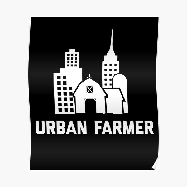
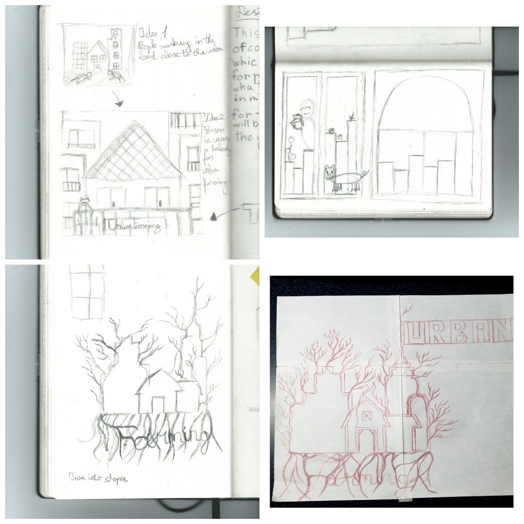
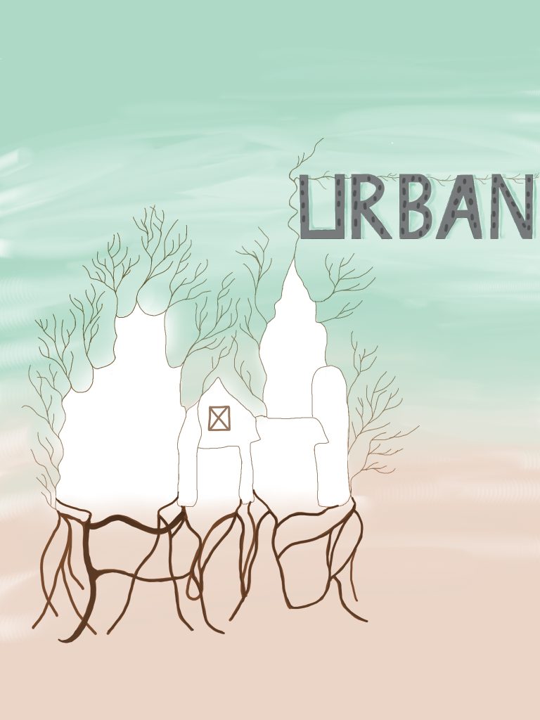
This poster doesn’t take advantage of using colour, however it has a simple and recognisable design. So, my initial idea was to include people working on the land next to the land next to the buildings which will grow fruit and vegetables. However the idea was too literal, so my initial idea was to zoom in into a top of the building and include person placing a plant in the balcony. Once again the idea too literal, I sketched another idea which would involve adding colour and including the typography into the design itself. So I decided to combine five different buildings from the original poster into a one large white tree with branches and roots sticking around to show importance of life in terms of nature in the city. The buildings will be connected by a singular line which will have an imperfection buildings to show a natural growth of buildings rather than perfectly build. I alter my idea by the roots underneath will be spelling “Farmer” which will be identified by darker brown to make the letters stand out and the roots themselves will be placed to form geometric shapes. The top of a skyscraper will have a branch which will spell “Urban” with the windows to represent buildings as letters. Both “Urban” and “Farmer” will be hand drawn in shapes to create a balance between shaped and sharp “Urban”, and smooth and unpredictable “Farmer”. The branches on the left hand side will be in pale brown and smaller to show the growth and natural imperfection of trees. The background will have less saturated green and orange colours which will make the tree and the typography stand out. Below, there is a traditionally drawn mock up and final design of my design idea.
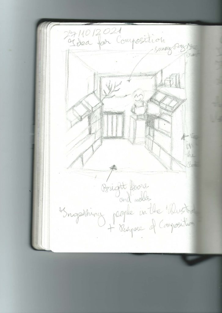
Design sketches
Final design
References
Courtney Jordan, n.d. Putting Perspective Into Perspective (Article) [Online] (n.d.) Available at: https://www.artistsnetwork.com/art-techniques/putting-perspective-perspective-principles-linear-perspective-mark-mary-willenbrink/ [Accessed in 28 October 2021]
Monika Egerer and Hamutahi Cohen, 17 December 2020 Urban Agroecology (Book store website) [Online] (Updated 2021) Available at: https://www.routledge.com/Urban-Agroecology-Interdisciplinary-Research-and-Future-Directions/Egerer-Cohen/p/book/9780367260019 [Accessed in 28 October 2021]
ScapegoatPrints, n.d. Urban Farmer (Educational posters original website) [Online] (n.d.) Available at: https://www.redbubble.com/i/poster/Urban-Farmer-by-ScapegoatPrints/45330654.E40HW [Accessed in 28 October 2021]
Composition
Daylesford Organic
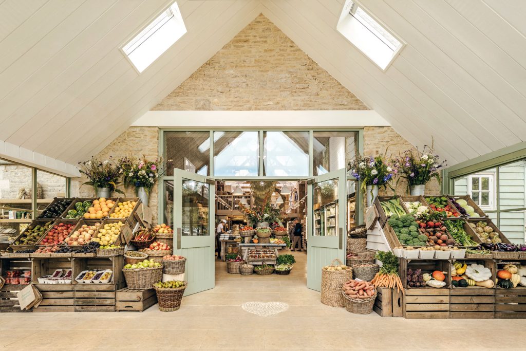
Daylesford Organic is an organic farm which raises animals and grows vegetables with care and consideration.
The photograph of Daylesford Organic is a great example of composition by implementing table with baskets as a vanishing point formed “where the orthogonal lines meet” ( Courtney Jordan, n.d. ) for the parallel perspective by using the outside baskets filled with fruits and vegetables. These baskets also include repetition by using symmetrically placed baskets at the angle to form rectangles which links with the square windows in the celling and outside, however both sides are asymmetrical due to having different fruits and vegetables on each side. In terms of shapes, the baskets of the side, the flower pots and in the next room represent cones. Linking with shapes, on the floor there is a while heart shape which represents brightness and warm. Photograph itself has a high resolution by all details being really visible and clear due to being taken the professional camera and having a white ceilings. If you zoom in the photograph, you interact with the photograph as though you are walking past these door and find person cooking, as well as customers looking while they are cooking. The photographer has chosen a perfect angle by the baskets and ceiling creating a perfect triangle. On the left hand side, the angled baskets have an analogous transition from a yellow to red and the side baskets have an analogous transition from a tint orange to greenish yellow. However on the right hand side and in the other room, the straight and angled baskets have a complimentary transition between red and green. The side baskets of this side have an analogues transition from orange to yellow. The rooms themselves are extremely bright, so if the weather is horrible, the customer can just come in and get the positive energy.
Colwith Farm Shop
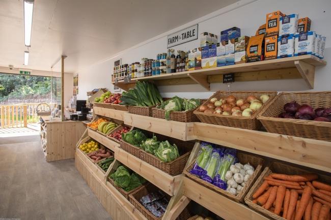
Colwith Farm shop is a farm food shop which was formed to deliver fresh products to the local community. The shop itself is really small but “plentiful stocked farm shop.” (Colwith Farm Shop, 2021)
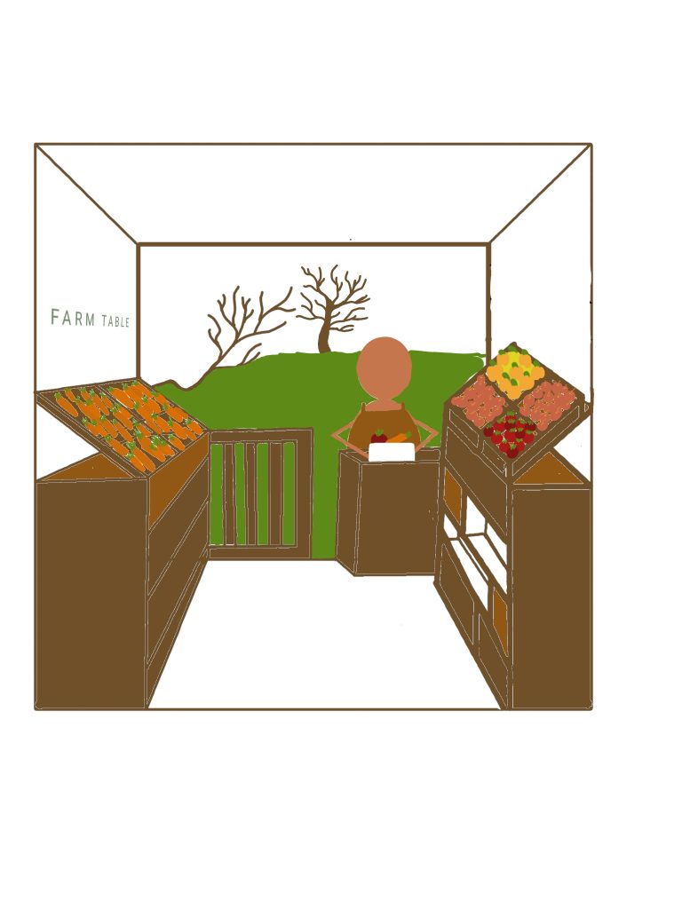
This image lack in perspective and lighting compare to the Daylesford Organic Farm above. Fruits and vegetables are placed randomly without using a specific colour scheme, however the first column from the customer service has a complimentary set of reds and green. This image could be improved by adding a tree in the outside garden to as a focal point which will represent the parallel perspective which will allow the viewer to zoom in as if they are walking through the farm shop and represent the compatibility of a small show. So, my initial idea is to add a wall on the left hand side to create symmetry. The “FARM TABLE” plate will be in a green sans script and moved to the left hand side which will include baskets with the carrots and draws in the tones of brown. Vegetables in the baskets will use an analogues transition from tint yellow to shadow red. In the customer service desk will have a person preparing a white vegetable box for a delivery to show the care and consideration in the organisation. The simple design of working person can interest the child of any age which will make their parents travel the shop. On top a small fence in the outside, will have a small branch sticking out to represent natural materials. Wall will stay white which give brightness to the vegetables and makes the store wider than it actually is. The drawn image will a use an earthy tones such as greens, blues and browns to link with the nature.
Design sketches
Final design
References
Courtney Jordan, n.d. Putting Perspective Into Perspective (Article) [Online] (n.d.) Available at: https://www.artistsnetwork.com/art-techniques/putting-perspective-perspective-principles-linear-perspective-mark-mary-willenbrink/ [Accessed in 28 October 2021]
Colwith Falm Shop 2021 About [Online] (n.d.) Available at: https://www.colwithfarmshop.co.uk [Accessed in 28 October]
Daylesford Organic, n.d. Our Farm [Online] (n.d.) Available at: https://www.daylesford.com/about/what-we-do/ [Accessed in 28 October 2021]