Categories
Illustrator Practical Skills 2D Uncategorized

Culture Jammed Logo T-shirt

This is a Culture Jamming Logo T-shirt with an upside down Nike.

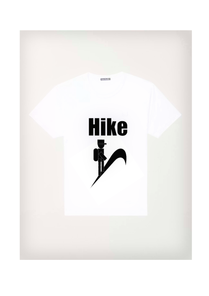
An upside down Nike appears on this Culture Jamming Logo T-shirt. The new logo has the same colour scheme as the old one. Instead of Nike, the design now features Hike, which illustrates a person hiking a hill with a backpack.

In order to create this piece, I used geometric forms to create a figure. The Nike logo was turned 180 degrees after the figure was correctly formed and gathered. Impact was the typography utilised in the new logo. The t-shirt photo was then downloaded from the internet.

References

H and M, n.d. Regular Fit Round-neck T-shirt (Official website) [Online] (n.d.) Available at: https://www2.hm.com/en_gb/productpage.0685816001.html?hier_id=go_cmp-12796663560_adg-126516123092_ad-516052907500_pla-311420097508_dev-c_ext-_prd-en-0685816001003_sig-CjwKCAiArOqOBhBmEiwAsgeLmdTFiNG98I2vML7nzI3H4YkpLBnSWQq-sfK0qvN6yLicTrZlMvfaShoCLtUQAvD_BwE&utm_source=Google&gclid=CjwKCAiArOqOBhBmEiwAsgeLmdTFiNG98I2vML7nzI3H4YkpLBnSWQq-sfK0qvN6yLicTrZlMvfaShoCLtUQAvD_BwE [Accessed in 19 November 2021]

Nike, n.d. (Official website) [Online] (n.d.)
Available at: https://www.nike.com/gb/
[Accessed in 19 November 2021].

Categories
Illustrator Practical Skills 2D

Banner

This is a “You Can Do It” banner encoraging people to believe in their abilities and follow their dreams.

I used a pen tool to trace my own hand with a light brown ink to create this piece. Fill a darker colour with the filling bucket once my hand has been traced properly. Both sides of the banner were copied and transferred by hand. The banner’s typography was bold Sans Serif.

Clenched Fist used in the banner to show requirement to united for similar purpose.
Categories
Illustrator Practical Skills 2D

Propaganda Poster

This is a Propaganda poster with a tree branch sticking out encouraging people to grow more trees.

In order to create this piece, I applied geometric forms to create a hand. Geometric tree branches were gathered together after the hand was successfully formed. However, the poster needed to be improved, thus the geometric construction was replaced with a real hand pointing its finger at the audience. A pen tool was used to sketch in the entire hand and tree branches. This poster’s typography was bold Sans-Serif.

Improved Propaganda poster with a tree branch sticking out as a pointing finger encouraging people to grow more trees.
Original reference image used for the Propaganda poster.
Categories
Illustrator Practical Skills 2D

University of Hull Icon – Reimagined

First University of Hull symbol logo reimagined with geometric shapes.
Second University of Hull symbol logo reimagined with geometric shapes.
Third University of Hull symbol logo reimagined with geometric shapes.

This is a reinvented University of Hull symbol logo with geometric forms. The construction’s original symbol was a fire.

To create the triangles in this painting, I utilised a white arrow to ensure that they are authentic to the actual sign. Then I duplicated them and reassembled them into a flower. However, the fire colour palette must be maintained. The pattern tool was pushed and some shapes were repositioned after the flower and petals were completed. The technique was then performed for two more possible modifications.

Categories
Illustrator Practical Skills 2D

Personal Calling Card

This is a calling card with the interpretation of nature by a butterfly flying its flower.

In order to make this calling card stand out, I interpreted a flower calling my name in black. Tulip will be surrounded by an orange border. So, using a red butterfly with a white outline, the tulip was screaming my name. Outside, the background will be blue, making the flower and butterfly stand out. I used a shape tool in Adobe Illustrator to create rectangles and rhombuses for this card. I used outline and then ungroup to resize each letter for Sans-Serif typography.

References

Britannica, n.d. Tulip (Informative article) [Online] (n.d.)
Available at: https://www.britannica.com/plant/asphodel-plant
[Accessed 14 October 2021].

Categories
Illustrator Practical Skills 2D

Big Sing and Little Big Sing

This is a Big Sing- Little Big Sing banner advertisement with note overprinting.

In order to create this piece, I employed geometric forms to create a note. A pattern was created by putting together a few notes. A pattern was successfully multiplied using a group tool. The banner’s typography was Times New Roman. At the bottom of the banner, the name, time, and small icons of music authority were added.

References

East Riding Music Service, 2021 (Official website) [Online] (n.d.)
Available at: https://www.eastridingmusicserviceonline.co.uk/site/
[Accessed 4 November 2021].

Categories
Illustrator Practical Skills 2D

Riddle

This is a Rebus Logo design for the I Love Zero organisation in Pocklington. This company sells organic products and allows customers to fill up house chemicals.

In order to create this piece, I used geometric elements to create a heart. After successfully constructing the heart, it was grouped and replicated to create a big flower. This piece’s typography was handwritten to complement the flower.

This is “I Love Zero” official logo located in Pocklington.

References

I LOVE ZERO, 2021. (Official website) [Online] (n.d.)
Available at: https://www.ilovezero.co.uk
[Accessed 28 October 2021].

Categories
Illustrator Practical Skills 2D

Piece with hearts

This is I Love Flowers construction by using green hearts.

In order to create this piece, I used geometric elements to create a heart. After successfully constructing the heart, it was grouped and replicated to create a big flower. This piece’s typography was handwritten to complement the flower.

Geometric heart construction stages from a single heart to a flower.
Categories
Illustrator Practical Skills 2D

AESTHETICA 2023

An “AESTHETICA 2023” book cover with the use of illegibility in typography and contrasting photograph.

This is an AESTHETICA 2023 cover with unreadable typography and an image. Fares Micue, a self-taught Spanish photographer, took this shot of a woman with floating origami butterflies all around her (Fares Micue, 2021). A distorted Sans Serif typeface was utilised for the cover typography.

A shot from a stock was used to create this piece. The utilising letter symbol then outlined the word “AESTHETICA.” The letters were placed in the column and deformed with a white arrow after hitting ungroup. The letters were then regrouped and made white. The numbers “2023” were likewise twisted in the same way. At the right-hand side edge is a little BAFTA logo.

References

BAFTA, 2021 (Official website) [Online] (n.d.) Available at: https://www.bafta.org [Accessed in 21 October 2021]

Fares Micue, 2021, ITSLIQUID, Featured Artist: Fares Micue. (Hitting the headlines article) [Online] (Updated 02 December 2021)
Available at: https://www.itsliquid.com/featuredartist-faresmicue.html
[Accessed 21 October 2021].

Categories
Illustrator Practical Skills 2D

Exit Velocity 2022

This is an Exit Velocity.22 Postcard with an original images and scream typography.

This is an original image Exit Velocity.22 Postcard with scream typography. The original photograph of a Duke Castle on the front of the postcard was taken during my summer vacation in Lithuania. The back of the postcard features a photograph of the Graduate School building with screaming black writing.

Paper was halved and two pictures were imported to create this piece. The typography was handwritten to ensure that the typeface was accurate.

Scream Font used in the Exit Velocity.22 Postcard which contrasts with the name of showcase. (Dreamstime n.d.)

References

Dreamstime, n.d. Scream fonts (Online photo stock ) [Online] (n.d.)
Available at: https://www.dreamstime.com/stock-image-scream-font-my-i-entitled-image38495301
[Accessed in 21 October 2021].