Categories
Illustrator Practical Skills 2D

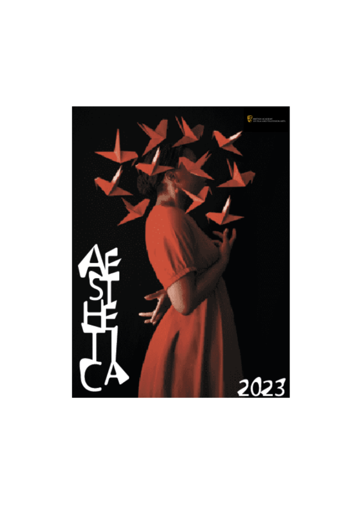
AESTHETICA 2023

An “AESTHETICA 2023” book cover with the use of illegibility in typography and contrasting photograph.

This is an AESTHETICA 2023 cover with unreadable typography and an image. Fares Micue, a self-taught Spanish photographer, took this shot of a woman with floating origami butterflies all around her (Fares Micue, 2021). A distorted Sans Serif typeface was utilised for the cover typography.

A shot from a stock was used to create this piece. The utilising letter symbol then outlined the word “AESTHETICA.” The letters were placed in the column and deformed with a white arrow after hitting ungroup. The letters were then regrouped and made white. The numbers “2023” were likewise twisted in the same way. At the right-hand side edge is a little BAFTA logo.

References

BAFTA, 2021 (Official website) [Online] (n.d.) Available at: https://www.bafta.org [Accessed in 21 October 2021]

Fares Micue, 2021, ITSLIQUID, Featured Artist: Fares Micue. (Hitting the headlines article) [Online] (Updated 02 December 2021)
Available at: https://www.itsliquid.com/featuredartist-faresmicue.html
[Accessed 21 October 2021].

Categories
Illustrator Practical Skills 2D

Exit Velocity 2022

This is an Exit Velocity.22 Postcard with an original images and scream typography.

This is an original image Exit Velocity.22 Postcard with scream typography. The original photograph of a Duke Castle on the front of the postcard was taken during my summer vacation in Lithuania. The back of the postcard features a photograph of the Graduate School building with screaming black writing.

Paper was halved and two pictures were imported to create this piece. The typography was handwritten to ensure that the typeface was accurate.

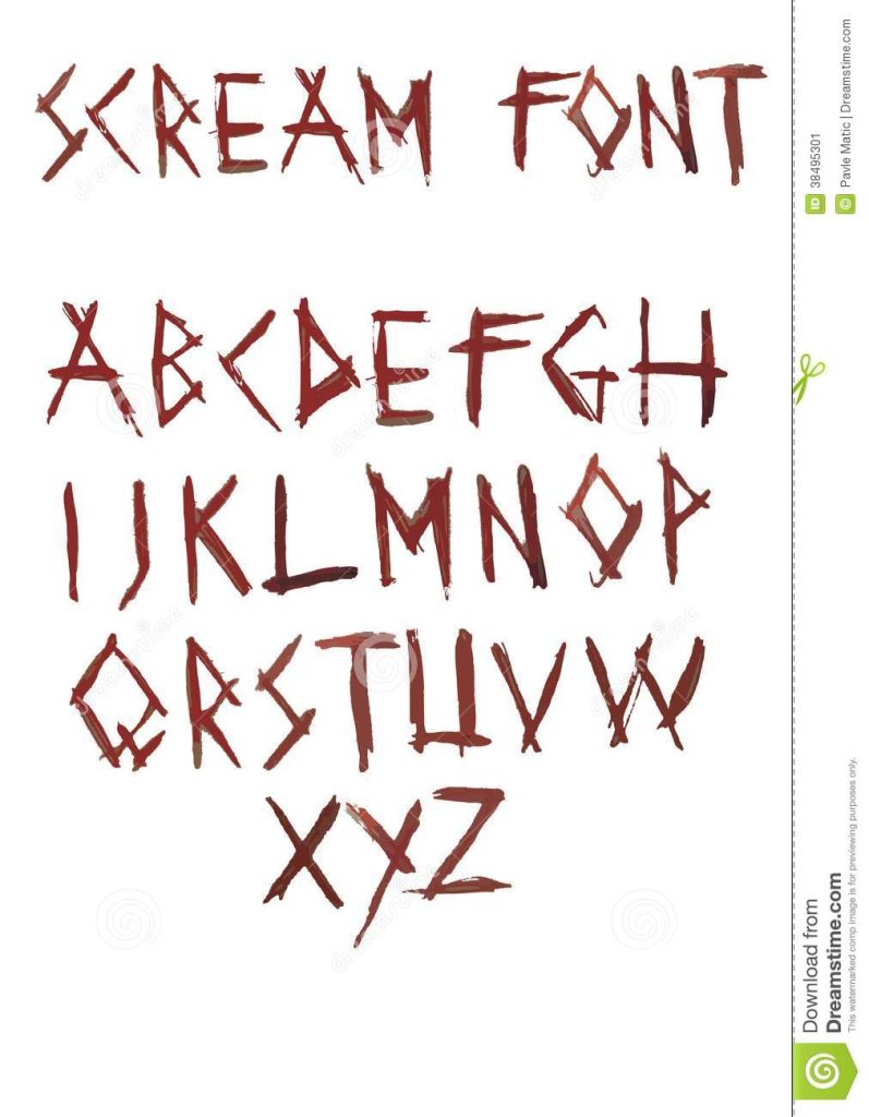
Scream Font used in the Exit Velocity.22 Postcard which contrasts with the name of showcase. (Dreamstime n.d.)

References

Dreamstime, n.d. Scream fonts (Online photo stock ) [Online] (n.d.)
Available at: https://www.dreamstime.com/stock-image-scream-font-my-i-entitled-image38495301
[Accessed in 21 October 2021].

Categories
Illustrator Practical Skills 2D

Cottingham Springboard 2022

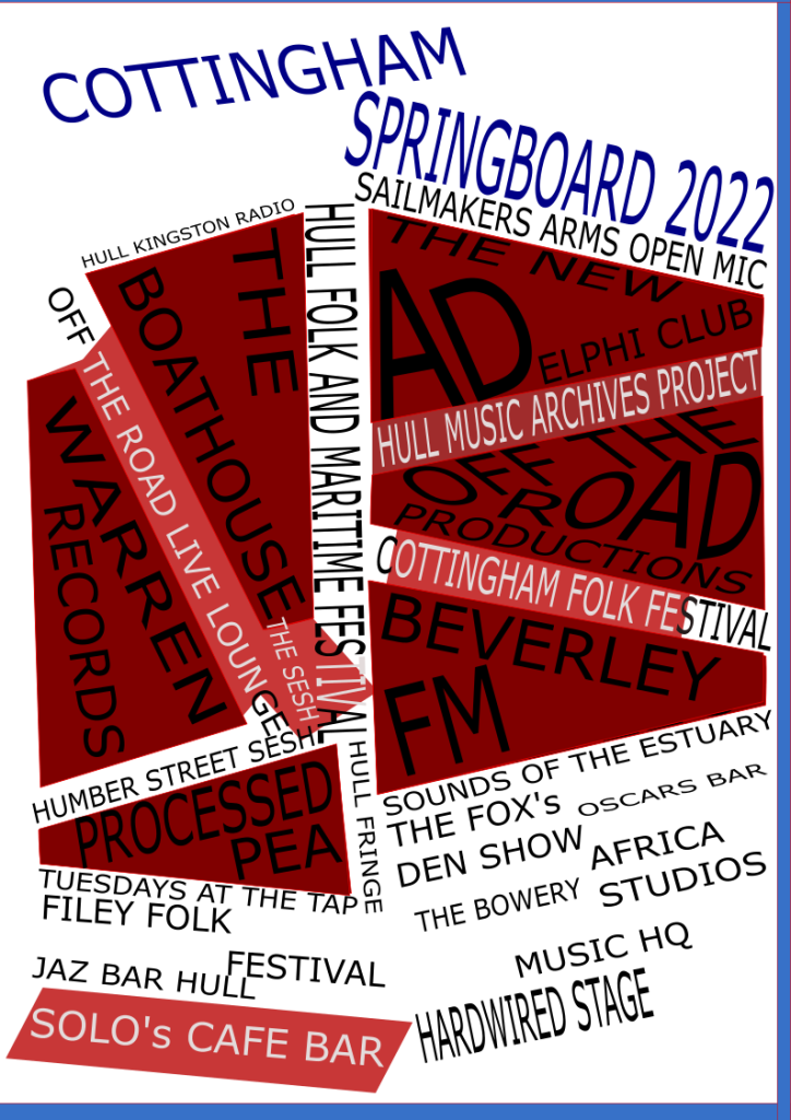
This is a poster for the Cottingham Music Festival, which was inspired by two well-known artists.

This is a Cottingham Music Festival poster that was inspired by Paula Scher’s typography arrangement and Aleksander Rodchenko’s use of megaphones to create triangle compositions, as well as the three-color palette utilised in most Russian posters. The design, however, does not have a perfect layout; an adjustment was done below.

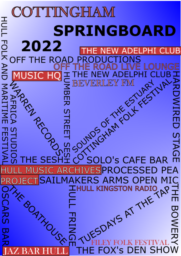
Improved version of Cottingham Springboard 2022 poster.

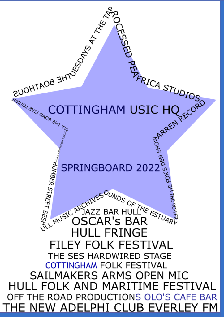
Although the change wasn’t as precise as it should have been, the poster was improved once more. This time, though, the banner will feature a star made up of words and other names arranged in a music throthy. The colour palette for the entire poster will be blue. Sans-Serif and Trebuchet MS were utilised in the poster’s typography.

Final development of Cottingham Springboard 2022 poster.
Categories
Practical Skills 2D

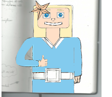
Selfie robot- Hello and ready to go

I really enjoyed this experiment and it was a very interesting experiment. For next time I would add more colour the design and improve the hair. I would also experiment with shapes a little bit more.

Improved Selfy robot design with a scanned background.