Categories
Development Log

Dev Log 6 – Google Chrome Experiments

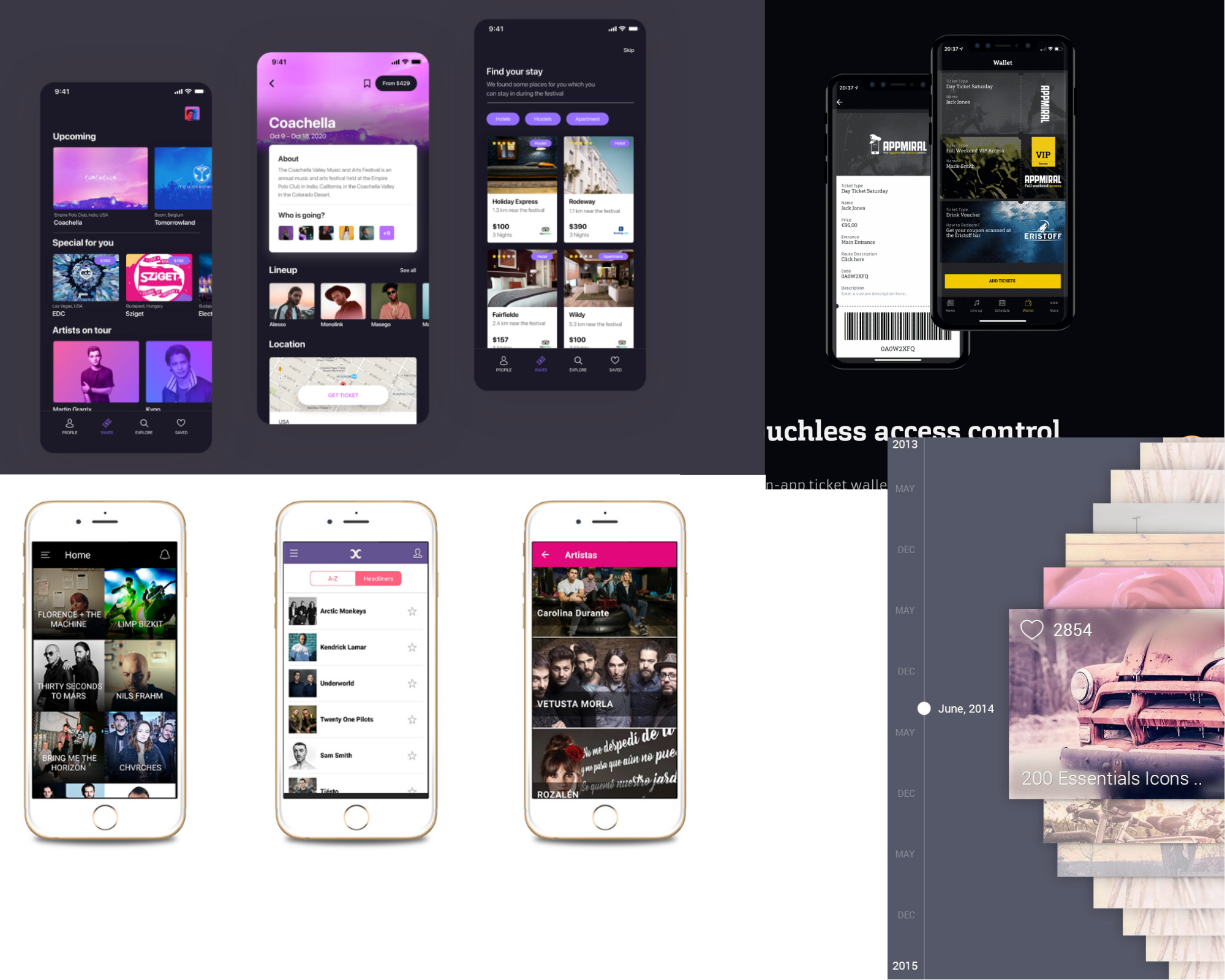
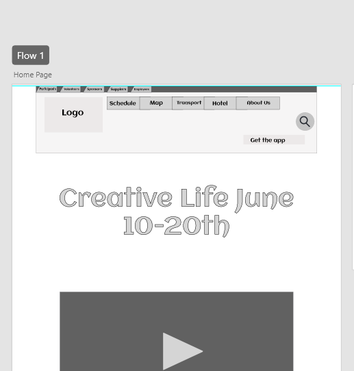
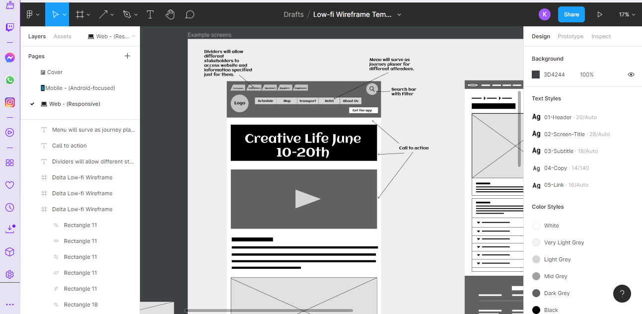
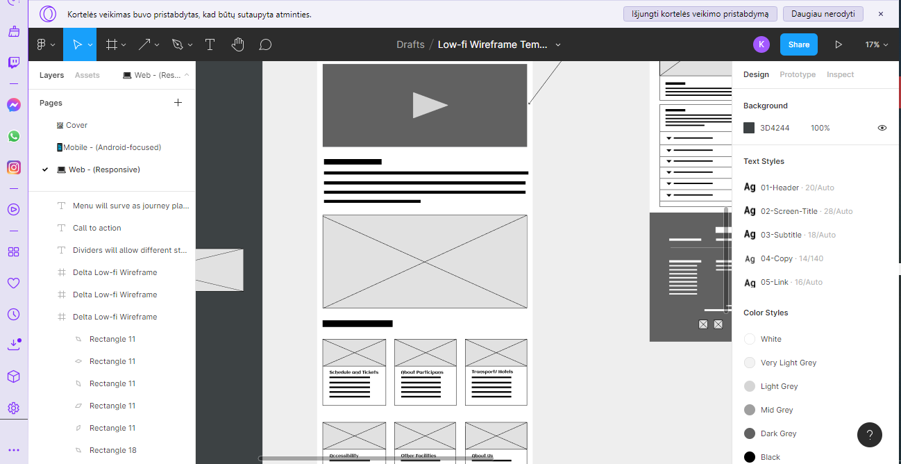
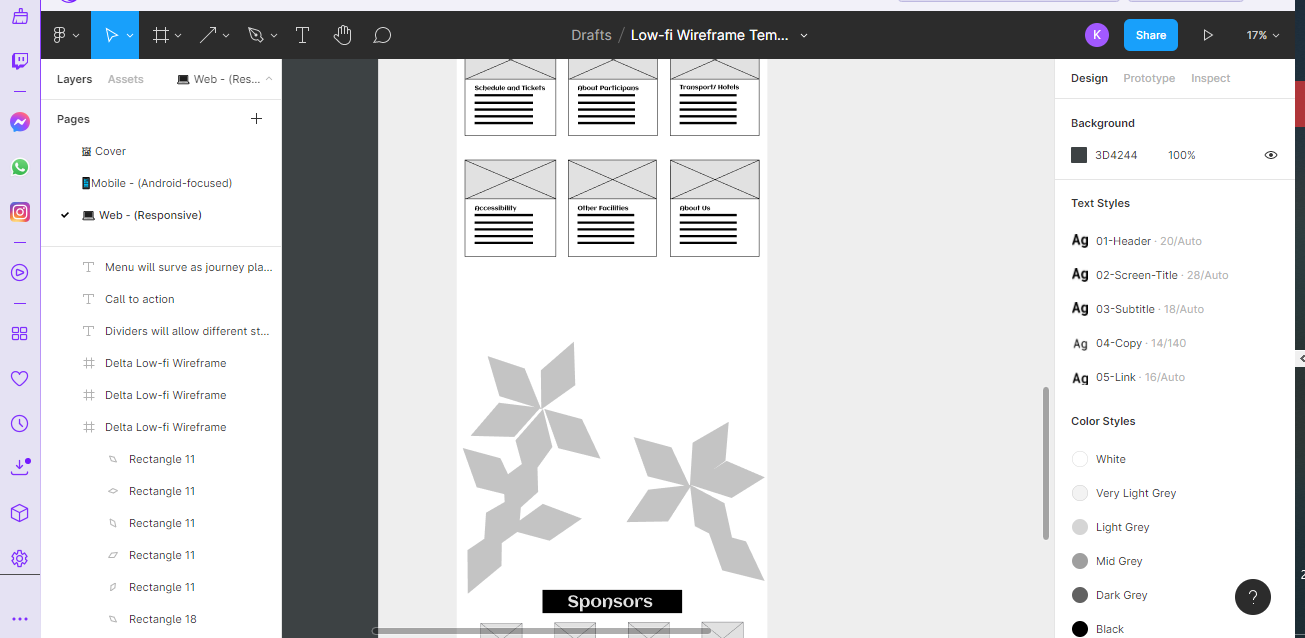
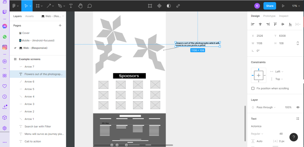
During the coding experiments, Google Chrome Experiments caught my curiosity in the use of HTML codes to build transitions using items of my choice if the code is done correctly.

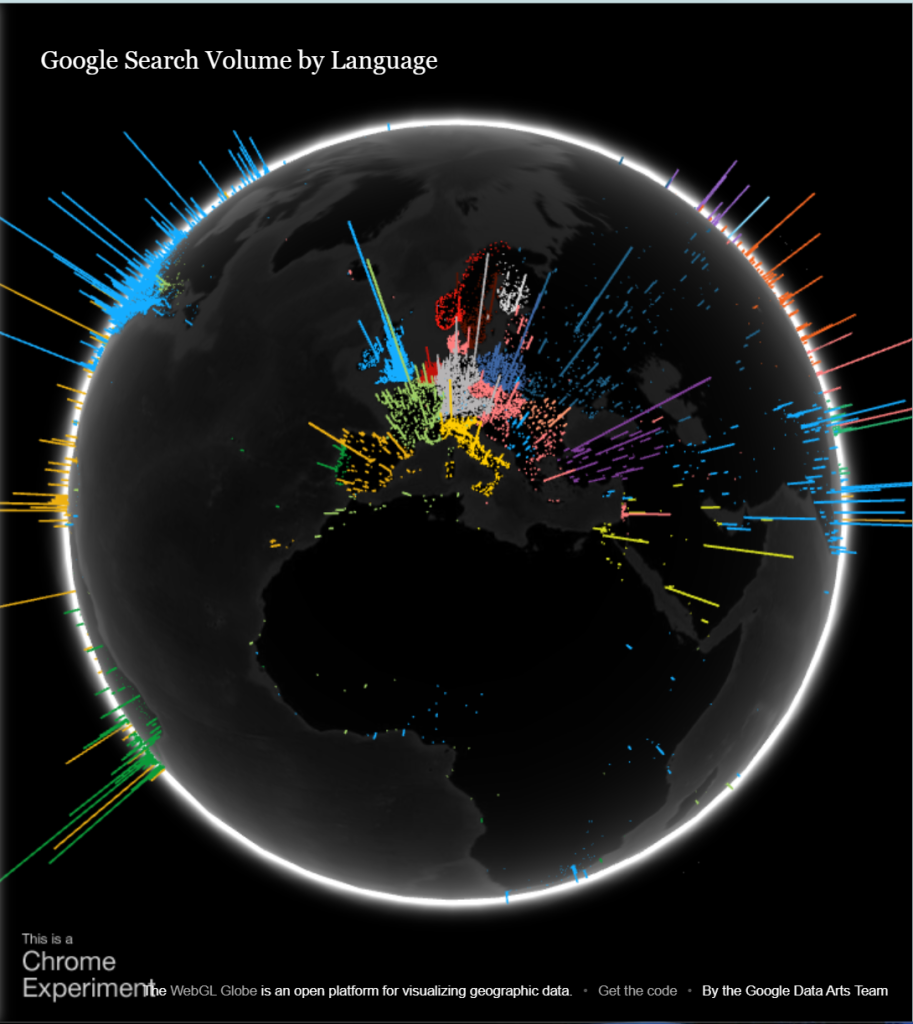
First Experimentation – Google Search Volume by Language  

Figure 1 : This interactive experimental displays the languages that are often used worldwide in Google Search. The globe can be navigated using the mouse, thus in addition to providing accurate facts, it also draws the visitor in with its visual appeal and encourages them to stay on the website longer (Google Data Arts Team, n.d. ).

Second Experimentation – Webgl Particle Audio Visualizer 

Figure 2: This amazing particle goes together with the audio’s linguistic movement thanks to the verbal audio visualiser. The Web Audio API is used in this experiment to hear input from your microphone. Based on this information, a WebGL visualization changes its shape and creates a particle system (Sehyun Av Kim, Experiments with Google, Februaby 2018 ).

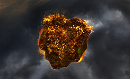
Third Experimentation – Flame  

Figure 3: A 3D fractal flame that is created by inputting letters is called a lovely flame; unfortunately, I am unable to test it, but the results are excellent. a word or phrase you write in serves as the seed for a 3D generating fractal flame and a generative music piece. Users’ typing causes the fractal flame to change (Xiaohan Zhang, Experiments with Google, March 2018).

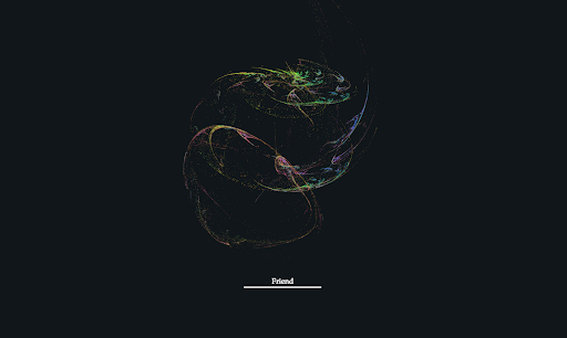
Fourth Experimentation – Tendrils

Figure 4 : These flower waves are interactive music visualizations that use your webcam, but because of its potential for personal data, which may worry users who don’t often use their webcams for personal purposes, Moving forms naturally interact, creating new connections. a continuous reflexive process that repeats through cycles of entropy and order and coheres through progressively higher levels of complexity. Scaling through and evoking organic forms: Animal ovums are formed from primordial materials (Eoghan O’Keeffe, Experiments with Google, February 2018).

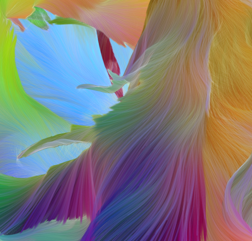
Fifth Experimentation – Colorful Fluid 

Figure 5: This intriguing silhouette was created using a fluid simulation and a web camera, as was previously noted as being risky. Users can build vibrant, flowing simulations of your silhouette as you move using their webcam (Yuichiroh Arai, Experiments with Google, November 2017).

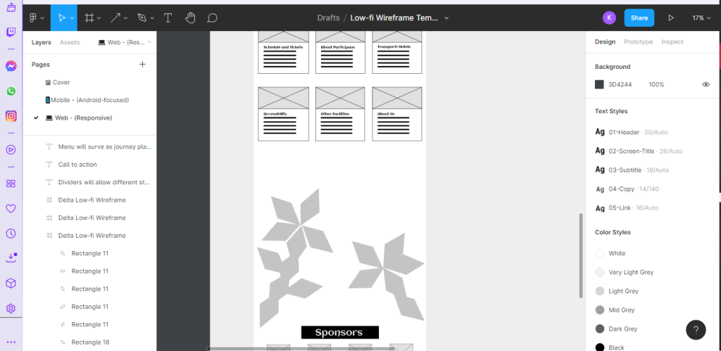
In terms of advancing these experiments, consideration was made to add code components to the design portfolio if they prove successful.

References

Eoghan O’Keeffe, Experiments with Google, February 2018. Tendrils [Online] (n.d.) Available at: Tendrils by Eoghan O’Keeffe – Experiments with Google [28 December 2022]

Google Data Arts Team, n.d. Google Search Volume by Language [Online] (n.d.) Available at: WebGL Globe (chromeexperiments.com) [28 December 2022]

Sehyun Av Kim, Experiments with Google, Februaby 2018. Webgl Particle Audio Visualizer [Online] (n.d.) Available at: Webgl Particle Audio Visualizer by Sehyun Av Kim – Experiments with Google [28 December 2022]

Yuichiroh Arai, Experiments with Google, November 2017. Colorful Fluid [Online] (n.d.) Available at: Colorful Fluid by Yuichiroh Arai – Experiments with Google [28 December 2022]

Xiaohan Zhang, Experiments with Google, March 2018. Flame [Online] (n.d.) Available at: Flame by Xiaohan Zhang – Experiments with Google [28 December 2022]

Categories
Design Portfolio

Creative Life

https://universityofhull.box.com/s/pvosdb54slpb0o54auow5494r8ze80rc

Categories
Development Log

Responsive Design

Creative Life Website is able to adapt to a different screen size such as Desktop, Tablet and Mobile. In order to respond to different sizes, the website becomes smaller and the elements have decreased to the screen. Some of the previously researched websites weren’t able to adapt to different screen sizes.

However Creative Life’s Website has movable features which allows the website adapt to any screen size and seamless transmission between the omnichannels.

Creative Life Website and an companion app will launch at 15th of May, so the users will be well aware on the website and have prepared plans in advance.

Categories
Development Log

Creative Life App Design Choises

Mood boards  

These are the layouts of different app screen and icons which are used as an inspiration for my companion app. 

User Flow

This is an user process of Jayne Fisher (Persona) buying tickets for her to go to Live Music Event.


Categories
Development Log

Creative Life Website Design Choises

Mood boards  

These are the layouts of screen and icons which are used as an inspiration for my website.

Colour planning +Typography  

To select an accessible colour palette, I used Adobe Colour new accessibility section. New feature had contrast section to check the legibility of text on the chosen colour. Another section was colour blindness to check three different types of colour blindness and colour conflict. The chosen colour was brown-ish orange because its very optimistic and user friendly in terms of legibility. While using the Google Guidelines for the app construction, an updated version came out with a Colour Tools to check contract and legibility of my chosen colour palette from Adobe Colour. 

However, in order to select an accessible typography for the companion app, the black  were change to white to help users see the text clearly and some users have problems reading black text. Roboto was chosen as a body and title font for the Creative Life App because its a standard font used for the android users and it allow a good legibility in different sizes. This app will also have Ocr A typeface for the realistic debit card number input. 

Creative Life Website uses Cambria as it’s mostly used in Windows computer and allows a very legible text reading.  

User flow  

This is an user process of Fred Jackson (Persona) visiting the website to plan the journey and buying a ticket.  

Categories
Development Log

Creative Life Conpanion App

What have I done so far? 

As the app will be downloaded, the “Welcome” screen will appear and the user will choose between attendees, volunteers, and employees because the interface will be slightly different depending on the stakeholder. The user will see a home with five relevant buttons and six menu sections. This app will not only allow map embedded maps but also will be able to purchase a ticket depending on the attendee and book a hotel, so attendees from far away will not have difficulties going to the festival. 

Low fidelity  

The „Welcome“ screen was changed to „Attendee“ and „Employee“ so, the user can easily access without pressing the additional buttons and a simple sign up section . Home page of the companion app has the fillterd events choosen by the user after the they have successfully signed up. 

Medium fidelity 

However, after meeting with UX and UI professional Anna Singer made me reconsider my app design. So her suggestions were to add a „LOG IN“ button with comments as action was successfully completed. After doing an additional research, the schedule turned into a carousel with moving events as you go down the timetable. Each event will its own description and call to action button “BUY TICKETS”. During the iteration process, my classmates were testing the app and were giving ways to improve the app to become user friendly. My parents also participated in the process, as they relay in the symbolic representation due to not being able to read in English.

High fidelity  

While doing the additional research, a Google UI kit was downloaded with Spacing guidelines for each icon and text. An icon requirements for an android users should be 24 x 24 pixels with 48 x 48 pixels touch space. Bottom navigation bar had accurately measured and working five small icons such as “Home”, “Search”, ”Map”, ”Notificate”, and ”Profile”. As you press the “Map” button, the existing map with existing pin point  created and added by me on Google “My Maps ” with a small description of each event. The map is scrollable to give the realitic Google Maps effect. 

Most of the moving components such as carousel and maps were prototyped to allow efficient access. All of the app buttons and icons follow the professional Google Guidelines and Accessibility needs for different users. Payment process of Creative Life App was made efficient by including skeoucard such as realistic card to let users add the correct bank details into the specified sections when buying tickets. The help button will allow the users to message in the live chat to talk to other people and ask for help by messaging the employees. The profile icons on the side of each screen will have the person’s photograph and will give feedback wheather the task was successful. This icon will also have a small button “BUY TICKETS” as call to action when scrolling through the event screen. At the top navigation panel with the “Profile” icon, the Menu Burger icon was added with sections to help user find what they are looking for. 

Categories
Development Log

Creative Life Website

What have I done so far? 

At the top of the website, each stakeholder is separated with the divider used to specify the stakeholder’s purposes for entering the website. The Header also has menu buttons with quick access to the important sections of the website and additional information about the festival. As the user scrolls down, the search bar of this website will transform into a help point and live message, so users can efficiently get help and engage in conversations if wanted. Under stakeholder dividers, the website will also have a menu and a call-to-action video introducing Creative Life and an opportunity to download a companion app by clicking a white button. Engaging video will be embedded link from YouTube which follows Laws of UX with a small description. Under the small description, the user will find an embedded Google Maps which was created with all events and small information about the participants. 

Low fidelity  

Top header of my website was changed after looking for additional references such as „York Ice Trail“ to allow efficiency and accessibility. Dividers were decreased and had a dark background box to meet the Laws of UX. However, after meeting with UX/UI professional Anna Singer made me reconsider the layout of the whole website with three different potential layouts. 

Medium fidelity  

Through iteration process, classmates were taking the tallies for which layout works the best in terms of usability. The chosen layout involved removing the dividers and adding the “LOG IN”/ “SIGN IN” buttonS allowing users to be automatically identified just by entering the details. However, menu buttons turns into dividers to keep the unique shape. The search button was removed from the home page and added to the event page to show the proper need of the search bar. 

High fidelity  

In order to make the website more profesional, the layout of the dividers and bitmap elements were adjusted to the right size with the help of the standard guidelines which were 12 columns wide and 16 gutter width. The boxed header was changed to a header with zig zag border with pen tool and the video was made under the divider with large call to action naming the festival with the dates. By scrolling down, the header “Welcome to Creative Life!!!” was added and a small description was attached. As you scroll down, the background map was changed to the existing map with existing pin point  created by me on Google “My Maps ” with a small description of each event. The large buttons were changed to the a smaller and instead of the description, the title of each button was made descriptive. At the bottom the flower construction was masked with primary and secondary photographs with zooming in as you press down the petal. The sponsors were adapted to the footer the website and site map was added to help users efficiently lcate the website. 

References

Material Design, n.d. Guidelines [Online] (n.d.) Availiable at: https://material.io/design/guidelines-overview [Accessed in 20 March 2022]

Categories
Development Research Blog

Low fidelity UI prototype

Paper prototypes

However, after doing further research and producing unsuccessful paper prototyping, a better paper prototype was produced to allow a realistic experience and accurate user testing. To produce this prototype, I have cut out a smartphone and tablet from cardboard.

Creative Life’s Website

At the top of the website, each stakeholder is separated with the divider used to specify the stakeholder’s purposes for entering the website. The Header also has menu buttons with quick access to the important sections of the website and additional information about the festival. As the user scrolls down, the search bar of this website will transform into a help point and live message, so users can efficiently get help and engage in conversations if wanted. Under stakeholder dividers, the website will also have a menu and a call-to-action video introducing Creative Life and an opportunity to download a companion app by clicking a white button. Engaging video will be embedded link from YouTube which follows Laws of UX with a small description. Under the small description, the user will find an embedded Google Maps which was created with all events and small information about the participants.

Creative Life’s App

As the app will be downloaded, the “Welcome” screen will appear and the user will choose between attendees, volunteers, and employees because the interface will be slightly different depending on the stakeholder. The user will see a home with five relevant buttons and six menu sections. This app will not only allow map embedded maps but also will be able to purchase a ticket depending on the attendee and book a hotel, so attendees from far away will not have difficulties going to the festival.

Categories
Development Research Blog

Rejected Designs

Original website plan was rejected because the website didn’t look efficient and the buttons needed improving.

Some elements of this wireframe of the Creative Life website was rejected because the elements didn’t allow efficiency and structure

At the Header, the dividers don’t look like the original or even look more like buttons, which will confuse users because of visual representation.

Creative Life’s website will have a call to action which should stand out, the layout can be more simplified and have a more a card fold layout look. The box layout for the key information will replace to a card layout in order to allow efficient and effective in order to have a visual memory, as card format is commonly used in order websites. The link to the companion app will be added as another form of call to action by encouraging people to get app and how vitally important it is during the festival.

However, the features such as Video and Map will be enlarged and displayed at the top as they are very important in order to understand the purpose of the festival.

Summary

This was a rough website which required an in depth research by some features and elements not accurately meeting usability goals. After research and development, the elements and features will be improve and made even more efficient and effective for users. A new useful features will be added to make users experience straightforward and enjoyable.

Categories
Development Research Blog

UI principles of Creative Life

Creative Life’s website

Each action of my design will have a short movement action and output feedback if the action was successful with a short positive message.

At the top of the website, each stakeholder will be separated with the divider used to specify the stakeholder’s purposes for entering the website. Suppliers will have a website section with food and drink requirements, as well as a diagram to show if the requirements were met with feedback. Volunteers and Sponsors will use their section to find out how they will be able to help Creative Life and in what way the festival helps stakeholders. This links with Hicks Law, in terms of following design patterns and using successful features which work across all users. (Law of UX, n.d.)

Under stakeholder dividers, the website will also have a menu and a call-to-action video introducing Creative Life. Engaging video will have an embedded link from YouTube which follows Hicks and Fitts Law. A small description will a schedule and an opportunity to purchase the tickets options depending on preferences if they want to. This links with Miller’s law in terms of giving minimising choices, so users don’t have a cognitive load from overthinking. (Law of UX, n.d.)

Creative Life’s app

A Companion app will have similar features and structure to show consistency and allow seamless access when using this app on a phone or in some cases a tablet. However, the menu will be a burger menu and will allow notifications as feedback and reminders in omnichannels such as smartphones, wearable devices, tablets, and desktops. Like the website, the Creative Life app will have Google Maps to allow a quick and efficient finding of the desired event with how long does it left to the destination. The time to go to destination links with Goal-gradient effect, so closer users are to a goal, the faster they are going to work to complete it. (Law of UX, n.d.)

Summary

Following Laws of UX will help Creative Life website and companion app to meet all users requirements and allow best possible experiance with minimal or none amount of difficulties.

References

Law of UX, n.d. Jacob’s Law, [Online] (n.d.) Available at: https://lawsofux.com/jakobs-law/ [Accessed on 3 March 2022]

Law of UX, n.d. Hick’s Law, [Online] (n.d.) Available at: https://lawsofux.com/hicks-law/ [Accessed on 3 March 2022]

Law of UX, n.d. Miller’s Law, [Online] (n.d.) Available at: https://lawsofux.com/millers-law/ [Accessed on 3 March 2022]

Law of UX, n.d. Fitt’s Law, [Online] (n.d.) Available at: https://lawsofux.com/fittss-law/ [Accessed on 3 March 2022]