Categories
Development Research Log Uncategorized

R6 – Social Media Channels

Aldi

Figure 1 : Aldi Christmas advert which gives a nostalgia to Home Alone. (Olivia Heath and Lisa Joyner 10 November 2022)

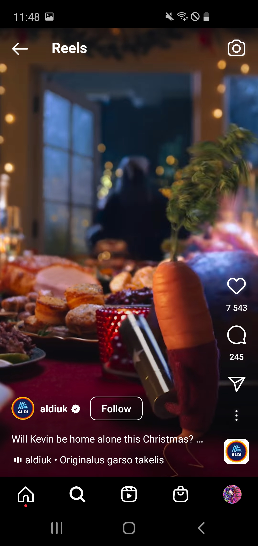
Aldi is a German grosery store located in most of parts UK which provides a large variety of products at a cheaper price.

While viewing the advert, the core message is the importance of the family and especially family reunion during Christmas . A nostalgia can also be found to the classic Christmas films such as Home Alone which for some people starts the Christmas season.

The target audience of this video advertisement would be families who go to Aldi, as well as adults and children which would later want to purchase the products related to this character.

Advert has received a lot of positive feedback and even made someones day due to having already well known character to the store with he’s version of a nostalgic movie.

Figure 2: Audience engagement under the post (Part 1)
Figure 3: Audience engagement under the post (Part 2)

Dyson Hair

While viewing the campaign, the core message is to explore the individuality of each women and creating an universal products for every women.

Figure 4: Dyson advertisement campaign (Dyson n.d.)

The target audience of this promotion would be women of any age and their partner’s as a gift for any acassion.

Video has received a lot of positive feedback and even an interest to purchase this product in order to make their hair look like women in the video. However, it has a massive engagement in Tik Tok where people are reviewing the hair driyer which even determined to purchase this product as the audience have seen it in use.
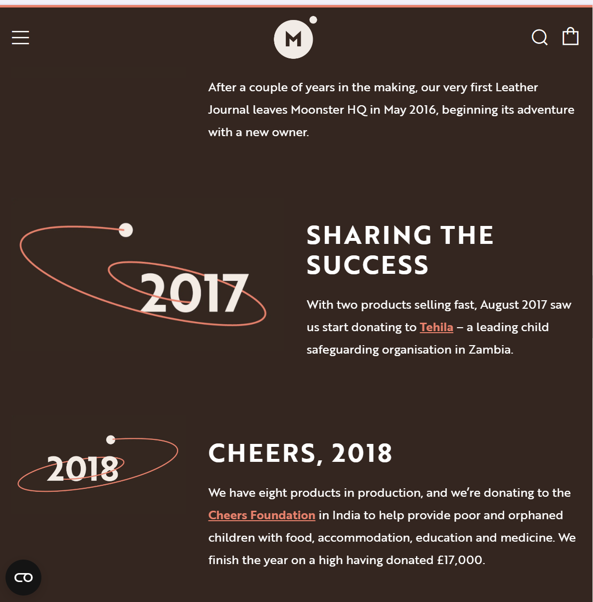
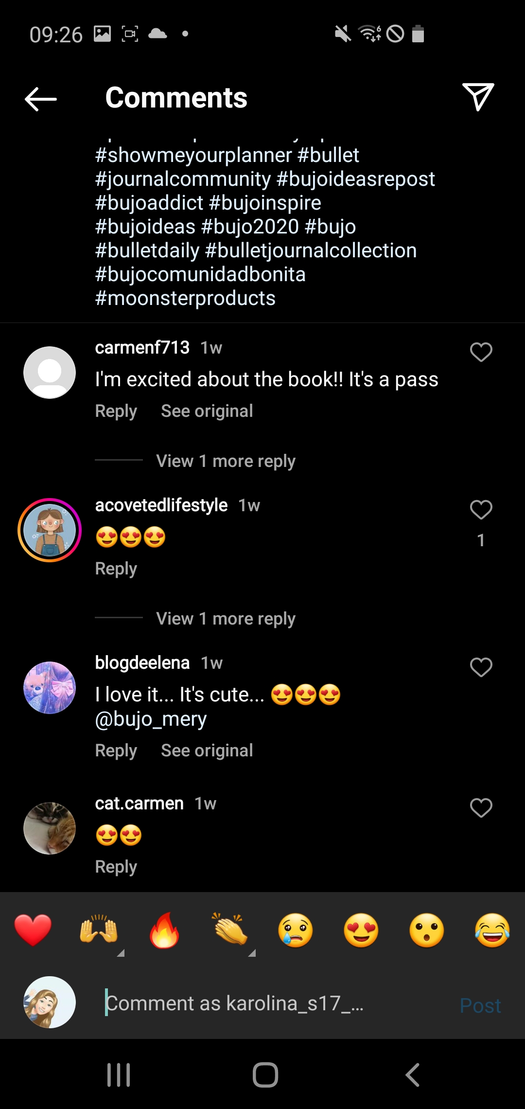
Figure 5: Audience engagement under the post (Part 1)
Figure 6: Audience engagement under the post (Part 2)

Moonster

Moonster, the brand behind genuine leather products with are hand made.

While viewing the campaign, the core message is to buy a handmade which will last a very long time, so the campaign is called “Purchase with a Purpose” in 2017. Percentage from this campaign will be donated to the non-profit organisation Zambia that promotes the prevention of cruelty towards children.

The target audience of this campaing are aimed at women because most women use handbag and in general have more bags than men. ” The female of age group ranging 15-64 years is the main consumer of the handbags market, with the gender demographics portraying the share of the female population of more than 50% “.(Business Wire n.d.) However, the company started producing notebooks which interest the male and female audience as good opportunity to give as a gift for some one.

Although the company doesn’t receive massive angagement on social media, most people expremely want to purchase.

Figure 7 : Moonster campaign
which they follow up to today. (Moonster n.d.)
Figure 8 : Audience engagement under the post (Part 1)
Figure 9: Audience engagement under the post (Part 2)

References

Business Wire n.d. Global Handbags Market Report 2019-2024 – ResearchAndMarkets.com [Online] (n.d.) Availiable at : https://www.businesswire.com/news/home/20190802005171/en/Global-Handbags-Market-Report-2019-2024—ResearchAndMarkets.com [Accessed in 23 October 2022]

Dyson n.d. [Online] (n.d.) Availiable at: https://www.dyson.co.uk/hair-care/dyson-airwrap-multi-styler/dyson-airwrap-multi-styler-overview [Accessed in 23 October 2022]

Moonster n.d. Lunar Landings [Online] (n.d.) Availiable at : https://moonsterleather.com/en-gb/pages/about [Accessed in 23 October 2022]

Olivia Heath and Lisa Joyner 10 November 2022 Aldi Christmas advert 2022: Kevin the Carrot is ‘Home Alone’ [Online] (n.d.) Available at: https://www.housebeautiful.com/uk/lifestyle/a24609280/aldi-christmas-advert/ [Accessed in 23 October 2022]

prReach 1 November 2019 Handmade Travel Tote Bag for Women by Moonster Giving Back to Non-Profit [Online] (n.d.) Availiable at : https://prreach.com/handmade-travel-tote-bag-women-moonster-giving-back-non-profit/ [Accessed in 23 October 2022]

Categories
Development Research Log

R5 – Websites that break the ‘rules’

What is Brutalism ?

A design approach known as “brutalism” in digital media aims to appear unpolished, careless, or bare. It resembles webpages from the early 1990s. This feature of brutalism can occasionally be seen in the form of a sparse, nearly naked HTML website with blue links and Monospace typography. (Kate Moran, 5 November 2017)

Figure 1 : Materials used in the Brutalism architecture (Reading, B. (2018)).
Figure 2 : An example of Brutalism architecture (Reading, B. (2018)).

The use of brutalism is considered as a reaction to artificiality and lightness in both architectural and digital design. Its supporters view it for being brave and honest. (Kate Moran, 5 November 2017)

Examples of Brutalism in websites

Too Much.Studio

A website that once employed brutalism to create a straightforward interactive Christmas card now features an interactive website portfolio of the creators’ works. (Brutalist Websites, n.d.) Not so much column grids are used on the Too Much.Studio website’s “Work” page to display the pieces. A mouse pointer is used to move the 3D objects on a website’s welcome page in to demonstrate interaction. There is a place where people can sketch their works of art. The website makes use of vibrant visuals and subtle movement to maintain audience attention. The majority of the interaction was created by using HTML code to modify the selected objects.

Figure 3 : TooMuch.Studio website (TooMuch.Studio, n.d.)
Figure 4 : The interactive items wouldn’t move freely when the website was converted to a mobile layout. Other little animations, however, adjusted rather well. (TooMuch.Studio, n.d.)

Johannes Strüber

According to Johannes Strüber, during the course of his job, he encountered the “brutalitic” approach. It became increasingly obvious that the provided URL serves as the foundation for the layout itself. He reasoned that his minimalist approach demonstrates his commitment to focused labour. It’s focused in a way, but it’s also playful. (Brutalist Websites, n.d.)

Figure 5 : Johannes Struber website (Johannes Strüber, n.d.).
Figure 6 : Testing responsives of Johannes Struber website (Johannes Strüber, n.d.).

Last Heavy

Figure 7 : Last Heavy website (Last Heavy, 2019).

According to Last Heavy, they were interested in developing a sort of environment for the brand that promotes exploration and discovery by presenting content in this completely overwhelming and distinctive manner. We required a website that fit our (schizophrenic) sense of design and had a particular taste for the kind of material that would help to promote and highlight their creative work.
When a user hovers their mouse over the website’s welcoming page, Last Heavy uses modular grids with minimal interactivity. Items are arranged in a modular grid as soon as the user clicks “Shop,” using brutalism while yet adhering to accessibility guidelines.

Figure 8 : Testing responsive design of Last Heavy (Last Heavy, 2019).

References

Brutalist Websites, n.d. Brutalist Websites [Online] (n.d.) Availiable at : https://brutalistwebsites.com [Accessed in 03 November 2022]

Johannes Strüber n.d. [Online] (n.d.) Availiable at: http://www.l-i-l.de/intro [Accessed in 03 November 2022]

Kayce Basques and Sofia Emelianova, Chrome Developers 2022. Simulate mobile devices with Device [Online] (n.d.) Availiable at : https://developer.chrome.com/docs/devtools/device-mode/ [Accessed in 03 November 2022]

Kate Moran, Nielsen Norman Group, 5 November 2017. Brutalism and Antidesign [Online] (n.d.) Availiable at : https://www.nngroup.com/articles/brutalism-antidesign/#:~:text=Brutalism%20in%20digital%20design%20is,Craigslist%20and%20the%20Drudge%20Report). [Accessed in 03 November 2022]

Last Heavy n.d. [Online] (n.d.) Availiable at : https://lastheavy.com [Accessed in 03 November 2022]

Reading, B. (2018) Britain’s Heritage: Brutalism. Stroud: Amberley.

TooMuch.Studio, n.d. TooMuch [Online] (n.d.) Availiable at : https://twomuch.studio [Accessed in 03 Nowever 2022]

Categories
Advanced Web Design Development Research Log

R4 – Visual Responsive Websites 

Spotify

Figure 1 : Spotify is a music streaming service that enables users to listen to music from any location. This is a desktop screenshot of Spotify’s website. (Spotify, n.d.)
Figure 2 : Shrunk down version of Spotify’s website. (Spotify, n.d.)
Figure 3 : Screenshot of Spotify’s website on my tablet to show responsive design. (Spotify, n.d.)
Figure 4 : Screenshot of Spotify’s website on a android phone Samsung Galaxy S10e. (Spotify, n.d.)

These screenshots display various layouts that then welcome the user with a banner including a call to action or use modular blocks to display various genre groups. The banner has been cropped to fit displays with bigger resolutions.

Figure 5 : Photograph of my families Smart TV to different responsive design. (Spotify, n.d.)

This website’s responsiveness might be further enhanced by using modular blocks for each component to enable a smooth transition as you scroll down the page and prevent the call to action from closing the border as it does in the TV example. Over time, the TV has evolved into a device for both searching for content and enjoying favourite shows. According to “A growing number of UK citizens use Smart TVs to access the internet, with up to 26% of all online time being spent on Smart TVs. ” (Federica Laricchia, statista, 14 February 2022) The navigation bar can be found on the left side of the website.

BBC

Figure 6 : The BBC is a good example of a responsive website. For consumers to stay current on the world, BBC offers a wide variety of news. This is a desktop screenshot of BBC’s website. (BBC, n.d.)
Figure 7 : Screenshot of Spotify’s website on a tablet to show responsive design. (BBC, n.d.)
Figure 8 : Screenshot of BBC’s website shrunken my tablet to show responsive design. (BBC, n.d.)
Figure 9 : Screenshot of BBC’s website on a android phone Samsung Galaxy S10e. (BBC, n.d.)
Figure 10 : Photograph of my families Smart TV to different responsive design. (BBC, n.d.)

These screenshots demonstrate various layouts that greet viewers with small column blocks for each news segment and a huge landscape box for larger screens that displays breaking news. However, smaller displays employ a single column hierarchy with each news item in its own box. Additionally, websites use hamburger menus rather than normal menus to keep everything simple and allow for complete focus on the news.

Depending on the user’s selections, the BBC website employs a navigation bar to direct visitors to topics like weather or sports in addition to news. When you click on a page, like Weather, it moves as the area gets smaller and fits precisely into the designated spot.

Netflix

Figure 11 : There is a tonne of movie content on Netflix for every genre, the streaming service allows not olny their own content but also well known series. This is a desktop screenshot of Netflix website. (Netflix, n.d.)
Figure 12 : Screenshot of Netflix website shrunken my laptop to show responsive design. (Netflix, n.d.)
Figure 13 : Screenshot of Netflix website on my tablet to show responsive design. (Netflix, n.d.)
Figure 14 : Screenshot of Netflix website shrunken my tablet to show responsive design. (Netflix, n.d.)
Figure 15 : Screenshot of Netflix website on a android phone Samsung Galaxy S10e. (Netflix, n.d.)

These screenshots demonstrate various layouts that greet users with a sizable banner and a call to action pushing them to sign up as members instead of just having the logo and a sign-in area. On a huge screen, the website is perfectly sized with a single, expansive landscape box.

Figure 16 : Photograph of my families Smart TV to different responsive design. (Netflix, n.d.)

The next column doesn’t appear cropped when browsing the website on a smaller screen, therefore by spreading out the next column, the responsiveness of this website might be further improved by allocating more space in the column block.

References

BBC, n.d. Welcome to the BBC [Online] (2022) Availiable at: https://www.bbc.co.uk/ [Accessed in 26 October 2022]

Federica Laricchia, statista, 14 February 2022. Household penetration of smart TV sets in the United Kingdom (UK) from 2014 to 2021 [Online] (n.d.) Availiable at: https://www.statista.com/statistics/654074/smart-tv-penetration-in-uk-households/ [Accessed in 26 October 2022]

Netflix n.d. Unlimited films, TV programmes and more. [Online] (n.d.) Available at : https://www.netflix.com/gb/ [Accessed in 26 October]

Spotify, n.d. Listening is everything [Online] (2022) Availiable at: https://www.spotify.com/uk/ [Accessed in 26 October 2022]

Categories
Advanced Web Design Development Research Log

R3 – Narrative Sequence

Cartoon Strip

Figure 1: This Peanuts comic strip was released on November 19, 1961, as one of the newspaper’s themes.
Comic strips from the modern era can be found in most magazines and newspapers.
They are normally printed in colour on Sundays and in black and white on Monday through Saturday in newspaper editions. (Norman Rockwell Museum, n.d.)

The cartoon shows a boy who dislikes eating lunch because he is forced to sit by himself while other kids play, which makes him feel lonely. He also tells himself, though, that he wishes kids would invite him to play with them so he won’t be alone.This comic encourages the reader to purchase the following issue of the newspaper in order to find out whether the boy will make friendships.

Storyboard

Figure 2 : The narrative sequence can brighten someone’s day who is having a poor day in addition to showing something serious. Tom and Jerry, which utilises little explanation but primarily relies on imagery to tell the plot, is an example of a humorous storyboard. The storyboard describes how Jerry’s relative, who took care of the little orphans, gave him the responsibility for their care. The second and third rows highlight how the little orphan attempts to eat the orange that gets stuck and the turkey that is consumed at the speed of light. The relative also mentioned the little orphan’s insatiable appetite. (Luke Leightfield, Boards, 11 August 2022)

Sequential photography

Figure 3 : Duane Michals, a French photographer, took these series of images to demonstrate the Heisenberg Uncertainty Principle, which looks at the fuzziness in nature. A woman is holding a magic mirror that distorts her face; when she looks in one direction, her face expands and some parts of it start to stretch out. As she rotates the mirror from side to side, the woman can be seen looking into the glass and seeing her stretched-out face. In order to put an end to the trip of face distortion, the story concludes with a woman looking at the photographer with her cheek towards the mirror. (Kate Andreasson, Guardian, 26 February 2015)

My Storyboard

This storyboard discusses the value of taking someone else’s recommendations because everyone sees things differently. So the story begins with someone taking care of and tending to the plant. Then he runs into his friend, who is worried about how the plant seems, which greatly frightened the individual. After giving it some thought, his companion handed him the book “How To Grow Healthy Plants?” from his rucksack. The book and the group activities helped the plant grow strong and huge. Instead of using colour, the entire storyboard used a greyscale to refer back to the examples mentioned above which had a very effective use of black and white.

References

Karin Andreasson, Guardian, 26 February 2015. Duane Michals’ best photograph: French Vogue does quantum physics [Online] (n.d.) Availiable at: https://www.theguardian.com/artanddesign/2015/feb/26/duane-michals-best-photograph-french-vogue-quantum-physics-heisenberg [Accessed in 20 October] 2022

Luke Leighfield, Boards, 11 August 2022. 28 Storyboard Examples to Inspire you [Online] (n.d.) Availiable at: https://boords.com/storyboard-examples [Accessed in 20 October 2022]

Norman Rockwell Museum, n.d. Comics: Comic Strips [Online] (n.d.) Availiable at:https://www.illustrationhistory.org/genres/comics-comic-strips [Accessed in 20 October 2022]

Categories
Advanced Web Design Development Research Log

R2 – Multichannel UX

A diagram showing different types of multichannel user experiance.(Ben Lutkevich, n. d.)

Knygos.lt

Lithuanian book retailer Knygos.lt offers books in all categories both online and offline. It appears most frequently in adverbs or in newspapers.

Figure 1: The website Knygos.lt welcomes me with a banner full of various discounts based on genres, therefore the website immediately encourages to purchase a book.(Knygos.lt, n.d.)
Figure 2: The website’s several categories, ranging from recently added to good pricing per book, are displayed as you scroll down which can’t be efficiently found from store. Additionally, symbols are used to display rating, new arrival, and discounts.(Knygos.lt, n.d.)
Figure 3: The Footer can be seen in this screenshot. There are contact details, including a phone number and email address, at the bottom of this webpage to demonstrate multichannel communication by providing a choice of methods. The footer contains further instructions, like as links to delivery, or even the help centre. Along with the address, you may find information about the bookstore’s hours, social media, and app redirection.(Knygos.lt, n.d.)
Figure 4: Knygos.lt social media promotion. (Knygos.lt, n.d.)

Potential improvement

Instead of the footer, advertise the app at the top of the website. You will receive a reward if you have purchased and read a certain number of books because this bookstore would also benefit from having a reward. Promote more in-person interactions.

Wizz Air

With its base in Hungary, Wizz Air offers flights to much of Europe as well as to places in Asia, Africa, and the Middle East. For preferred seats, reserved seating, onboard food and drinks, and additional fees, passengers may choose. Additionally, this airline places advertisements in airports and on social media.

Due to safety precautions, Wizz Air doesn’t have many print advertisements on board. However, a promotional magazine is kept in a pouch of the back passenger’s seat and is used as print advertising to keep the passengers’ entertained while they fly.

Figure 4: A picture of a Wizz Air magazine with a QR code for the app download. The magazine contains distinctive QR codes throughout. For instance, the code on this page displays the location of the store.

After purchasing the ticket, you will receive numerous email marketing ads offering prospective airline discounts to persuade you to take a vacation.

Figure 5: An email advertisement to persuade you to purchase a WIZZ Air PRIORITY for an extra luggage with additional perks like being first in the registration queue and being first to the plate.

However, in order to board the aircraft, you must present a ticket. This ticket can be stored in the app and used as a marketing tool to establish confidence that it will be securely stored when it is brought.

Figure 6: Multichannel options for downloading an app.(Wizz Air, n.d.)
Figure 7: Wizz Air Social Media.(Wizz Air, n.d.)

Potential improvement

More advertising that encourages to plan new vacations or even to tell their friends and family about their experience could help Wizz Air boost its image for other International flight users.

Campaign suggestion

A social media campaign where members of the reading community could discuss their reading preferences and favourite books is one concept for a new multichannel user experience. This could also work for sharing flying experiance.

References

Ben Lutkevich, Search Customer Experience, n. d. Multichanel Marketing [Online] (Updated in November 2021) Availiable at: https://www.techtarget.com/searchcustomerexperience/definition/multichannel-marketing [Accessed in 10 October 2022]

Knygos.lt, n.d. [Online] (n.d.) Availiable at: https://www.knygos.lt/ [Accessed in 10 October 2022]

Wizz Air, n.d. Explore your travel opportunities with Wizz! [Online] (n.d.) Availiable at: https://wizzair.com/en-gb?gclsrc=aw.ds&ds_rl=1282923&ds_rl=1277705&ds_rl=1277705&ds_rl=1282923&gclid=CjwKCAjw7p6aBhBiEiwA83fGuuAYi0te7mwJIimw30PFz1cpdDUpH2A2SMojBdDOw3s3X08NZ9hjiRoC76kQAvD_BwE&gclsrc=aw.ds#/ [Accessed in 10 October 2022]

Categories
Advanced Web Design Development Research Log

R1 – Grid and Frame

Grid and frames are an inreplaceble tools used to resize websites or apps to the required size depending on the device they are using such as tablet, smartwatch or even the largest TV. Various types of grids serve different purposes and tasks depending on the clients preferences.

However during the early 20th century, grid method which was previously used in literature, began to become more useful and used as a method of experimentation by many artists. So this meant that “The grid system is an aid, not a guarantee. It permits a number of possible uses and each designer can look for a solution appropriate to his personal style. But one must learn how to use the grid; it is an art that requires practice”(Josef Muller-Brockmann, Designlab, 10 March 2020)

How are frames and grids used in my surroundings?

All across the world, frames and particularly grids are frequently employed. The most intriguing grid interpretations involve converting former Soviet-era residences into lovely homes that use rectangle blocks to establish consistency throughout the city. These blocks will insulate and keep the entire building warm. However, some of the homes in the neighborhoods have been completely individually designed and built from the ground up. There is a grid on even windows.

Figure 1 : Recently renovated buildings with a modular grid structure.

These recently rebuilt homes use a modular grid of  rectangular tiles to keep the structure warm throughout the winter.

Figure 2 : Newly built house with modular window grid.
Figure 3 : Newly reconstructed upper floors with column grids.
Figure 4 :The second level of this recently refurbished building includes windows that match the balcony doors in the column grid.

A very lovely hotel with a very distinctive design can be found in the park Oginskio Dvaras, which is right next to the city center.

Figure 5: This is the library that was relocated to the newly built castle, which also features a clock tower, and the greenhouse next door has column grid windows to suggest an aging, dusty library. While reading a book, these windows also provide a wonderful view of the outdoors.
Figure 6: This hotel’s built-in restaurant and the Oginskio Hotel itself, uses a column grid for its windows to display the stunning scenery.

Even though the majority of people buy their furniture from IKEA, some people who live in apartments or traditionally built homes frequently have uneven walls. People order custom furniture to address this issue, which uses the grid technique as a guide while allowing for originality in the planning and creation of each component.

Figure 7 : The door frame of my grandmother’s flat.
Figure 8: This set of kitchen furniture was created according to my grandmother’s specifications and includes a column grid throughout the entire interior. The Scandinavian furniture had a major influence on her choice of decor.

In addition to being aesthetically pleasing, this kitchen has a spot where you may read a book, magazine, or newspaper. Depending on how you fold it, even a local newspaper or  weekly magazine uses the grid system to direct readers  through the page and provide vital information. Many people don’t have the time to read, so they tend to utilise the grid method to quickly scan the news, which influenced their curiosity.

Figure 9 : A modular and column grid is used throughout the Lithuanian weekly magazine “Week” to make it easier for readers to find the part they’re looking for. These individual sites discuss events that occurred on this day one hundred years ago, such as the establishment of the first Lithuanian currency on January 10, 1922. One of the coins is, however, just outside the border.
Figure 10: Newspaper article with key events in history.

Grids and frames are utilised in architecture when giving truly ancient buildings a new function, not just in websites and apps. Visualize interior/exterior designs to allow for not only a distinct decorating style but also different interpretations of each person’s individuality. You can not only learn more by reading publications and newspapers, but you can also find the needed information very quickly. So long as they work with other elements, grids or even multiple kinds of grids can be used wherever.

Figure 11 : This is my recorded presentation of Grids and Frames, which has a grid representation for most of the these examples.

References

Josef Muller-Brockmann, Designlab, 10 March 2020. Grids In Graphic Design: A Quick History, and 5 Top Tips Online Availiable at: https://uxplanet.org/grids-in-graphic-design-a-quick-history-and-5-top-tips-29c8c0650d18 [Accessed in 06 October 2022]