Figure 1 : Cosmic Cradle Metamorphosis Animation exploring the movement of space (Andrewkn, Pixabay, 28 January 2022) (Pixabay, 31 August 2022.) (Jonny Hughes, howstuffworks, n.d.).
It is also necessary to incorporate Edward Tufte’s laws into this task. So, who exactly is Edwarde Tufte? Edward R. Tufte is a retired political scientist, statistician, and computer scientist. His study focuses on statistical evidence and scientific visualisation (Shruthi Sampathkumar, Medium, 6 February 2018).
Effective web design can be achieved by following the broad information design principles proposed by Edward Tufte. In his article and books, he explains how to design web pages effectively using micro/macro design, layering and separation, small multiples, colour and information, and the integration of text and graphics (Shruthi Sampathkumar, Medium, 6 February 2018 ).
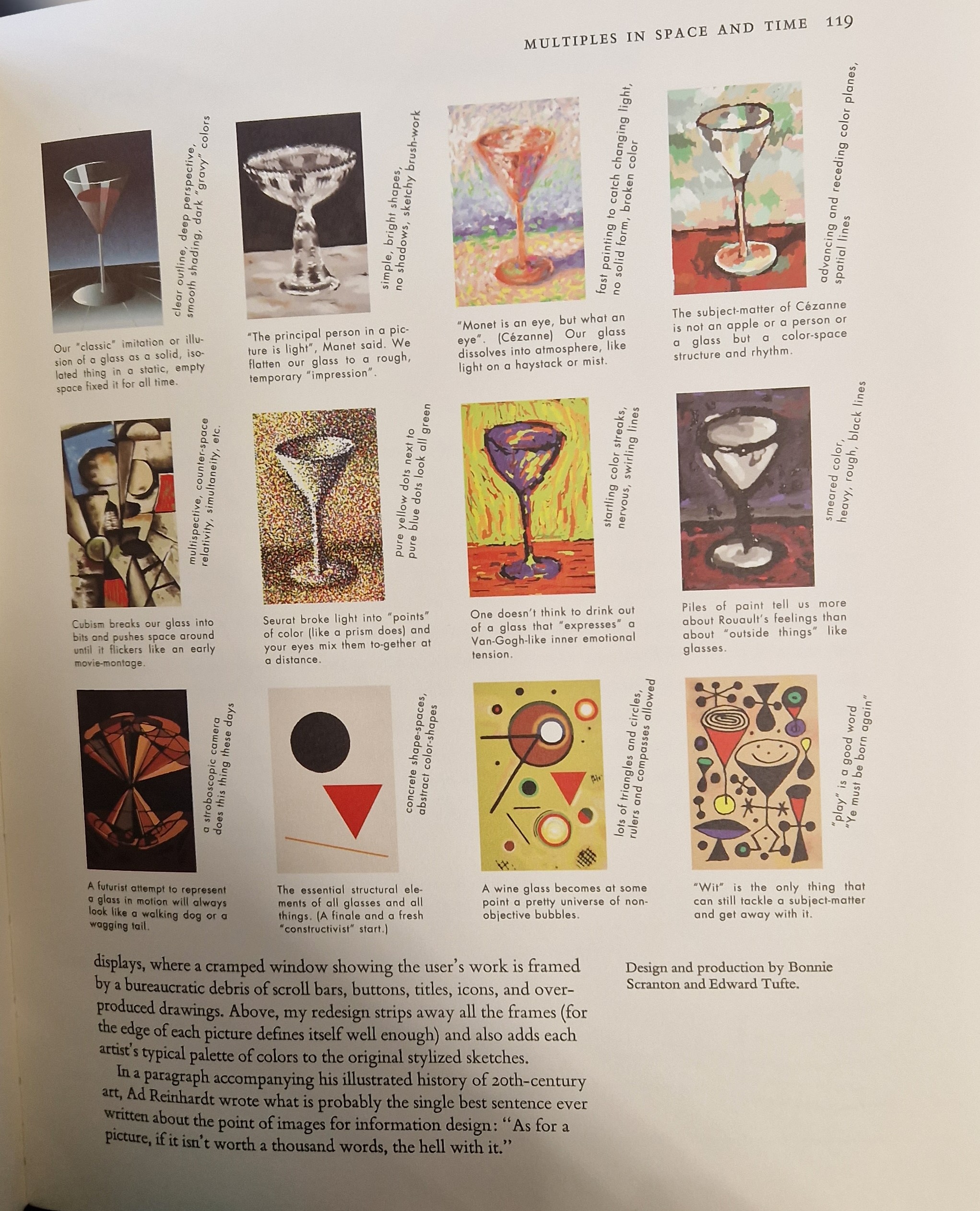
Tufte’s Comparison of Small Multiples
Figure 1 : A little multiples demonstration using different painting mediums of the same glass that will apply to future planets (Tufte, Edward R, 1990 ).
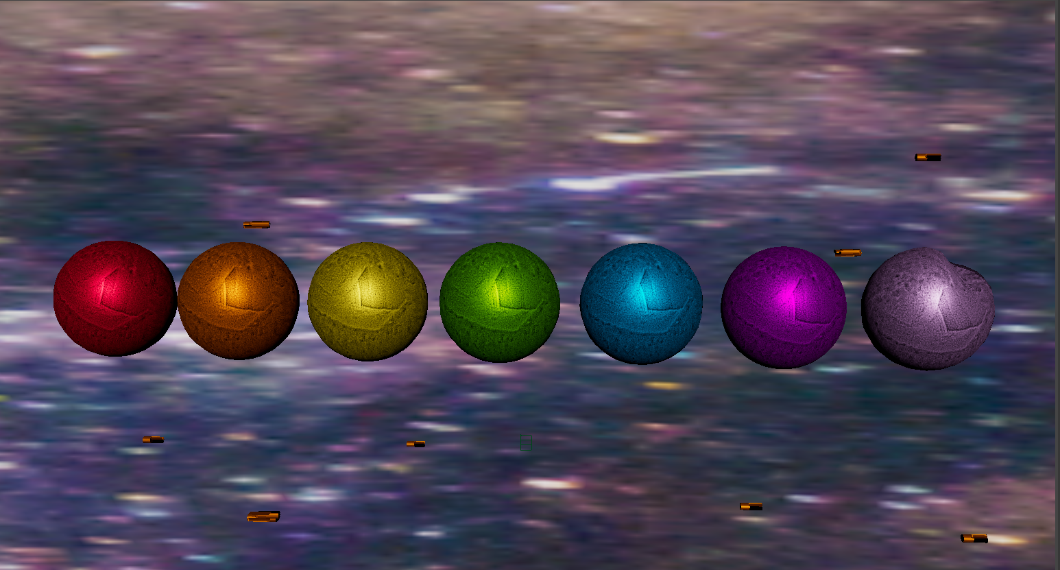
The small multiple is a data visualisation that consists of a grid of several charts. This makes it simple to compare the complete set of data. This law will be great because the Newton’s Cradle will include seven coloured balls. As a result, they will all be made of the same metal but in different colours.
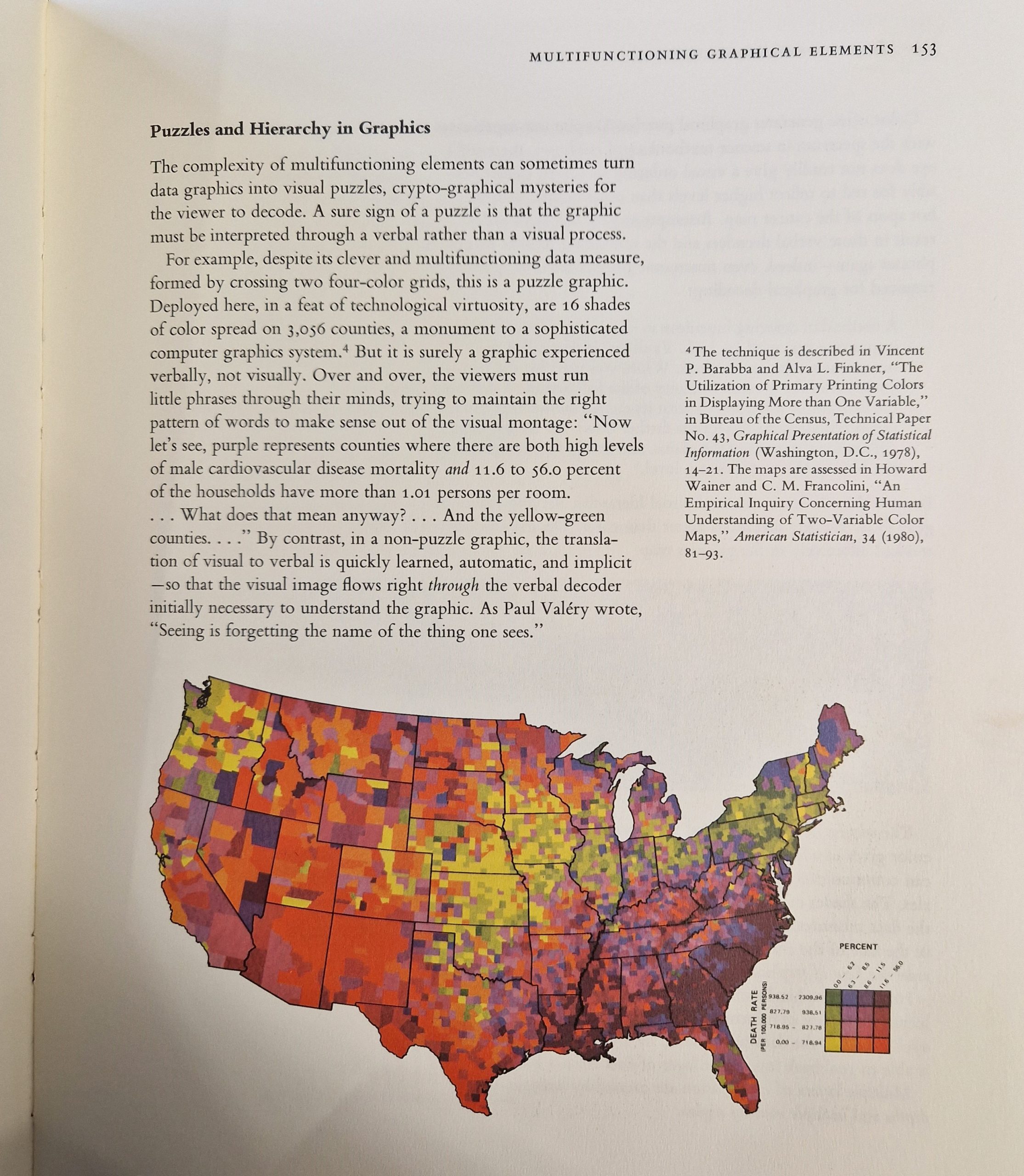
Tufte’s Use of Colour
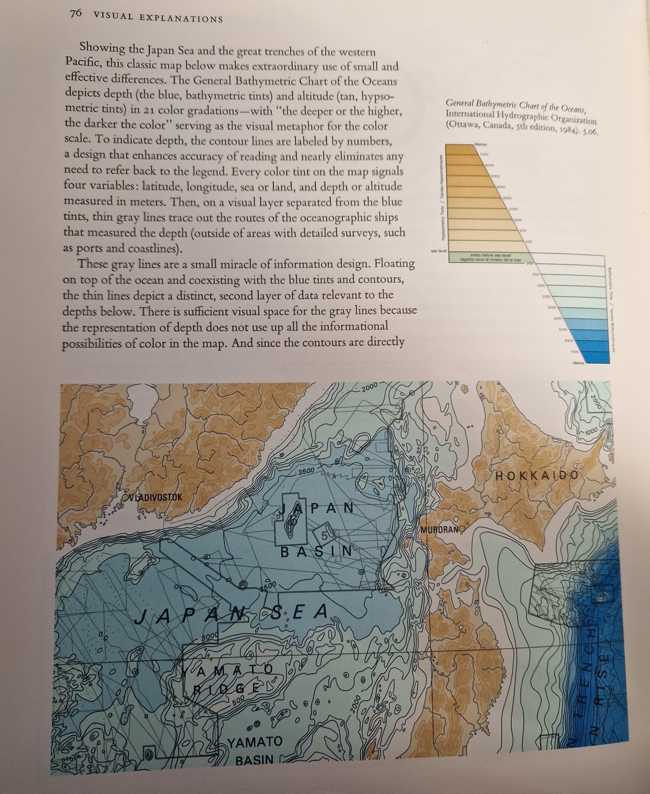
Figure 2 : According to Tufte’s law, “Use Colours to Help Users Understand Data or to Add a Layer of Information,” each colour not only helps to divide the data but also aids in memory retention because people tend to associate colours with specific memories (Chrisanthy Rebecca Surya, Medium, 21 March 2019), (Tufte, Edward R, 1990).Figure 3 : This map depicts ocean and land using various tones of blue and brown (Tufte, Edward R, 1990).
Colour is important for my animation because the setting is known for its blue, purple, and white hues. As the white light from the sun strikes the prism, it produces seven different colours, which is why the planets themselves will be in a prism colour also known as a rainbow colour to relate back to the space.
Tufte’s Micro-Macrocosm
In his works, Tufte discusses several micro- and macro-data instances. Micro readings come in a format that has the most granular details imaginable (Shruthi Sampathkumar, Medium, 6 February 2018 ). The planets in this space animation will serve as the microcosm and macrocosm because each one will have its unique story and small surface breaks. Additional cracks will also appear due to planetary movement.
Tufte’s Layering and Separation
Layering is the process of visually arranging or stratifying data to build a proper link between different forms of information, according to Tufte’s definition in his article “Layering and Separation.” By emphasising more significant elements and downplaying less important content, layering serves to establish a visual hierarchy (Shruthi Sampathkumar, Medium, 6 February 2018 ). A layering component in animation would be found between the planets and the background.
Figure 1 : On camera, astronaut Ronald E. Evans is seen engaging in extravehicular activities during the trans-Earth journey of the Apollo 17 spacecraft (Emily Carney, NSS, 26 September 2021).
This was decided to create some storyboards while considering how to merge the Metamorphisis, Alexander Calder, and Science. However, a mindmap of what science specifically entails before creating a storyboard. Consequently, planets and rockets are a part of science, particularly planetarium. The plaques flown on Pioneers 10 and 11 and, of course, the Voyager Golden Record are two instances of how the human element was conveyed even in robotic spaceflight throughout the 1970s. Each artefact was intended to express the human condition to potential extraterrestrial life, if said extraterrestrial came upon each spacecraft (Emily Carney, NSS, 26 September 2021).
Furthermore, it is impossible to ignore the connection that both scientists and engineers as well as technicians felt when the great planetary research missions of the 1970s succeeded. The era’s NASA and JPL films depict the control rooms’ almost amazement when, for example, the Viking landers touched down and actually sent back the first sharp photographs of Mars (Emily Carney, NSS, 26 September 2021).
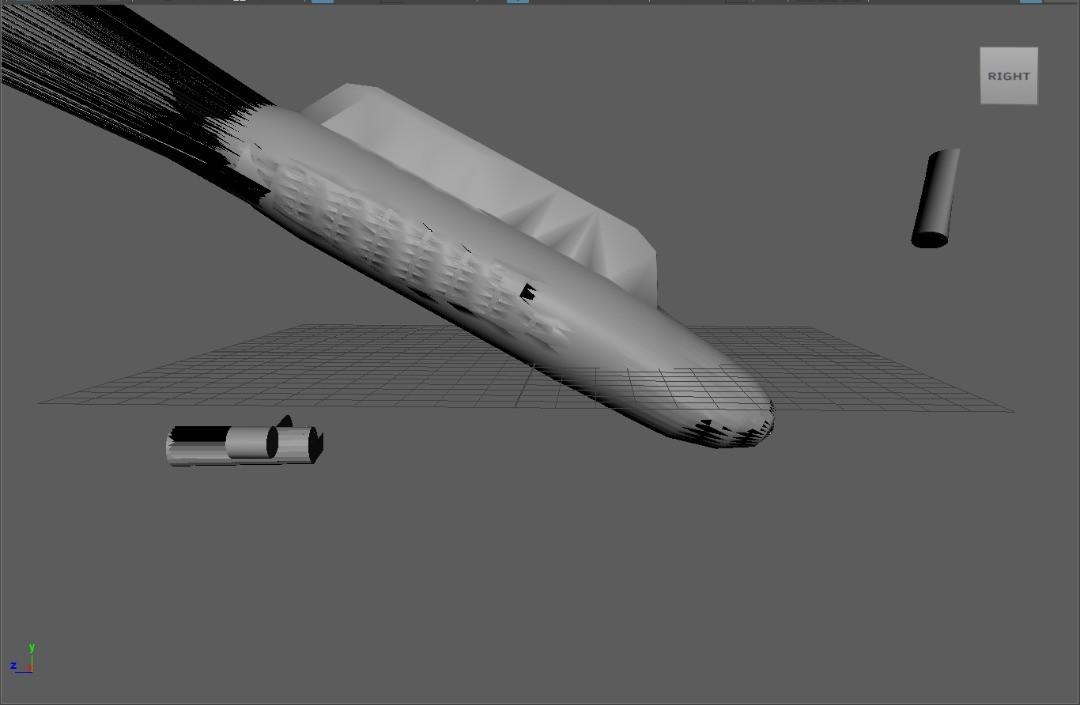
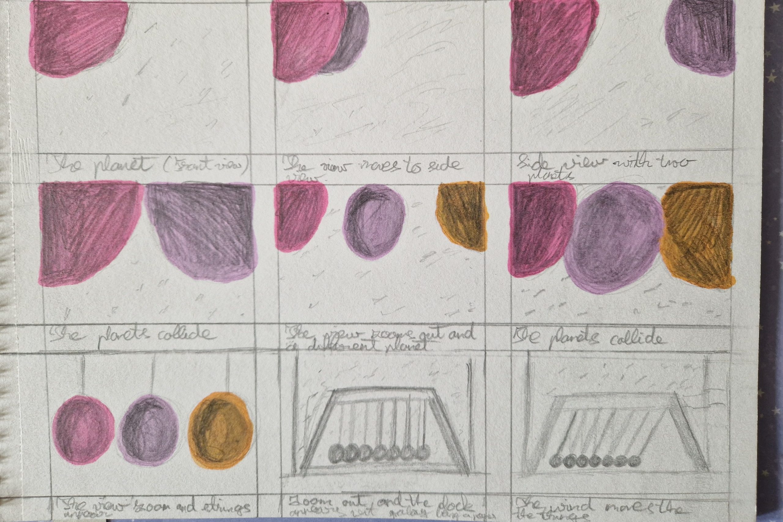
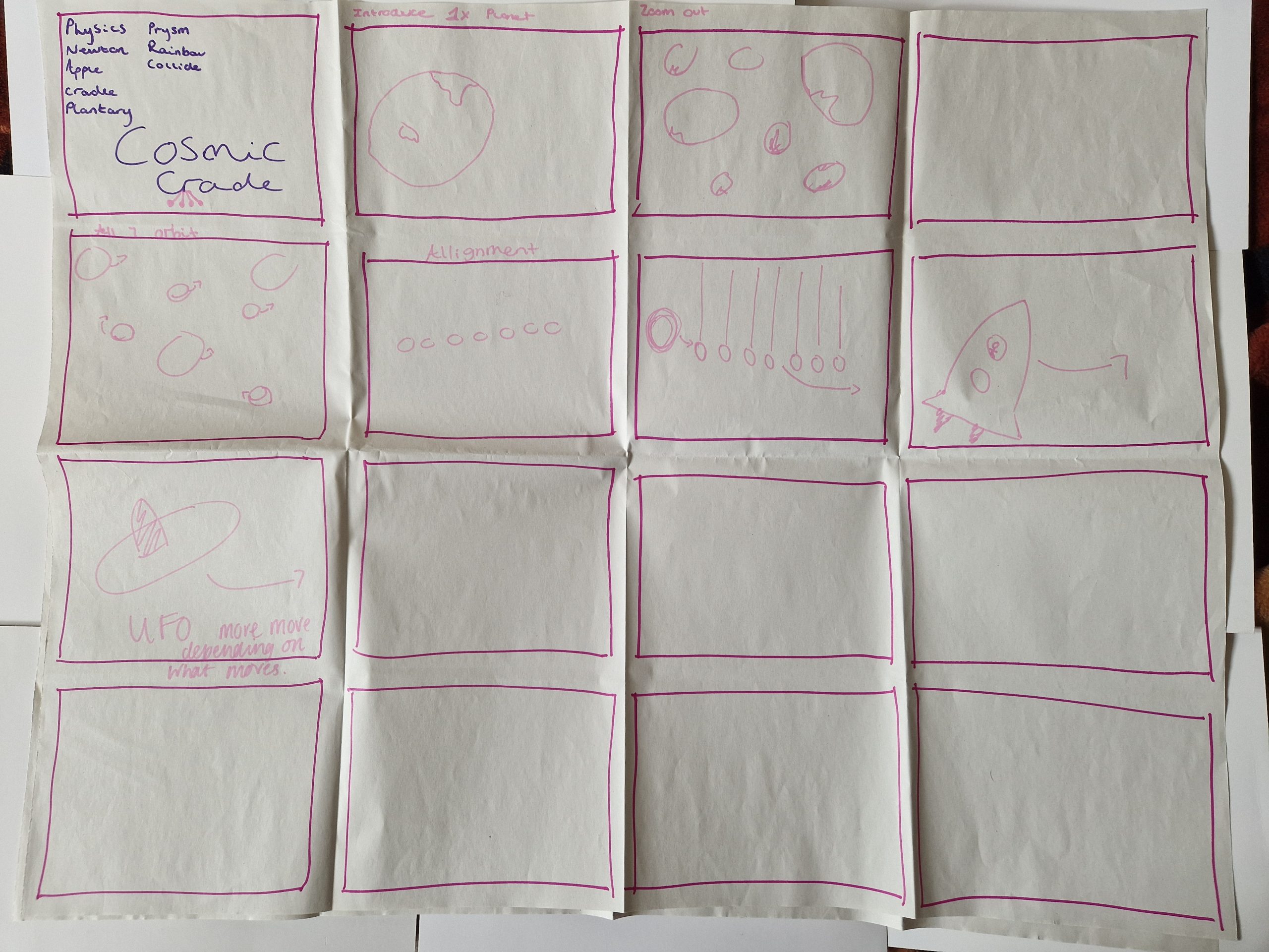
Initial Storyboard
Figure 2 : Rough animation storyboard that provides a quick visual representation of the work.
A decision was taken to storyboard and clarify ideas following mind mapping. As a result, the animation opens with a planet in the background of space. So camera is crucial in transitions because a second planet then appears after a minor camera movement. Both of the planets begin to clash like gas particles as soon as they arrive. Three planets form after a collision, but the colours used in the storyboard won’t be utilised in the final animation because the three planets will be different from those shown in it. Several planets have so collided, and the collision is zoomed in on by the camera. After the collision, the strings become visible as the camera pans out. As planets are actually a Newton’s Cradle on a workplace as the camera continues to zoom out.
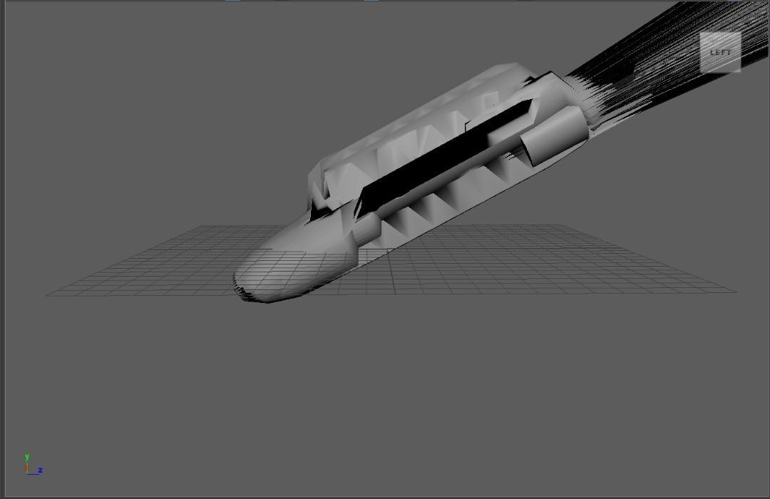
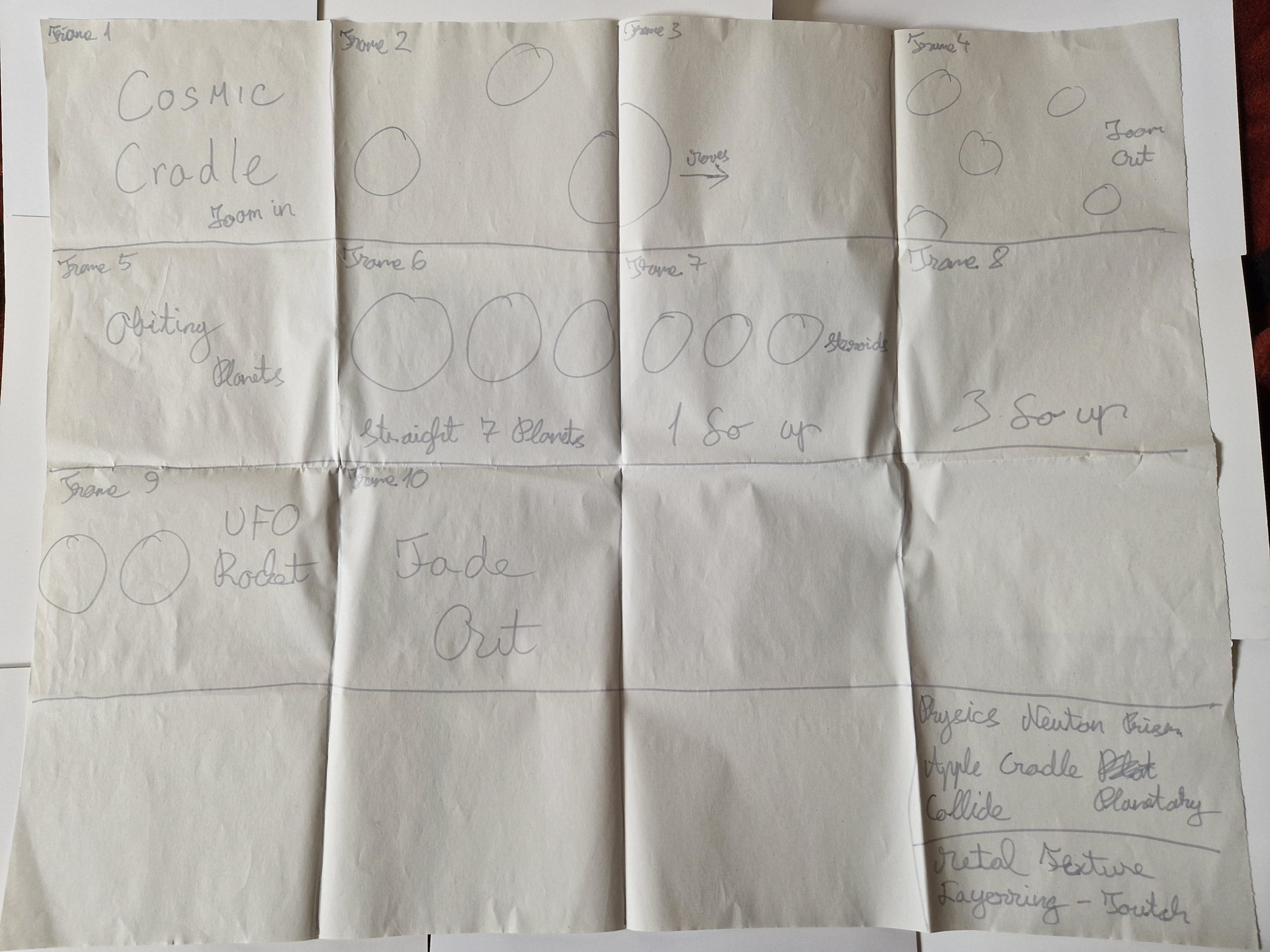
Group Storyboard
Figure 3 : Storyboard interpretation was made following a group discussion.
An area was actually a wallpapered rear wall that moved like an Alexander Calter mobile. However, since the storyboard was unfinished and lacked a beginning and a conclusion, doing a group brainstorming was helpful. The group storyboard that Abbie, Adam, and Sidney presented is shown in the photo below. After the group project, additional factors were taken into consideration, such as having various planets turn in a line that will resemble a cradle and an asteroid that is travelling in the direction of the planet. After an asteroid strikes the planet, all the planets collide once more. Three planets are then moved by the rockets, which causes them to rise after colliding and then fall. This connects to the Alexander Calder mobile as well.
Figure 4 : The final choice was to call the piece Cosmic Cradle after more examination of the important terms that would be included in the title.
Development of the idea for the entire animation would involve space and a 3D rocket in a similar style, by thinking back to space exploration from the 1970s.
Figure 5 : During the in-depth conversation, a group storyboard was created.
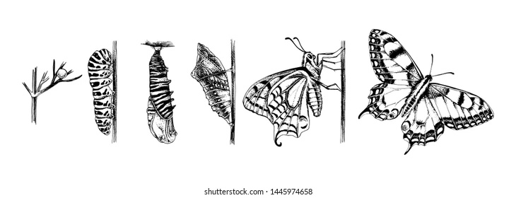
Figure 1 : Analysing the metamorphosis and illustrating the transformation from a caterpillar to a buterfly. This illustration will help people understand what animation is supposed to be (Mart, shutterstock, n.d.)
Animals change drastically and quickly after birth through a process called metamorphosis. Changes in an organism’s complete body plan, such as the number of legs, method of feeding, or mode of breathing, may be the outcome of metamorphosis (BD Editors, Biology Dictionary, n.d.).
However, in terms of design, metamorphosis may be associated with a change in habitat or even in mode of life, even if this may also occur independently of any initial morphological or environmental alterations. Cities are a fantastic example because they are always changing (Architecture Ducation, n.d.).
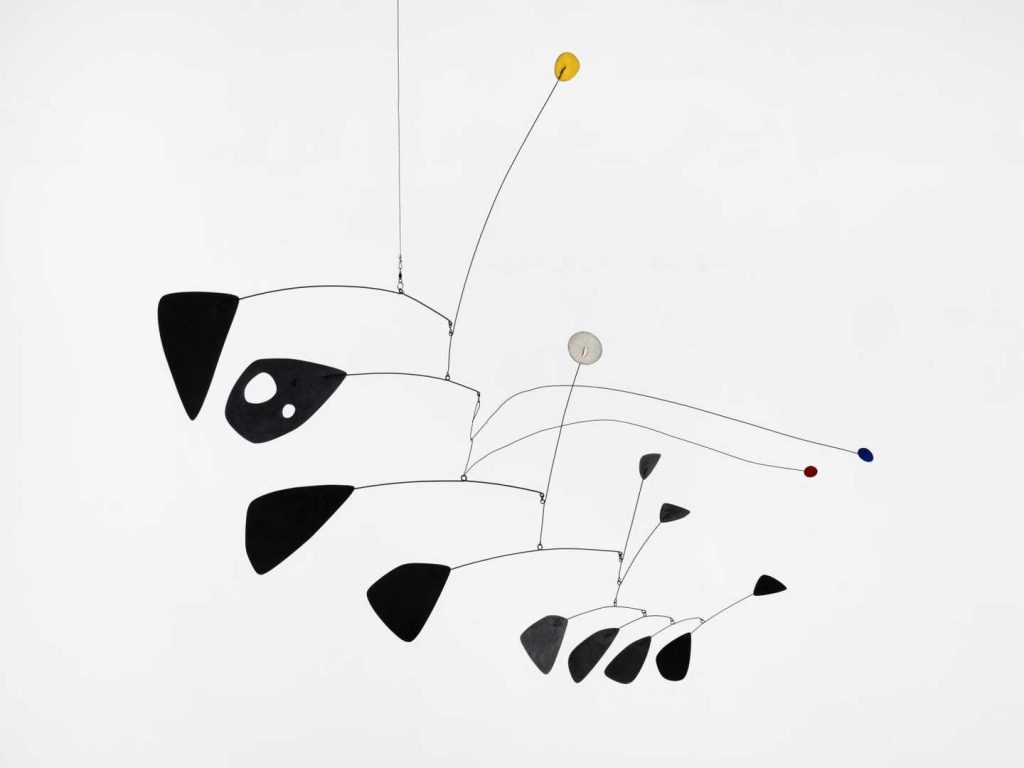
Alexander Calder
Figure 2 : Kinetic refers to something that involves motion. Movement has been included into art since the early 20th century. This was done in part to explore the potential of movement, in part to explain the concept of time, in part to reflect on the significance of technology and machines in today’s environment, and in part to investigate the nature of vision (Tate, n.d. KINETIC ART).
After careful thought, the decision was made to adapt Alexander Calder’s work to create a moving planetary or atomic animation. As a result, having planetery in a mobile format would be considered. Alexander Calder is credited with creating the mobile, a form of kinetic art that relied on careful balancing to achieve equilibrium and suspension in the air, as well as wire sculptures. At first, Calder utilised motors to move his pieces, but he quickly stopped using them and switched to just using air currents (Tate, n.d. WHO IS ALEXANDER CALDER?).
Looking at Alexander Calder’s work made me realise that the motion was similar to that of Newton’s Cradle.
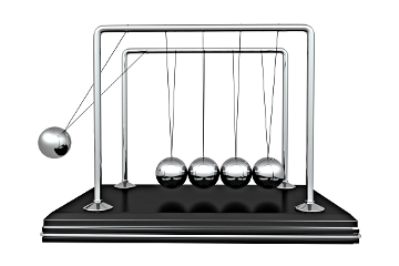
Newton’s Cradle
Figure 2 : The Newton’s cradle, with its swinging, clicking balls, isn’t just a regular desk item, despite the appearance of its straightforward design. In actuality, it is a beautiful illustration of some of the most fundamental physics and mechanical laws (Chris Schulz, howstuffworks, n.d.)
The item serves as an excellent example of how friction, momentum conservation, and energy conservation all function together in physics. These collisions that are inelastic and elastic, and kinetic and potential energy (Chris Schulz, howstuffworks, n.d.)
In order to create anything analogous to Alexander Calder’s mobile, the idea for the prospective animation would therefore be to include metomorphism and the Newton’s cradle itself or even its motion.
BD Editors, Biology Dictionary, n.d. Metamorphosis Definition [Online] (Updated in 4 October, 2019) Available at : https://biologydictionary.net/metamorphosis/ {Accessed in 10 May 2023]
Figure 1 : Refresh Time energy drink stop motion animation to encourage target audience to purchase the drink and become interested in the animation itself.
Figure 1 : Commercial for the energy drink business Celsius. Short social media product video. When massive handheld energy drink meets elegant transitions and dramatic sound design
Refresh Time Storyboard
A can will roll about in a slow-motion Refresh Time animation until it stands on end and the energy from the can causes it to fly. It flies, lands upside-down, then turns. The other two cans show when it turns the appropriate way, and it appears as though the camera is switching between the views while the energy lightning splashes as a liquid. There won’t be any verbal advertising; instead, background music related to slow motion animation will be playing.
After some time, my package concept was changed from illustrations to straightforward vector shapes that symbolise a particular activity the target audience would want to achieve when drinking the can. This makes the design even more simple, and speaking of simplicity, the animation won’t have any extra components because during teamwork activity, the created the wooden slow motion animation just used the key components to convey the story.
Robert Consoli divided the group into two teams of three and assigned them the goal of making a stop motion video using wooden dolls while cooperating as a team.
We covered how roles in the Danish orchestra can be followed in real life in the previous assignment. So it was up to me to be proactive and show leadership skills, which were lacking in this collaborative project. Abbie was the group leader, and her offered idea was accepted by both myself and Rana.
What is a Stop Motion Animation?
Stop motion animation, often known as stop frame animation, is a type of animation in which actual objects are moved about the screen between each frame as the animation is being recorded. The illusion of movement is produced by quickly replaying the series of photos. Stop motion is comparable to 2D drawn animation (early Disney), although it employs real-world objects rather than drawings (Dragonframe, n.d.).
Taking a photo of your items or characters, moving them slightly, and then taking another photo is the fundamental method of animation. The objects or figures seem to move on their own when the photographs are played back one after another (Dragonframe, n.d.).
Example of Stop Motion Animation
Figure 1 : It involves an artist’s tiny posable dummy doll that comes to life and desires for a face identical to the one in the drawing (Doug Vandegrift, 18 May 2009 ).
The development from a simple sketch to a moving wooden doll is explored in this stop motion animation. As the artist walks away, the doll begins to move and gazes at the drawing, wishing for a face. This animation also has a comedic element, as the doll creates weird faces until it finds the appropriate one.
The Sting of Love Stop Motion Animation
To create this stop motion animation, I, Rana, and Abbie planned to use moving wooden models to create a toxic relationship fight. So Clara approaches Bob and slaps him, causing him to slap her back and they both fall down. Abbie was leading the teamwork session and filming the video frame by frame. Rana and I were gradually repositioning the wooden figures.
Figure 2 : Our String of Love focuses on the toxic relashionship between Clara and Bob (Rana Maglad, 02 March 2023).
Clara runs towards Bob and slapped Bob which they later fight each other. As Clara fells to top of Bob, she stands up and leaves in tears and sorrow. My job was to manoeuvre Bob while Abbie took each shot, and the entire collaboration process was fun.
When it comes to creating my stop motion animation, a similar approach and move the can slightly. As the can will be moved, a drawn logo on it and stick it together.
How might it differ if Energy Drink had a specific target audience?
Figure 1 : Caffeine-laced energy drinks have been the subject of much debate in recent years, following a number of reported deaths and overdoses linked to the drinks (Ariana Eunjung Cha, The Washington Post, 12 November 2015).
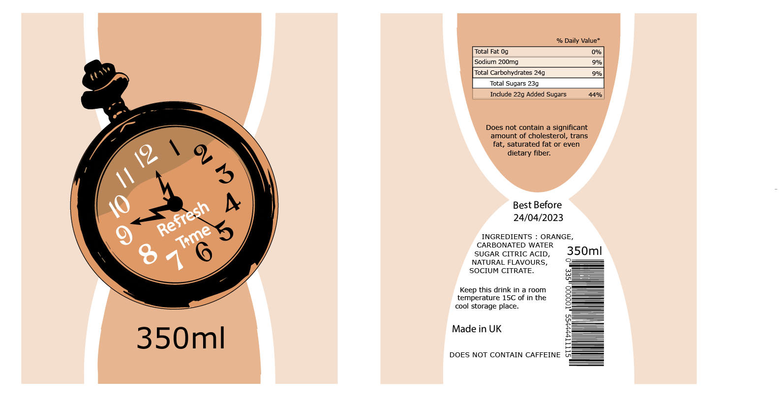
Refresh Time’s major purpose is to sell a natural flavour drink with sugar instead of caffeine because people with high blood pressure cannot and will not consume such drinks. The label will mention whether or not caffeine was added, as well as other legal information.
The following must be printed on all food and drink products as required by law. This information ought to be unambiguous, permanent, understandable, easily visible, and not deceptive (GOV.UK, 2022).
Such as the food’s name, the ‘best before’ or ‘use by’ date, any required precautions, net quantity data, an ingredient list if necessary, the country or place of origin, the lot number or the expiration date, any special storage requirements, and use or cooking instructions if applicable (GOV.UK, 2022).
This information would have to be integrated into any designs created during the brand’s creation stage because it occupies about 25% of the can’s overall print area (GOV.UK, 2022).
Why Eco Friendly Packaging is Important ?
Figure 2 : The use of renewable or biodegradable materials that are not harmful to the environment represents eco-friendly packaging. Sustainability has been fundamentally examined in practically every alcohol sector, including beer, wine, and spirits, and has impacted not only packaging but also sourcing ingredients and other procedures (Shreya Kohli, Beverage Trade Network n.d.).
Normal packaging is extremely dangerous not only to wild life but also to people as the materials produced from the polyethelene. “In Europe, 70% of recyclable plastics end up in a landfill or the oceans.” The production process of non-environmentally friendly packaging is another issue. Not only is the majority of plastic produced by the refining of crude oil, but the degradation process is also hazardous. Plastic degrades over hundreds of years, releasing harmful compounds such as bisphenol A, which can affect animal hormonal systems (Shreya Kohli, Beverage Trade Network n.d.).
Sketches of Package
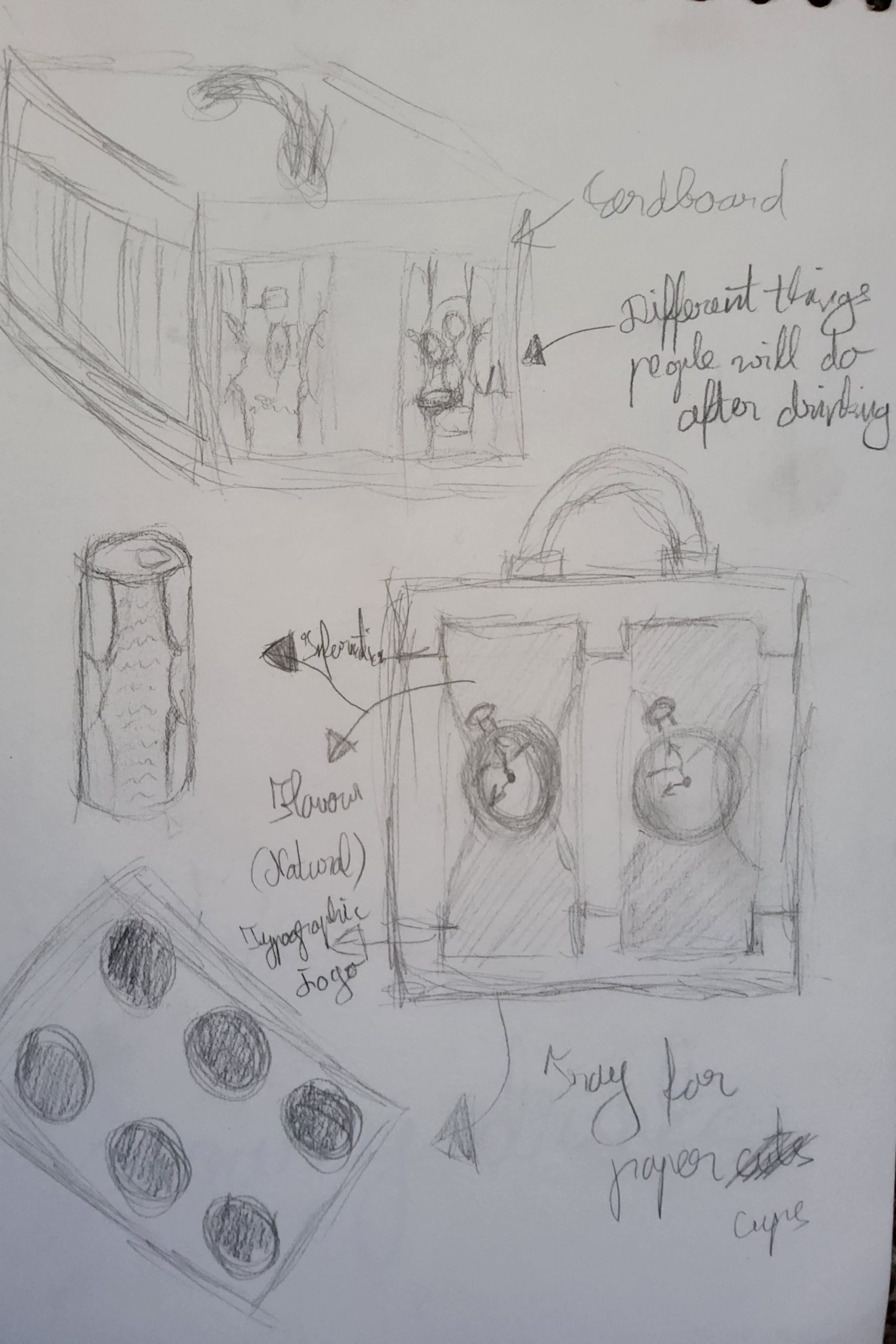
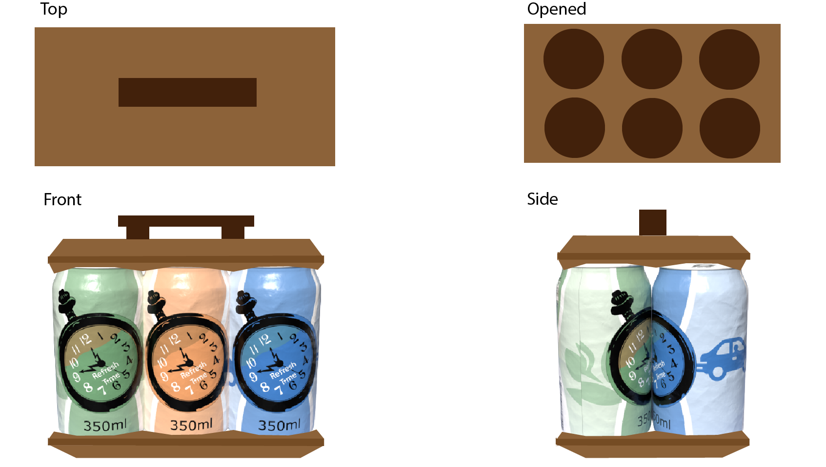
Figure 3 : Refresh Time drinks will be packaged in recycled cardboard, which is now utilised in environmentally friendly packaging, according to these sketches of potential packaging. However, having just the top would make it easier for senior people to move around. In order to be carried on a carry bag with wheels across the buses or to their car, the packaging will have a bottom and a handle.
Package Design
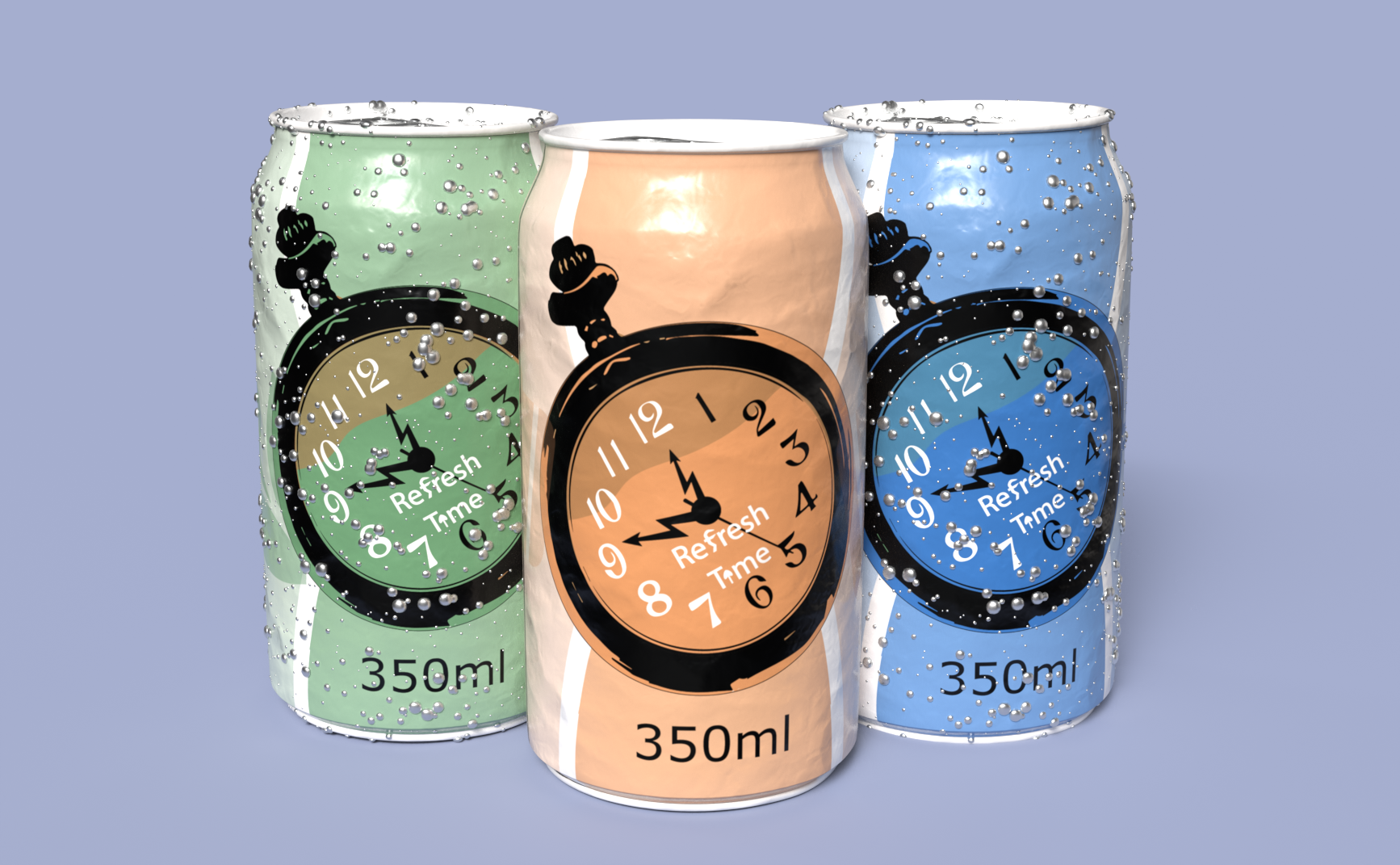
Figure 4 : Refresh Time can label with showing all of the description according to law.Figure 5 : A rendered design of Refresh Time that could be used as advertising promotion.Figure 6 : Visual Refresh Time packaging design from different views.
A well-designed logo can provide significant benefits to brands. It can help stimulate consumers’ interest, distinguish brands from competitors, facilitate brand recognition and communicate what a brand is all about (Jonathan Luffarelli, Mudra Mukesh, and Ammara Mahmood, Harward Business Review, 12 September 2019).
When you design a logo, your goal is to produce an instantly recognisable visual representation of your product or service. The graphic visual language you choose conveys the meaning, organisation, and aesthetic of your brand (Cath Caldwell 2019, p. 35).
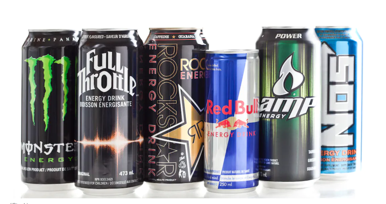
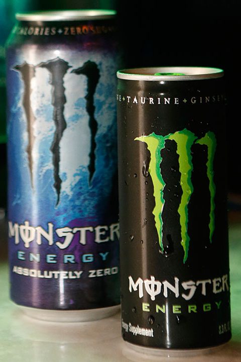
Figure 1 : Monster Energy is an amazing example of a logo that was created but was not ideal for this target audience. Because of the Devil theme, this target population and some younger people find this logo controversial (ABC 7, 12 November 2014.).
The woman argues that the “M” logo appears to resemble three instances of the letter Vav, the Hebrew numeral for six, and interprets the logo to indicate “666.” Next, she refers to Monster Energy’s motto on a product banner that reads “Unleash the Beast,” interpreting these two examples as Monster Energy meaning to relate to “the beast” in the Book of Revelations (ABC 7, 12 November 2014.).
Sketches of Logo design
Unlike Monster Energy, which features a wide variety of logo-related contradictions. Refresh Time will have a classic pocket watch as a logo and a sand watch behind the pocket watch because turning the sand watch causes the time to advance backwards, in contrast to Monster Energy, which has a wide spectrum of logo dispute.
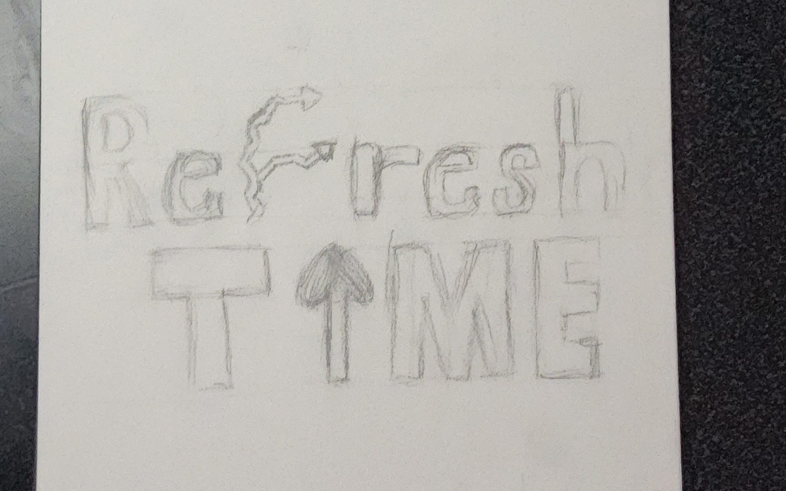
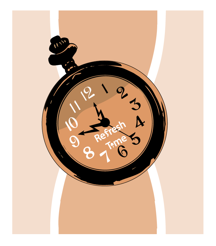
Figure 2 : This brand’s target customer is over 60s who don’t want to be reminded of their fantastic age. Therefore, Refresh Time would act as an energy booster, bringing back previously unvalued time and giving them a second chance to achieve something they actually wanted by drinking the pocket watch.Figure 3 : Both letters “f” and “i” will be replaced as the lightning and time arrow to show the energy boost.
Refresh Logo Design
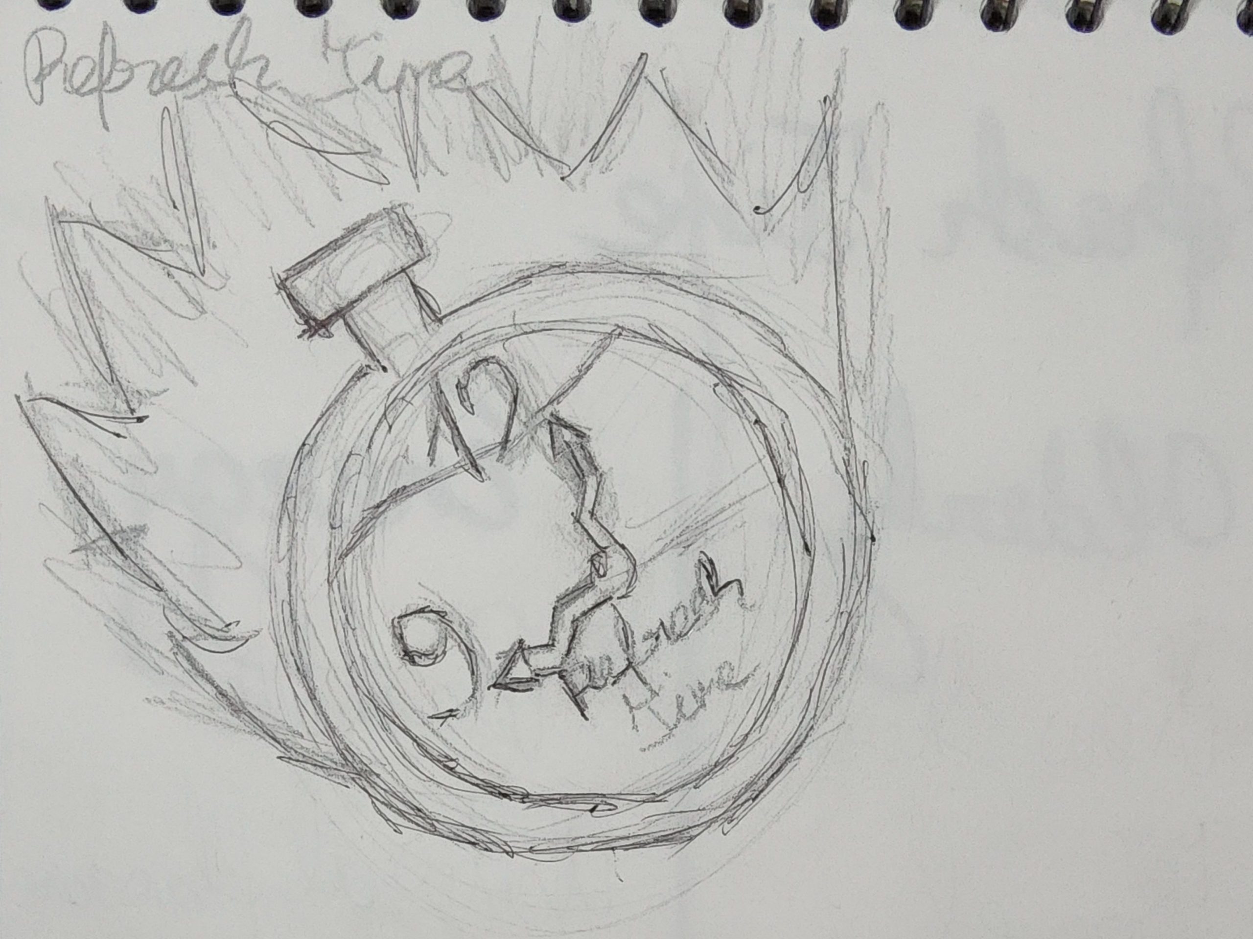
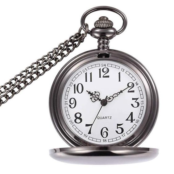
Figure 4 : A classic pocket watch served as a source of inspiration for the design (Amazon, Pinterest n.d.).
The original pocket watch photograph from Pinterest was used as a reference for my energy drink logo. The logo was created using circular forms, and the shapes were carved out with pathfinders to give the original timepiece realism. A pocket watch was utilised to show the target audience of over 60s that instead of going clockwise, the watch goes anticlockwise, taking them back in time and allowing them to do things they couldn’t do before because they were too busy or didn’t value their time. Change can be visible in activities such as travelling, trying new things, and learning to drive.
Figure 5 : Completed Refresh Time logo that integrates the concepts of energy and time and appeals to the target market.
Cath Caldwell, 2019, Graphic Design For Everyone: Understand the Building Blocks so You can Do It Yourself, DK and Penguin Random House Company, London.